Friday, June 22, 2018

Nine-Patch Paper Quilt


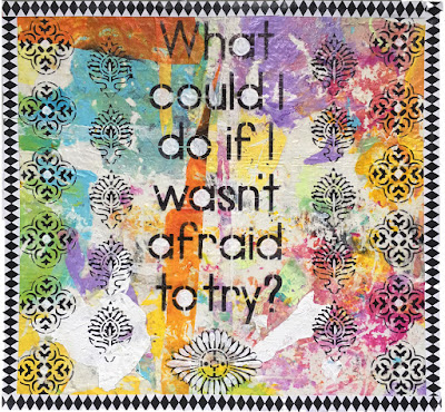
When I saw Gwen Lafluer's Spring 2018 Stencil Girl designs, one of my favorites was a large stencil that had words and little flowers. The words said "what could I do if I wasn't afraid to try?" and they really resonated with me. (You can see the artwork I made with those words here.)

The designs surrounding the words also spoke to me. They were based on some hand carved, India-inspired designs that Gwen made during "Carve December."
 
I decided to try making some fabric designs with the stencils. I studied Textile Design at the Fashion Institute of Technology, and my early career was as a textile designer and print stylist. I  often visualize stencil and stamp designs as fabrics and imagine their colors and repeats in my mind's eye.

I made a bunch of different designs, and was especially happy with a couple. Then I thought of the words "what could I do if I wasn't afraid to try?" on the stencil and realized that fear can be of big things or of little things. Even the fear of cutting up the new fabric designs gnawed at me. I threw caution to the wind and decided to cut them into squares and try making a paper quilt. Fortunately I took photos of my design so I can recreate it in the future, which eased the fear a little.

Mixing and matching the papers I created with Gwen's new and old stencils.
A StencilGirl stencil by Jessica Sporn was printed on white and green on yellow paper.
One of Gwen's new designs was printed in  turquoise on top of the yellow and green print above.
My paper designs and fabrics in shades of yellow and pink.
My paper designs and fabrics in shades of blue, green and lavender.
These four designs were used to make the final paper quilt.
I didn't have enough of the paper I stenciled with the yellow, green and turquoise designs to make a very big quilt, so I combined them with some of my own fabrics, which I had designed a few years ago and printed at Spoonflower, along with a yellow and white print using a Jessica Sporn Stencil Girl design. Since the prints I made from Gwen's and Jessica's stencils were on paper, I glue-sticked my two fabrics to some heavy paper, then cut it all into squares. I was on a roll.


The 4" squares of the four designs looked pretty good, but the design (above) was too square and boring. I decided to cut all the squares diagonally and rearrange them.

 I almost had enough for a 9-patch, but wanted something in the center. (The red design in the middle is my living room rug, not part of the design!) I thought Gwen's words would work beautifully with the paper quilt. I painted some smooth, heavy watercolor paper turquoise, and stenciled the words on with an indigo ink. They were a little big to fit inside my center square, so I squished them in and hand wrote the word afraid.

 The words were a little too close to the edge, and the colors a little too harmonious, so I tried adding strips of contrasting fabric.
  I wasn't sure I liked it, so I left it and looked at it again the next day. I decided to try cutting the triangles even smaller so that it would be more of a pinwheel design. I liked the new arrangement, so I cut the rest of the pieces smaller, so that each 4" block would have 8 triangles.
 Next, I repeated the pattern until I had a square design with an empty center space. I  lightly glued the pieces to deli paper, leaving the center empty.
I tested out a few different ideas for the center. The words I had originally planned to have in the center didn't fit quite right, so I saved the quote for a future project.
Some reverse applique fabric pieces looked interesting and unexpected. I ended up using them in another project. You can see that project here.

I tried the reverse applique fabric pieces in the center and around the edges, and added some accent strips of another fabric.
The colors of the mermaid journal page worked, but it was too large.
The mermaid artwork looked too small inside the center square.
A piece of silk sari scrap fabric was the right size, but the wrong color.
A print of the Scribble X stencil had the right color, but didn't seem bold enough for a centerpiece.
A piece of deli paper printed with assorted stencils was harmonious, but lacked a central focus.
An art deco stencil print had the right colors, but was the wrong size and shape.
A print of Gwen's Art DecoMedallion stencil was just the right size and color for the center.
I tested some other stencils as accent, but they were too large and the extra brown color didn't work.
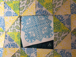
Finally, I decided to keep it simple and move forward with just Gwen's turquoise Art Deco Sun Medallion stencil in the center. The color was right, and the geometry worked with the quilt's geometry.
After backing the pieces with some fabric for stability and removing the deli paper that they were temporarily glued to, I zigzag stitched all the pieces together, and the design was finished.
A close up of the stitching in progress.
Detail shot of the stitched center design and surrounding quilt pieces.
My plan is to print some yardage of the green and yellow designs at Spoonflower so that I can play with the design some more, but this time as a real quilted fabric instead of paper. Can't you see this design as a big quilt on a bed, as throw pillows, or even a summer dress?


Friday, June 8, 2018

Not Afraid to Try

Fear. It holds us back from big things and little things, from life-changing, difficult decisions to small daily choices. Fear stops us from making a phone call or sending an email. It stops us from applying for a dream job, speaking up when something is wrong, initiating conversation. It stops us from wearing our prettiest outfit, trying a new haircolor or hairstyle, traveling somewhere exotic.

For artists, fear makes us hold on to beautiful fabrics and papers that are too pretty to cut. It makes us afraid to go further with a design or painting for fear of ruining it. It stops us from using the really good watercolor paper. Fear makes many of us work small, keeps us from making large bold strokes on giant canvases.

When I saw Gwen Lafluer's stencil called "Not Afraid" the words called to me. In my life, fear kept me from trying and doing many things. For a long time, panic disorder controlled me--an unseen force, a petrifying, reasonless fear ran through me and ran my life. It nearly kept me from a career as an artist. As an adult, I am constantly pushing myself through fear and making myself move forward.

I tried using Gwen's stencil several ways. I knew they were powerful words, yet the pieces and journal pages didn't do the words justice.
This piece has a background collage of vintage sewing items, and reflects my interest in fashion design--a path I was afraid to try. The purple stenciled floral shapes represent overcoming fear, and my resulting career as a fabric designer.
A journal test page with the Afraid to Try stencil and the Scribble X mask.
An unfinished journal page, testing the Art Deco Peacock Feather and sections of the Afraid to Try stencil.
This is a collage of random papers, handwritten thoughts (on the underlying page) about overcoming my claustrophobia and fear during a recent MRI.
As I was cleaning my art space one Saturday morning, I found an abstract painting that I had made a few years ago. It had started with a piece of 12" x 12" cardboard packaging from saved from some commercial scrapbook paper. I had covered it with gesso. When it was dry, I carefully peeling the paint skins off my craft mat and adhering them with matte medium. It was done pretty randomly and instinctively. I wasn't sure if it was finished or not--I liked it, but not enough to hang on the wall as an abstract painting. Something was missing but I didn't know quite what. I put it aside for a long time...almost two years before rediscovering it.
This was the finished abstract painting that eventually became the background for "Afraid to Try."

Dried paint was peeled off my craft mat and placed on a gessoed cardboard using matte medium.

These patches of dried acrylic paint became the background.
I rifled through my boxes and bins and discovered that the recycled paint skin painting was exactly the right size for the "afraid to try" stencil...serendipity! I grabbed my black ink, a cosmetic wedge, a mini dabber, and got to work. First, I put the words in the middle.


Next, I added designs on the left.

 
 I flipped the stencil over and finished the right side, mirroring the left.

I liked it so far, but thought it needed a little more. I decided it needed some kind of frame or finished edge.

I love the combination of bright colors with black and white patterns known as Zetti, so I pulled out some gingham fabric and black and white papers. I also considered some black and white painted lutradur that I had made a few years ago.
The brightly colored sari scrap corners matched, but the black and white painted lutradur sides overpowered the center design.
Some gold paper Dresden Medallions were tested in the corners.
I removed the Dresden stars and tried colored sari silk and a gingham diamond, but still didn't love the border.
The large harlequin border seemed too bold and overpowered the artwork. I liked the way the squares of silk sari scraps looked in the corner and matched the center piece though. I didn't have enough black and white gingham fabric so that was vetoed.

I decided finally to keep it simple, and cut some thin paper strips of a black and white diamond pattern, then glued it around the edges. That worked--the delicate diamonds didn't overpower the central image...the thin border finished the piece without fighting it.


Last, I decided to sharpen up some of the white areas, especially dark orange under the O in DO, which made the words a little hard to read. With white acrylic, I used a very small brush and enhanced the circular letters, the large shape under the words, and the centers of the cross-shaped designs.


This piece speaks to me in so many ways. The words reminds me of the times I beat fear, and forged ahead anyway even if I was afraid, especially with a decision to become an artist, to move to New York alone, and go back to school to study textile design. The designs surrounding the words remind me of fabric designs, my first art career. The colors are pure and clean, and remind me to be true to myself, to the colors I like and that make me happy. The whole piece reminds me to stifle my inner critic, to believe in myself, and to be true to the designs and ideas that resonate with me.