Sunday, July 19, 2015

The Reiki Master Said to Go Home and Paint Yellow


Embracing yellow, musing about ideas running through the inside of the brain, experimenting. That’s what is going on during my lunch hour. Trying to learn how to make drawings and paintings of people look kind of realistic by using Jane Davenport’s techniques, and trying to make them kind of pretty but unique, quirky and interesting.
This piece started out as a randomly painted piece of deli paper…mostly yellow acrylic with strokes of red, orange and white. Twelve years ago, when I was having some serious health issues, I went for reiki treatments since conventional medicine wasn't helping much.  My reiki master told me to “go home and paint yellow.” I did go home and paint yellow then, and found it very freeing and healing.
I never forgot about the simple truth of the reiki master giving me "permission" to use my favorite color. I had been trying to stay away from colors right out of the tube, trying to be more urban and sophisticated in my color choices. I later realized, in the line made famous by Popeye, that "I yam what I yam" and that I should embrace my artistic instincts. Once again, I am following her instructions and using lots of yellow.

 
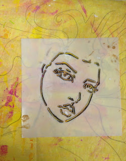
First, I sketched a face outline using an Artistcellar JaneDavenport face stencil and a prismacolor pencil. Next, following the advice on Jane's DVD about Whimsical Faces, I painted the face with a flesh-tone acrylic and added some pinks on the cheekbone and lips.
 
Then I brightened up the features with more pronounced cheeks, lips and eyes and added white accent strokes and added flowing lines to indicate hair. I debated about stopping here, but decided to push on and see what developed.
 
I wanted to make the hair more interesting so I painted it white and added some dots—somehow I always feel inclined to add dots. I also am inclined to make swirly spiral lines. These shapes probably have some deep-rooted psychological meaning, but I have no idea what it would be. Again, I considered stopping at this point, but felt the need to push on and fill in the empty spaces.
 
The piece called out for words, so I used the negative space between the hair to write—first with a pencil and then with a sharpie—the thoughts that were going through my mind. Random thoughts…some big, some small. Some heavy, some light. Things I wonder about daily and wonder about occasionally. And mostly things that have no answer.
 

Monday, July 13, 2015

Drawing with Jane Davenport


Jane Davenport has a wonderful CD about how to draw whimsical portraits. I first became aware of her work when I tried out some of the stencils she created for Artistcellar. They were really fun and easy to use.
I am all about recycling and downsizing and trying NOT to purchase too many unnecessary art supplies. Kind of an oxymoron, isn’t it? With my art addiction, supplies are always necessary. But I try not to splurge on every new tool or supply that catches my eye. However, I DO love faces. And looking at my published work…well, it is pretty much all faces.
Back in the 80s I took a class in pastel portraits where I learned the basic mathematics of drawing a face and how to mix the pastel colors to get a nice flesh-tone. But, Jane’s faces were so enticing that I decided to break down and order the DVD from Cloth Paper Scissors so that I could learn her secrets. 
Jane’s step-by-step DVD kicked my face drawing talents up a notch. I learned how to do “pretty” which was a big change—I usually have abstract or ugly or disturbed looking faces…and I probably will return to doing weird faces, but I may be using Jane’s method—which is practically foolproof.
In the first photo, I drew the basic shapes with colored pencil, then used a flesh-colored acrylic over it.
In the second, I added more detail and lines with colored pencil.
The final photo has more color, blending, and white accents. A few strokes of Tim Holtz’s distress stain in antique linen, with a couple strokes of white gesso was all I needed to give a blonde hair effect. I think she looks a little like Morgan Fairchild, but my daughter says she resembles Elsa from Frozen.

Monday, July 6, 2015

Turning Marker Doodles into Stenciled Crackle Paste ATCs


The background for these ATCs started out as a random art therapy drawing one evening. As my husband watched TV, I sat next to him with a sketchbook full of thick white paper, my collection of TomBow brush tipped markers, a koi paintbrush and jar of water.


First, I made random doodles with some of my favorite shades of blue and green. Next I added a little more color and more doodles, and then added water with the koi brush to make the colors bleed together. 


Pretty, and if it were a silk scarf, I would surely have worn it. But since it was paper, what was I to do with it?
My new motto, learned from Kelly Kilmer, is “when in doubt, add a stencil or a stamp.” So I took a gorgeous Retro Café Art large flourish stencil and pushed white Crackle Paste through it. I was impatient, so I used some small Artistcellar stencils with crackle paste to fill in the empty spaces, being careful not to smear the flourish section—the mini virtue Tudor Rose hope pocket stencil worked with the flourish stencil perfectly.
 
 
When it dried and the solid white paste turned to a nice crackled design, I loved it, but still…what was I going to do with it?
 
The idea lightbulb went off inside my brain…ATCs, of course! So, using an Artiscellar pocket stencil as a template, I selected the areas I liked best, traced around the template, and made six colorful, textural ATCs. After I cut them out, I glued them to an ATC blank with rubber cement. The final touch was edging them with some purple Ranger Archival Ink.