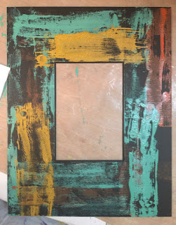
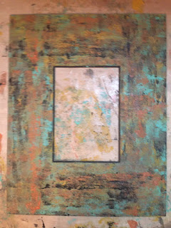
I had a frame on hand with a very wide (4") plain black mat. It was just the surface to suit Seth Apter's "grunge" technique. I had taken a class with Seth a few years ago and learned how to combine his Paper Artsy paints with his line of Emerald Creek embossing powders for a wonderful aged and distressed look.
I pulled out my paints and got started, applying each of the four colors one at a time until I got the effect I wanted.
Next, I added a spritz of distress stain and shimmer gold spray.
Then it was time for the magic: I added more texture with stencils and embossing powder.
 |
| Ancient Amber embossing powder before heating. |
 |
| Ancient Amber embossing powder after heating. |
 |
| Patina Oxide embossing powder before heating. |
It is always a little tricky to photography shiny artwork, but above you can see the finished frame.
I keep a painted box on my desk, filled with my "go to" stamps, ink pads, and small art supplies.The finished frame went perfectly with my box, which I had made last year using the same technique.
I was so excited to realize that I had made a companion piece to the box! Here they are together on my worktable.
(click HERE to see the blogpost on how I transformed an ordinary shoebox into a faux-wood distressed art piece.)
Usually people have a photo or painting, then select a frame to match it. This time I worked backwards, rifling through my boxes and bins and electronic files to find just the right photo to go with the frame.
Here's a few I considered:
I love my parent's wedding photo (from 1944!) but the pinkish tone of the sepia photo didn't quite work with the frame.
This punky painting from last year's ICAD (index card a day) looked kind of cool, but it was too small, and also had a hole in it that I punched to keep it on the ring with all my ICADs.
I finally settled on a piece that I had created in Photoshop a few years ago. I had used the artwork to make some 4" x 4" trading cards as well as some ATCs. However, for that project, I overprinted the photoshop artwork with stamps and white printmaking paint. (click HERE to see the old post.)
The Photoshop document was created by combining some images from The Graphics Fairy with an old photo of my mother, circa 1937.
It was a small (1.75"x 2"), vintage sepia toned photo taken in an old-fashioned photo booth. In Photoshop, I took out the background curtain, replaced it with the vintage script and botanical floral, then added some soft color to her cheeks and lips. The flower is upside down intentionally.
I loved the contrast between the pink, feminine image and the earthy frame. Even better, the colors and textures were strikingly similar to shingles on the house we grew up in, so the framed piece is a double homage to my mom, my siblings, and our family memories.


