Showing posts with label retro café art. Show all posts

Sunday, July 2, 2017

Turning Over a New Leaf

Doodles, doodles, doodles. I am constantly doodling flowers, leaves, geometric shapes, alphabet letters, names, and faces. I often collect my doodles and turn them into a design, or just tape them on a journal page for later reference.

After I doodled a leaf on a little blue sticky note the other day I realized the symbolism--I am actually in the process of turning over a new leaf--a new job, new duties, with a new location, new co-workers, a new commute--so what could be more appropriate than a journal page about turning over a new leaf?

Then, yesterday morning, I got a package in the mail with some art trades in it, and the trade hostess had included some little cutout pieces of...guess what?...leaves of course. So, I painted them green, and also used them as a stencil while I was painting them.

I was in love with my old journal. It was square, which is perfect for Instagram. Perfect for a Virgo who likes everything neat and square and tidy. But the new journal is a horizontal rectangle, which has me less in love with it than my old journal. Previous to the square journal, I used, or made, journals that were rectangular, but vertical.

So, I decided to create a square space on each page of my new journal, and either leave the extra space blank, or do something unrelated in that space. Sometimes I incorporate it into my design, sometimes not. On the page below, I put the blue sticky-note on the top right, and underneath, some of the little stencils of the cutout leaf shapes I received in the mail. The main design is on the left. I started with a page painted in a bright yellow--one of my favorite colors.

"Turning Over a New Leaf" journal page
 I used acrylic paints, paint pens, and Jane Davenport paint-over pens. Once it was dry, I added white printmaking paint with a Nathalie Kalbach Versailles art-foamie stamp around the edges.

When I was done, I realized it was strikingly similar to a design I made several years ago and turned into fabric. Here is the link to the fabric I designed a couple of years ago, and the blogpost about it. Not only do I keep doodling the same thing, I also seem to choose the same color combinations. I guess they are my happy shapes and colors.

Below is an art journal page that I did a few days before the "turning over a new leaf" page. Again, I used the happy yellow acrylic in the background, then added whimsical vintage paper doll parts, a model's face from a fashion magazine, and some of my own fabric scraps. I finished it with some handwritten words, a Retro Cafe Art solar flare stencil and Artistcellar inspirational word stencils.

"Riding the Waves" journal page
I realized recently something I have always known, but had forgotten: that I love not only making art, paintings, and designing fabrics, but I love turning them in to a useful, beautiful end product. Below I took some paper I had designed in Photoshop and output with a color laser printer on 8.5" x 11" paper, and, using an old envelope as a template, cut, folded and glued my own envelope. I added paper scraps and assorted washi tape. I used the fancy envelope to send out my folding ATC doll to the winner of the Paper Traders June "winner take all" ATC lottery. Here's the link to last week's post in case you were wondering what is inside the envelope.

"Mail Art" handmade envelope


Saturday, November 12, 2016

Up-Cycling Leftover and Imperfect Artwork

I used to open the refrigerator and look around for something to eat for dinner and close it saying: "Nothing good in there to eat." But my roommate Susan had a knack for cooking, and would rummage around and turn the leftovers into something delicious. Our deal was that Susan cooked and I did the dishes...we both thought it was a good deal.

In the past few days, I decided to apply Susan's creative cooking technique to my art stash and UFOs. First, inspired by a class I took with Julie Balzer, I made a new Junque Journal. I alternated pages of painted deli paper (doubled together with matte medium for strength) with really pretty commercial 12"x12" scrapbooking paper. I decided to try machine binding the pages because I had a shoulder injury and hand stitched binding would have been painful.

Here is the cover I chose: painted deli paper with 6" Artistcellar chakra stencils. (Artistcellar also makes small chakra pocket stencils) The spine was created with some old hippie style trim I purchased years ago on sale. Not a perfect match, but not too bad, and since it is a Junque Journal, it didn't matter.

"Junque Journal" with cover made from painted delipapr and Artistcellar Chakra stencils
The first page I worked on has a beautiful fashion figure that was an illustration in a recent FIT Alumni News magazine. It reminded me of why I came to New York, how much I wanted to be a fashion designer when I was young--but afraid to try, afraid I wasn't any good. I eventually ended up going into the fashion business and found my niche as a fabric designer. It was an uphill battle against parents and teachers who had other ideas of what I should do with my life. I wrote my memories on the page with white and purple ink.

An illustration from FIT's alumni magazine sparked some memories, which are written on the journal page.
A few days later, I decided to use up small ATCs and scraps that were too pretty to throw out, but not quite pretty enough to trade with my Paper Traders yahoo group. Adhering them to some Retro Cafe Art mini gothic arches gave them a new look. I made a duo and a triptych, and hinged them with 1" pieces of elastic and mini brads.

Leftover, imperfect ATCs were used to create this butterfly themed gothic arch mini triptych.


Leftover and imperfect ATCs were the base of this mini gothic arch duo.

On Election Day, I decided to use up some splattered watercolor paper that was hanging around. I cut the pages in half, then folded them, stitched them, and viola...I had a new mini journal. It needed a little something on the cover, so I grabbed my favorite Artistcellar pocket stencils, some Michelle Ward NYC urban-themed stencils, some ink, a cosmetic sponge wedge, and just played. Little did I know that the words I stenciled would have even deeper meaning as the election results began to come in.

This mini journal has 4.5" x 6" pages, with a simple stitched binding.


Sunday, July 3, 2016

Abstract Sunflower ATCs


Sunflower ATCs should be easy, right? So why did I struggle with making them? I wanted to stay away from cliches, and decided to go abstract...maybe I should have just gotten out my paints and done cutsie little yellow petals with brown centers and called it a day. But I love abstract work, so I sat down at my art table and got to work.

Abstract Sunflower ATCs
First, I started by pulling out my gelli plate, brayers and yellow and magenta acrylic paint. Using various Artistcellar and other stencils, I made about 50 prints on deli paper. They were hideous. Colors too bright, prints too sloppy.

So next I tried layering them onto various papers that I had prepared with a white gesso surface. Some improvement, but still not great.

The next step was stamping some "petals" over the top using sepia archival ink and white printmaking paint on two different Julie Fei Fan Balzer stamps. Better, but not great still. I added a spiral center in sepia and black with an old Retro Cafe Arts stencil, then used a black stamp pad around the edges of the ATCs.

I set the ATCs in my unfinished art box thinking an idea would come to me to improve them. Then I went away for a long weekend to something called "The Letting Go Weekend" in upstate New York. My brother had a lot of insight from going to a previous weekend retreat, so I gave it a try. It was pretty healing and illuminating. I did quite a lot of journaling during the event and feel less stressed, even less compulsive about needing to make art--although I am not entirely sure if that is a good thing or not.

This weekend I decided to finish the ATCs and meet the trade deadline so I added some words with tiny round alphabet stamps and called it a day. So, they aren't the best art I ever made. I don't love them, but like the name of the weekend retreat, I am learning to "let go," move on, and accept that I am not perfect and will not always love my work but I can just meet the deadline and move on. AND maybe somebody will think the ATCs are terrific, after all, beauty is in the eye of the beholder, right?

Sunday, February 21, 2016

Gothic Arch Duo

About a year ago I ordered a bunch of items from Retro Café Art. Some I used right away, some I tucked into my art stash. Yesterday I had some time on my hands and no deadlines to meet, so I played around with a couple of the large chipboard gothic arches.

The shape seemed so lovely that I didn't quite know where to start, my inner critic didn't want me to make a mistake. But, I just decided to start anywhere, thinking I could always paint or collage over them if they ended up really ugly. I started with a collage base of favorite items: text. I used some French script, vintage newsprint, and snippets from a Chinese newspaper.

A famous American scientist stamp was recently gifted to me, so that went on top of the text. My Artistcellar stencil collection is always handy, so I pulled out some favorites: the harlequin, a little flower, garden gate, and inspirational words. I found a tiny bottle of my favorite old go-to paint, Lumiere, in a beautiful turquoise, which I used along with some chalk inks and markers. The woman on the right is part of a vintage Sunmaid raisin ad--thank you Susan Morgan Hoth for your gift of vintage magazines.

The edges were finished by running them over an Adirondack sepia ink pad, and the hinge was created with silk jewelry cord and square decorative brads. Hinges are always tricky for me--they need to be strong, they need to be able to work without being too stiff or too floppy. This hinging method was not perfect, but was satisfactory. Sometimes I use fine ball-chain link, sometimes pretty ribbon, and sometimes actual hardware hinges.

The piece is simply art therapy--no hidden meaning, no deep message, just me messing around with art supplies on a Saturday afternoon.  I had been saving the gothic arches for the right day, the right moment, the right inspiration. They seemed to want to want to be part of something important and meaningful, and maybe with the next attempt I will use some kind of cherished photo or keepsake.

Monday, July 6, 2015

Turning Marker Doodles into Stenciled Crackle Paste ATCs


The background for these ATCs started out as a random art therapy drawing one evening. As my husband watched TV, I sat next to him with a sketchbook full of thick white paper, my collection of TomBow brush tipped markers, a koi paintbrush and jar of water.


First, I made random doodles with some of my favorite shades of blue and green. Next I added a little more color and more doodles, and then added water with the koi brush to make the colors bleed together. 


Pretty, and if it were a silk scarf, I would surely have worn it. But since it was paper, what was I to do with it?
My new motto, learned from Kelly Kilmer, is “when in doubt, add a stencil or a stamp.” So I took a gorgeous Retro Café Art large flourish stencil and pushed white Crackle Paste through it. I was impatient, so I used some small Artistcellar stencils with crackle paste to fill in the empty spaces, being careful not to smear the flourish section—the mini virtue Tudor Rose hope pocket stencil worked with the flourish stencil perfectly.
 
 
When it dried and the solid white paste turned to a nice crackled design, I loved it, but still…what was I going to do with it?
 
The idea lightbulb went off inside my brain…ATCs, of course! So, using an Artiscellar pocket stencil as a template, I selected the areas I liked best, traced around the template, and made six colorful, textural ATCs. After I cut them out, I glued them to an ATC blank with rubber cement. The final touch was edging them with some purple Ranger Archival Ink.


Sunday, June 28, 2015

Empowerment Paper Doll

This post from a couple months ago somehow got deleted from my queue...no idea how, but I love this little paper doll so here it is...


Lately, my personal challenge has been to use up what I have on hand before buying new art materials. I have boxes and boxes of paper scraps, unfinished projects and things that just didn’t turn out quite right. On Sunday mornings my husband watches all the news shows for hours, so I have a window of undisturbed art time to putter and sip my coffee.

 
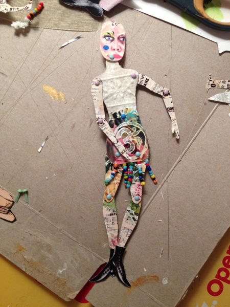
This Sunday, I pulled out my boxes of little bits and pieces to see what I could do. As I was sorting, I came upon a little brown cardstock figure that I purchased from Retro Café Art. It was smaller than I was comfortable with, and I had put it together with little star brads just to see what it looked like, and then put it aside.

I decided that one of the problems was that the star brads were too big, especially since they had points sticking, out so I took the doll apart. Next, I sifted through my piles of scraps to find something just right to cover the body parts. For the face, I thought I might use a mini-self-portrait from an old business card. The template had a teeny tiny head, so I cut mine a little bigger. I found some old ATCs that weren’t quite right, and used the sections I liked for the arms, legs and body.

With matte medium, I glued some vintage advertising typography from the Graphics Fairy to the arms. The legs are floral sections of cast-off ATCs, and the upper body has printed tea bags with a snippet of sheer lace. The bottom torso has a stamp of the OM symbol—also from a section of an imperfect ATC—and some beaded trim at the bottom edge for the suggestion of a skirt.
This time, I put the parts together with tiny mini brads in pastel colors, which worked better than the stars. Any points that were sticking out from the backside were snipped shorter with a jewelry wire cutter.

One of the fun parts of art paper doll making is putting it together—you never quite know what the doll will look like, and what kind of “personality” it will have until all the parts are connected. I often switch out faces or clothing until it seems right. I didn’t like the face as much as I thought I would, so I rummaged through my baggie of faces and found one I had made a few months before. I made a bunch of heads when I tested some Dina Wakely face stamps, using Artistcellar's black ink pad and Derwent blocks for spots of color. (Non-water soluble ink works best if you are planning to add color after the stamped image dries.)
 
The new head was oversized for the body, but it added to the eccentricity of the doll. It also wasn’t a happy, beautiful face—it is actually kind of sullen—but then, who is always happy and beautiful?
For pizzazz, I added a pair of vintage boots, also from the Graphics Fairy. Somehow my dolls don’t seem complete without wings and a hat, so I added a bowler hat and my favorite Graphics Fairy butterfly (cut in half and glued to the upper arm with matte medium, carefully avoiding gluing the brads, so that the doll will still be poseable.) The finishing touch was a saying from a Yogi tea bag: You are unlimited.

 
The doll reminded me of an angst-filled teenager who doesn’t fit in anywhere. It seemed that she needed the extra oomph of the inspirational words from the tea tag, the OM symbol and the butterfly wings, to empower her and know she is okay just the way she is.