Sunday, May 29, 2011

Indigo ATC Tray


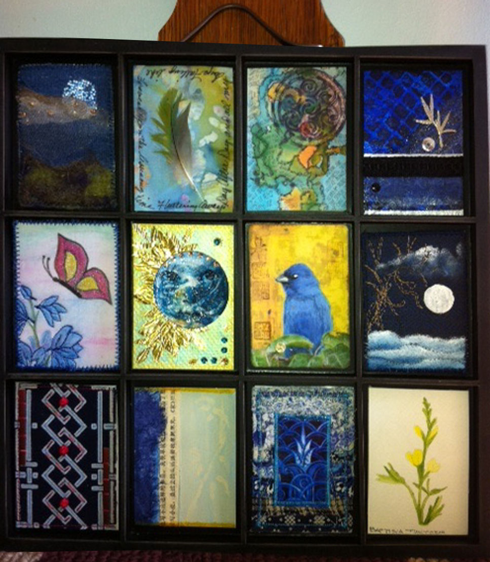
Thanks to artist Lisa Fulmer, I learned about the 7 Gypsies display cases for ATCs and other small art pieces. The first group I chose to display was my indigo collection, from a recent Arts in the Cards ATC trade. I added a few blueish pieces from other trades to make it an even dozen. Soooooo much better to have them out for viewing, instead of sticking them in binders and putting them on a shelf.

Wednesday, May 11, 2011

Squares within Squares


I enjoyed making my circle cutout 12" x 12" quilt so much, I decided to try it again. But this time, I decided to try using a square theme rather than circles...easier to sew, easier to cut, I hoped. Well, easier to sew, since doing little circles is pretty tricky. Easier to cut...not really.

Again I used about half fabric that I designed and printed myself through Spoonflower.com, and half commercial fabrics. I discovered that finely woven, lightweight fabric worked better than heavier and/or coarsely woven fabrics. I also made a few extra pieces, and I am glad I did. I had to take away some pieces that were too orange, and some that were too lime. Although they are colors I love, they looked garish and Halloweeny together.

Here is the quilt pinned together, ready to be sewn. I am also posting the finished circular patch quilt.

Wednesday, May 4, 2011

Truth is a Whisper


I had a great time today playing with some royalty free antique images in Photoshop. I have admired collagey mixed media work and asked a woman from my Roses on My Table group where in the world she got her images. I thought she spent all her free time scouring antique and flea markets...but no, she steered me to the blog called Graphics Fairy. http://graphicsfairy.blogspot.com/

This design shows my softer, romantic side, which might surprise quite a few people. The words say Truth is a Whisper, which come from the lyrics of a Goo Goo Dolls song of the same name from the Gutterflower album, one of my all time favorite CDs.

Monday, May 2, 2011

Mixed Media Tags


I greatly admire the mixed media work I see in publications like Somerset Studio. I have been trying to figure out how to get my work to look casually elegant, and incorporate calligraphy, aging techniques, vintage photos and torn bits of lace. It is waaaay harder than it looks. But at least it is therapeutic to try. This weekend all I managed to do was prepare some backgrounds for future tags with bits of painted tyvek, old maps and dried teabags.

Right now, I'm working on music themed tags for Roses On My Table. I can't decide whether to go soft and romantic or bring out my inner rocker chick. I am also puttering with ideas for Fabulous Fakes for my Arts in the Cards ATC group.

Sunday, April 24, 2011

Southern Rosebud Tree


I just went on a little spring break adventure to DC with my daughter Amanda. While wandering around the city, I spotted this amazing tree, called a Southern Rosebud Tree. It had flowers growing all over the branches. Not branches with flowers on the tips like most trees, right out of the wood! Gorgeous colors. I imagine it is a rare find...will have to look up more information on it. And yes, that really is me...I usually only put up abstract paintings of myself, so now everyone can see what I really look like. Shockingly normal, right?

Sunday, April 17, 2011

Spring=Mud


The ee cummings poem that was our starting point for this month's Arts in the Cards ATC exchange had me baffled. I couldn't think about charming children of yesteryear shooting marbles and playing hopscotch in the sun when all around me all I could see was mud. Inside, outside, mud everywhere. So, I decided to go with the flow and let the muddy footprints on the carpet and dormant lawn and garden inspire me.

I used some paper fabric that I made from recycled, dried tea bags and coffee filters. I stamped them with handcarved floral and leaf stamps, as well as a commercial face stamp, using brown distress ink. A piece of hand-dyed green cotton that a friend in Norway made, placed at the edges reminded me of grass just beginning to grow, and I added a strip of mesh tape, painted with green Lumiere acrylic, across the middle to give the idea of a garden fence that needs a little repair after a long, cold, hard winter.

The face, while not mine, felt like me looking at a cold, wet, muddy mess and wondering where the heck the pretty spring weather that cummings referred to was.
Monday, April 11, 2011

Earth Day 2011


For the LisaLisaLou ATC trade [on facebook] this month, the theme is our planet. Since April 22 is Earth Day, what better way to honor the earth than use recycled materials? The background for my cards was made from a discarded tyvek FedEx mailing envelope. I slit it open, painted the inside with Lumiere acrylic paint and heat distressed it by ironing the painted surface. It crinkled up nicely and gave an irregular bumpy surface that reminded me of a topigraphical map of the earth. I couldn't resist my inner 70s hippie, so I cut a peace sign out of a recycled coffee sleeve, threaded a strip of sewable, woven copper fabric [real copper...my only non-recycled item, leftover from a previous project] and added a strip of sheer copper ribbon and machine zig-zag stitched it all together. The symbolic wrapping of the peace sign around the painted earth is a statement on how badly the planet needs healing.

The LisaLisaLou trades, run by artist Lisa Fulmer, are open to anyone, beginners or experts. We send one card with a self-addressed stamped envelope, and get one in return. No big committment, no hassle, lots of fun.

Wednesday, April 6, 2011

Slicing and Dicing My Circle Quilt


The circle quilt, using my original fabric (along with a few commercial prints and checks) is about half done. I haven't done the final stitching yet, but have it pinned together and am pretty happy with the results. I would like to try one on a larger scale (this has nine 4" squares) and maybe one with squares rather than circles.

The photos show my "watercolor butterfly" fabric before and after I sliced into the layers to reveal the fabric underneath, the 10 layered and reverse appliqued blocks[I made one extra just in case I needed it], and the 36 little pieces rearranged and ready to be stitched. All in all, I am pretty happy with this new technique, and relieved to find a use for my fabrics. [the fabrics are available at spoonflower.com. Just sign in, then do a search for Edzellinni to see my line]

Monday, April 4, 2011

Beryl Taylor, Spoonflower and Me


I have been stalling for months, trying to think of what to do with the original fabrics that I designed for my SAQA visioning project. I was leafing through a Quilting Arts, and saw a photo of Beryl Taylor's reverse applique sampler. I found the back issue that had the directions in it and decided to give her technique a try. Many of my own fabrics were too busy to use, so I made 9 stacks of assorted 4" squares of fabric using some of my designs mixed with commercial prints, solids and checks. Tonight I experimented with stitching a few lopsided circular lines and snipping out pieces to reveal the layered fabric.

So far, so good. I like the technique: it is planned, yet unplanned. Geometric, yet random. I also like the raggedness and irregularity of the circles. I have 5 more circles to go, then I will split each one into 4 pieces and reassemble it.

Wednesday, March 30, 2011

Ups and Downs


Today I had my heart set on seeing the red and white quilt show at the NY Armory after work. I scooted out the door at 5 sharp, having checked online for the hours of the exhibit, which was scheduled to be open until 7 pm. Well, apparently the online hours and the real hours were not the same; it closed at 5. I was allowed to peek in the door but not enter the exhibit room. It looked just like the photos I saw online, but darker. I did see a surprise exhibit: giant tulip sculptures up and down the center strip of park avenue. Here is the one right near the armory.

Sunday, March 20, 2011

Organic Cave Hunters


For Lisa Lisa Lou's March ATC swap on Facebook, the theme was 'organic.' That covers a lot of bases, so I couldn't decide what to do...natural fabrics? earthy colors? collect wrappers from organic food and collage them? use flowing, gentle organic shapes? paint with natural dye, like beet juice?

Finally I decided to go the earth theme, earth route: I took an old fabric design that I made years ago of cave hunters and cattle. I printed it from my computer on a homespun type ecru rough-hewn cotton [I ironed freezer paper to the back of the fabric and cut it 8.5 x 11], added hand needlefelting in earth/rust colors at the top and bottom, and a small feather. I left the side edges rough [seemed more rustic] and did the stitching by hand.

Wednesday, March 16, 2011

Deco Blues


I made ATCs using one of the photos I snapped in the graybar building last week. I used a filter in photoshop to change the color, bumped up the contrast, and viola, an indigo deco image. I used torn strips of cotton indigo colors, arranged from light to dark, then put a little snippet of the indigo deco in the center.

Check out my group blog, artsinthecards.blogspot.com, for more indigo ATCs from a really great group of creative women.

Monday, March 14, 2011

Deco Bumblings


The other day I took a wrong turn coming out of the Grand Central subway station. I ended up in the basement corridors of some nearby building. I think it was the Graybar building, but am not entirely sure. I stood mesmerized by the deco artwork, snapping photos like a tourist with my iPhone. I haven't decided how to work these designs into my own artwork, but I am sure I will.

Little Bunny Artist


I cut up the needlefelting that I posted last week; here are the ATCs for my spring themed Roses on my Table groups trade. I hand blanket-stitched the edges and tacked the bunny on with tiny aqua seed beed. The center design is a vintage image...Mr. Bunny is busy painting his egg if you look closely.

Monday, March 7, 2011

Pretty Pretty Pretty


Maybe its that I am anxious for spring. Maybe I'm feeling my girly side. Whatever the reason, I've been using lots of pink lately. My two latest projects are for the groups Roses On My Table. I made a pinkish hand needlefelted piece, about 9"x12", then stitched over it in springy shades of lilac, aqua, pink and lime. I later cut it up into atcs and added a small vintage illustration of a bunny painting an egg. Really cute and sweet; I embellished it with little turquoise beads and hand blanket stitched the edges.

The pink floral pieces are art tags. The theme was floral for this trade, and what could be better for a textile designer than flowers? I used some of my own fabric, New York Roses. I underprinted a floral on cardstock, then modge-podged sections of my own rose print (available at spoonflower.com under edzellinni). I accented the floral with squiggles of gold dimensional paint, punched in pink grommets, and added pink satin ribbon and fuzzy fiber. I finished it with my own hand-rolled tyvek beads. [made from used fedex envelopes]

Monday, February 21, 2011

Weekend ATC Work


ATCs were on the agenda this weekend. I made three batches: first, I altered a Ralph Lauren cologne ad, along with a Marc Jacobs cologne ad, and made a dozen ATCs for my ArtsInTheCards group. Next, I made some ATCs about love for Lisa Fulmer's facebook ATC trade using coffee-dyed waxed rice paper embedded with Hawaiian floral matter [thanks Sonja]. Last, but surely not least, I made some reiki healing ATCs. I incorporated the antahkarana (probably spelling it wrong...I should know by now but still mess it up) and the healing color purple. I used 3 purple fabrics: a)a piece of soft purple corduroy from my daughter Amanda's old favorite shirt b)some purple soy batik I made a few years ago that I was saving for a special project and c)purple fabric that I printed at spoonflower as part of my Visioning project. I designed the fabric using 12 major world religious symbols in a circle around my personal symbol, a leaf, an image that I constantly doodle and shows up in much of my work.

Friday, February 4, 2011

Sweet ATC Valentine Triptych


A while back I posted a photo of a Bloomingdale's Christmas catalogue that I distressed in places using NevrDull. I cut shapes out of removable floppy diskette labels and removed them after I distressed the paper...some of the shapes were hearts, and the artwork was red, orange and pink, so I decided to cut it into pieces that were ATC sized for one of my Valentine's trades. The ATCs were a little dull, so I decided to put 3 together into a triptych. That was not bad, but still dull, so I added stitching and a couple of grommets that I threaded pink satin ribbon through. Now it definitely says sweetness, love and romance to me. They are going to a small trade group, and should arrive just in time for Valentine's Day.

Monday, January 31, 2011

Sweet and Feminine ATCs


I recently joined a few new ATC trade groups that are more mixed-media than fabricky, which is a direction I want to go in. I kind of walk with one leg in the painting world and one in the sewing/quilting one; I have been missing the smell and texture of paint and the feel of good paper. These ATCs might be surprising to people who are used to seeing bold, bright stuff from me, especially my self portraits. These are from my soft side.

I started with a doodle from my journal. Back in the fall there was a terrible storm in NY, and it took me about 5 hours to get [via bus] from the city to the tip of Long Island. I was in my world of iPod and journal, so it wasn't so bad [until the power ran out on my iPod!]. I did the doodle for these cards somewhere in Queens, surrounded by uprooted trees and downed power lines.

I scanned the doodle, reduced it and printed it on Japanese rag paper that I cut down to 8.5x11. I dyed the paper with coffee after printing--should have done it first since it made the ink run a little, but it added a softness so it was okay. I painted each a little differently, using watercolors, watersoluble oil pastels, touches of marker and edged it with pink acrylic.

Sunday, January 23, 2011

Mad White Dog Blogs!

Please visit my new favorite blogsite, madwhitedog.blogspot.com to read all about the crazy adventures of Coconut J. Wyatt. He doesn't really quilt, can't be trusted with a pair of scissors or with glue, but he sure can write.

Monday, January 17, 2011

Hearts in Space


I can't stop playing with NevrDull. This time I took a National Geographic photo of outer space that had red tones, and cut some heart shapes from old removable floppy diskette labels. I had visions of doing something Valentine's-ish with it, but am not sure whether to chop it up for ATCs or reprint the scanned art and work from that. Or maybe I should make it into a giant card for my husband...but then, he would probably think it smells funny, which it does. Seems the best art supplies have the worst fumes.

Sunday, January 9, 2011

Thinking Small in 2011


For 2011 I decided to embrace my love of small works. Not everyone is meant to do huge murals and giant artquilts that take up a whole wall. And I certainly don't have the time or patience for that anyway. So, I am going forward with my ATC addiction and will maybe do some small art quilts and even look for shows and/or galleries that specialize in small work. And of course keep up with my art-o-mat work.

At the end of 2010 I got some new thermofax screens from Lynn K. aka Fibraartysta. I had an ATC group challenge that involved felt and gold paint, so I printed them of several shades of felt and also on some purple crushed velvet. These are the early results. The multicolored ATCs are from some painting on fabric that I did with markers and alcohol, and for another ATC challenge involving markers and cotton.

Sunday, December 26, 2010

Country French Trash


Country French Trash...now doesn't that sound like an oxymoron? Well, I had a catalogue from Pottery Barn that I had been saving for a while. It was full of a line of Pierre Deux-inspired country french prints on towels, sheets, beach umbrellas and bedspreads. I am crazy about that particular style of fabric design, so I saved the catalogue.

When I was cleaning, I discovered the catalogue that I had squirreled away a few summers ago, and decided to take the prettiest items and cut them into strips. I glued the strips to heavy paper. [The whole collage process was verrrry therapuetic.] It looked boring, and not at all country french any more, so I printed one of my hand-carved stamps in black on it. Still boring, so I painted gold in the middle of the flower leaves. Not so boring any more, but I added touches of green, white and gold squeeze on dimensional paint for some extra zip.

Even though I always think I am more a mixed-media artist than an art quilter, the ATCs looked naked without some stitiching, so I added some simple criss-cross lines and machine blanket stitched the edges. They remind me of poinsettas a little, but maybe that's just because I finished them Christmas eve after all the presents were wrapped.

Monday, December 20, 2010

Christmas Cleverness


Feeling terribly clever tonight--I managed to make beach-inspired ornaments for my friend Jeanne who is having a mini-holiday gathering around her tree tomorrow night. She looooves the beach, so I bought some starfish from a Hamptons shop and managed to turn them into ornaments. I gently hammered a sewing machine needle through one of the five points, wiggled it around to enlarge the hole, and squished a gossamer silky wire-edged aqua ribbon through the wee hole. I tied it in a bow, nipped the ends, attached an ornament hanging gizmo, put some faux turquoise beads on the hanger, and viola, instant beach ornament. But then I had no box, no wrapping paper. I grabbed an old shoe box and covered the top of it with a sheet of heat-distressed painted tyvek. Funny, when I was a kid and throwing together homemade gifts, it was because I couldn't afford to buy them. Now handmade is in...lucky for me!

So, I don't have a photo of the ornaments and fancy box, but look what I did with the Bloomingdale's holiday catalogue I got in the mail: I cut hearts and Matisse inspired shapes out of old removable floppy disc labels, rubbed some NevrDull on the whole thing, peeled off the labels, and the look went from Christmas to Valentine's Day in a very short period of time.

Monday, December 13, 2010

Goofing Off


I have been working nonstop lately, scarfing down a quick lunch while I work at my paying job, staying up late and working weekends for my husband for my non-paying job.

So, I finally have time to rest, maybe do some artwork, putter around. And how do I spend my time? Changing my facebook photo. I changed it 4 times...tried different self-portrats. And no, I am not going to use a real photo. They don't look any more like me than the self-portraits. Well, maybe a little more.

Anyway, I settled on this picture, a self portrait that I did from a photo at my niece's wedding a few years ago. I printed the photo [enlarged and kind of blurry] that my brother Kenny took and printed it on fabric, then overpainted it with water soluble oil pastels. I am wearing a black velvet coat that my mother made in the 1940s that has a really cool high collar [in the back] and my dangly old favorite fancy pearl earrings from the Metropolitan Museum of Art's gift shop.

Friday, December 3, 2010

NevrDull Moment


I'm really never going to have a dull moment any more...I just discovered a new art technique (thank you, Karen Musgrave)! I took some random photos from a magazine, blocked off sections with removable floppy diskette labels [dating myself that I even have a stash of these ancient things] and rubbed them with a cleaning product called NevrDull. It removed much of the ink from the page and made it soft and magical. I peeled away the labels to reveal the untouched portions. Verrrry cool results!

Wednesday, December 1, 2010

Crazy?


Have I gone crazy? I spent about an hour tonight hand needlefelting the beginnings of a winter coat for my dog. Well, it was my daughter's idea. After all, I spend hours needlefelting pieces for ATCs and postcards and bracelets, so she thought, in the vernacular of my mother, that it would be keeno if I did a soft, wooly felting for the skinny, badly behaved but adorable four legged member of the family. Since he is so pretty and strangers think he is a girl, I did it in earth tones with a little indigo blue thrown in...hopefully it will say: "I am a macho boy dog, and I protect my family and home; I am the official Wyatt guard dog." Of course I don't have a working scanner handy or a digital camera nearby, so you have to wait to see a picture of it. With any luck, Coco will pose wearing it. But you can see my latest self portrait sketch, me at 55, looking crazy indeed.

Saturday, November 27, 2010

Tradition, for a change


I have made a lot of samples of my own fabric designs and printed them through Spoonflower....the question is: what the heck should I do with them? Not enough to make something to wear, they don't work together for an art quilt. I matched them up to some solids and solidish batiks. My orange/pink/yellow paisley worked well with an orange batik, and also with a thermofax screenprint of a tulip, orange on yellow. Here are pix of my recent experiments. (color is a little off, thanks to my tempermental scanner and lack of finess in photoshop)

Saturday, November 20, 2010

Typography, Calligraphy and Fonts


I chose the theme of Typography for my atc group exchange this month since I love fonts, calligraphy and graphic design. I used famous signatures/symbols (John Hancock, Ben Franklin, Gandhi and Vermeer) along with part of the font from Tazo Tea. I created an aged look with watercolor in shades of ochre and brown, then added gold paint and Pearlex Powder, with a gloss finish.

Monday, November 8, 2010

Thermofax Prints and Marker Watercolor


My last few art days have been experimental: testing the colors and designs on my newly arrived thermofax screens (designed by me and made by FibraArtysta at Esty)Screens worked well, any problems were due to me being sloppy and rushing or being stingy with the paint.

I plan to try printing on gingham and maybe stripes...something more interesting than white broadcloth, but they came out pretty well for a first try.

My second experiment was with Sharpie Markers directly on cotton. I drew flowers and abstract shapes, then added alcohol and let it bleed. Kind of like doing watercolor, but the bleeding takes longer. Colors dried nice and bright though, unlike watercolor which usually dries softer. And thank you to Janice Paine-Dawes who introduced me to this technique!

Tuesday, November 2, 2010

Painted Peltex Experiments


This is a piece I have been puttering with...I finally got sick of it and decided to call it done. I painted directly on Peltex with water soluble oil pastels, a very wet and messy process that took forever to dry. I decided to enhance some of the lines with stitching, but my rotator cuff gave out, so I couldn't do the needlework I envisioned. It was drawn freehand, with no plan, just a random design that came out of my head. Pretty much typical of what I doodle, but bigger and in color. It is about 20" wide x 10" high.