One of the most therapeutic art things I do is create journal pages. Years ago I tried off and on to keep a journal. Mine never looked anything like the beautiful journals I saw in magazines and books. They were awkward and incomplete. I was intimidated by all the white pages staring back at me, and felt pressure to do a masterpiece…at least on the first page or two.
All that changed when I took a course offered by Ink Pad NYC with instructor Kelly Kilmer. Not only did I create my own handmade journal that day, I learned a step by step technique for journaling and created several good journal pages. Now I’m addicted to art journaling.
When I saw
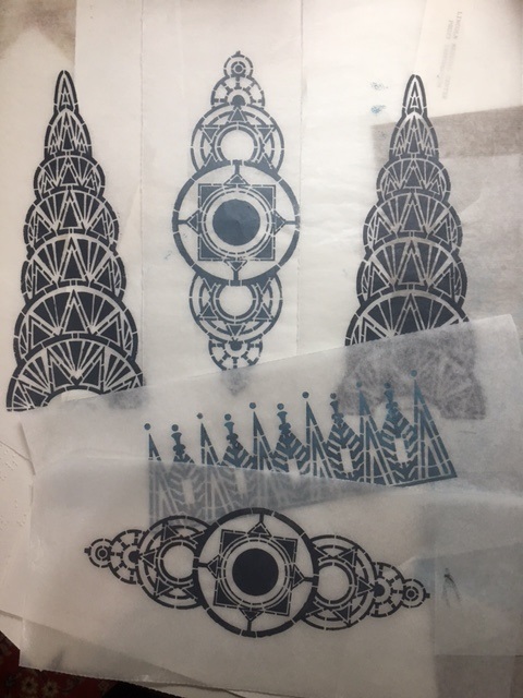
Gwen Lafleur’s Stencil Girl Art Deco stencil series, I just had to have the one with a triangular design that reminded me of the Chrysler building. I am inspired each time I see that art deco structure, and often pass through the lobby of the building on my way to take the subway to and from work.
 |
| First, I gathered my stencil, paints and other supplies. |
I tested the deco stencils on several kinds of paper, with several colors, and tried it out on my gelli plate as well. I selected the most perfect print—which was done on lightweight deli paper with a steel-gray paint—and decided it would be the centerpiece of my journal page.
 |
| Prints of the deco stencils done with acrylic paint on deli paper. |
As I made the page, I was thinking about Sinatra’s song
New York, New York—which has become the unofficial anthem of New York—and all the thousands of people who come to the city seeking fame, fortune, love and happiness.
Following Kelly’s formula, I rummaged through my scrap box and piles of hand-painted and commercial papers and pulled out whatever caught my eye at that moment. I also pulled out some papers that
Gwen carries on her website. They were a miss-mosh of colors and styles from several different countries, but that seemed right. I also chose a strip paper from a Chinese newspaper, which added to the multicultural theme. I was aiming for a page about New York, with the many cultures and nationalities living and working side by side, so the unrelated designs made sense to me.
 |
| Blank journal pages, with assorted favorite papers and ephemera. |
 |
| Final selection of papers, fabric and images for the journal collage. |
I worked instinctively, tearing them to the size that, in that very moment, seemed right, and used both a glue stick and gel medium to adhere them to the page of my journal. Kelly’s method is to work quickly, without overthinking, choose 4-5 background papers, tear then to the size you want, and glue them down quickly. Then, add your focal point. Next, add a stamp or stencil somewhere on the page. Last, add some words or some handwritten marks.
For this page, the focal point was the deco stencil print. I carefully trimmed away the excess deli paper around the image, and later, used a glue stick to hold it in place.
 |
| Deco image, printed on deli paper, suggesting the top of New York City's famous Chrysler Building. |
Here is a step by step view of my base page creation process:
 |
Liquitex matte medium was spread on the blank page with an old credit card, and first layer
(hand printed in white on blue painted deli paper with a Nathalie Kalbach art foamie set) was added. |
 |
| More base layers from Gwen's paper collection were added instinctively. |
 |
Yet more layers of fabric and papers were added. Using two of my own fabrics (the green batik and dotted leaf)
seemed especially appropriate because I came to New York to fulfill my dream of becoming a textile designer. |
 |
| The final base layer is finished, with the cutout deco stencil and butterfly positioned, but not glued. |
I was almost done, but felt it needed something soft to balance the deco building image, so, for an accent, I chose a butterfly from Gwen’s
Beautiful Butterflies downloadable pdf. I gently tore the butterfly around the edges, and added Distress Stain and a little sepia ink to age it a bit.
 |
| A butterfly was torn from the Beautiful Butterflies sheet. |
 |
| The edges of the butterfly were aged with distress stain and a sepia ink pad. |
The butterfly represents the hope that so many people have—hope that
they will find success and happiness and maybe even love by coming to
New York. Aging the butterfly kept it from looking too stark, and also
reflects the fact that New York can be a sooty, dirty, noisy place but
that doesn’t stop the butterfly or the hopeful people.
When the page was nearly done, I took an old favorite lacy stamp, and, with white printmaking paint, added some soft touches on the right side to represent clouds.
Last, I added a stamped (on deli paper) Dina Wakely quote:
“Give the
historians something to write about.” It seemed the perfect quote for a
journal page about hopes and dreams. The
page is a bit autobiographical; 39 years ago I was a bit of a
starry eyed young woman, coming to New York to study textile design and
hopefully find a fulfilling career. Almost four decades later, I am
still inspired by New York, the Chrysler Building and other
architectural wonders, and the energy of the millions of people who live
and work here.
 |
Close up of Deco Dreams journal page.
|
And here's some news...
Gwen is going to be having a birthday / Halloween
sale the 30th-31st on everything,
including original artwork and jewelry! So mark your calendars and save the date. There will be a coupon code that
has to be used in checkout. Click HERE to go to Gwen's website to see all her awesome merchandise and creations.
For more information about classes sponsored by Ink Pad NYC, click
here.
To find out about Kelly Kilmer's technique, click
here.
To see Nathalie Kalbach's art foamies, click
here.