Showing posts with label radiant rust. Show all posts

Friday, April 27, 2018

Vintage Photos With Grunge and Bling

I have always loved vintage photos. After taking a course called "Radiant Rust" with Seth Apter at Ink Pad NYC a few months ago, I got addicted to the grunge effect, and love combining it with vintage photos to enhance the aged look of my art pieces. These two pieces use similar techniques and materials, and both honor my own parents, and turn old faded photos into keepsake artwork. 

On the left is the piece I call "Football Hero Circa 1936," and on the right is "1942 Wedding." Both pieces developed as I went along, rather than being carefully thought out and sketched in advance. 


During the Radiant Rust workshop, I had created a center piece that I didn't like at all. (Click here for my blogpost about the workshop.) Rather than trash the imperfect artwork and fine watercolor paper, I decided to paint over it and keep experimenting.
This was the painted, stamped center piece that I didn't like and decided to paint over.
After painting over the original artwork with Seth's chalk paints, I added some of my favorite stamps--a dragonfly and a Julie Balzer geometric--with radiant rust and patina oxide Baked Texture.
The dragonflies and geometric stamps didn't work with the painted background.
I didn't love it, so I added more texture with a woodblock stamp from Gwen Lafluer. It was better, but still needed something more.
A little rust baked texture powder was added to the background.
One of Gwen's carved wooden stamps was added around the edges with rust baked texture.
I thought a steampunk image look might be cool with the rusty grunge effect, so I set to work with a few steampunk stencils. This time, I used an olive green embossing powder that I had on hand.

The olive embossing powder didn't work with the background, so it was covered with chalk paints.
It was pretty much a disaster. The olive was hideous, so I  painted over sections with the chalk paint and cheesecloth, and eventually ended up with a rusty, grungy background that I liked.

Eventually the color and texture looked just right.
The football hero photo was "auditioned" on another grungy background, which was later used in the "1942 Wedding" piece.
I was working on a few backgrounds at the same time. I auditioned a photo reprint of my father in his football uniform on one of the other backgrounds; I liked the effect. He was born in 1918 and the photo was taken in high school, so it is probably from 1936. He had been the quarterback for his team--what a difference from today's uniforms!

My father loved to read, so I found some old dictionary pages and tore them to give a frame effect. To go with the grungy idea, I decided to use distress stain to age the paper.

A frame effect was created around the photo with torn vintage dictionary pages.
The distressed paper frame looked good, but the piece still needed more.
A little more distress ink was added to the paper, as well as some extra rust baked texture.
The final touch was trying some baked texture Beeswax over the photo and dictionary paper.


 I was really happy with the final piece. The beeswax baked texture united the background and foreground, and added to the aged effect.


For the 1942 Wedding piece, I used one of the grunge backgrounds that I had considered for the Football Hero. The wedding photo contrasted nicely with the grungy background, but I knew it needed more. I auditioned a lot of elements until I found just the right combination.

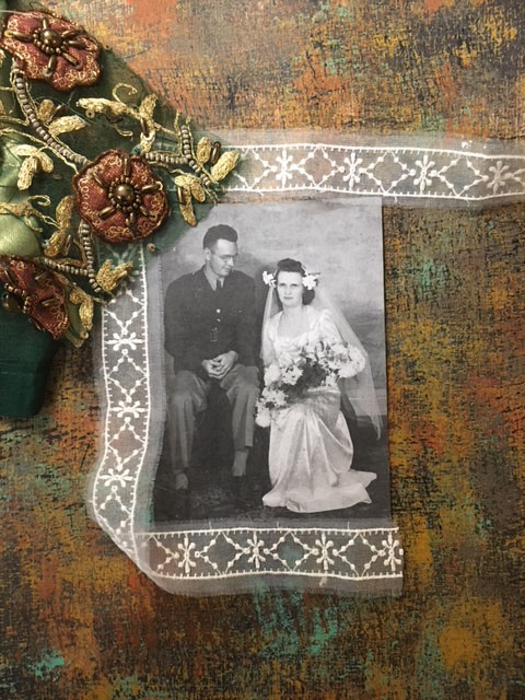
A piece of sari scrap was just the right color for the background.
Sheer lace added contrast with the earth-toned background and sari scrap.

I liked the idea of lace with some of Gwen's Sari Scraps from the online shop. The colors were great with the grungy background and they added a nice contrast. I set about carefully cutting some coffee-colored silk and beaded medallions. 

I also decided that rather than pasting the photo on top of the background, I would cut out a center section and use the grungy background as a frame. Not only did this add depth, I also ended up with a nice little piece of the grungy background for later use in another project.

On the back of the background, I carefully measured and marked before cutting the frame.


The photo was mounted on some heavy, smooth paper before placing the frame over it.


I used some ink and a dabber tool around the edge of the cut-out center to give a more finished, professional look.

A small piece of the background was cut out, and the photo inserted.
The hard part was deciding on exactly how many medallions to use, where to place them, how much and what kind of lace to use, and how to arrange it all so it didn't look too busy or too stagnant.

Audition 1
Audition 2
Audition 3
Audition 4
Audition 5
Audition 6
Audition 7
Audition  8
Audition 9
Audition 10
I finally decided on an arrangement, and set about adhering the elements. I used a gluestick for the lace, and heavy gel medium for the Sari Silk scrap medallions. The gluestick went on purple, which is great because it shows where the glue is and is not, but it dries clear.


Just before the glue had dried, I decided I didn't love Audition 10, so I added some triangular shapes of lace at the top and bottom, which kept the design from being too square and boring.
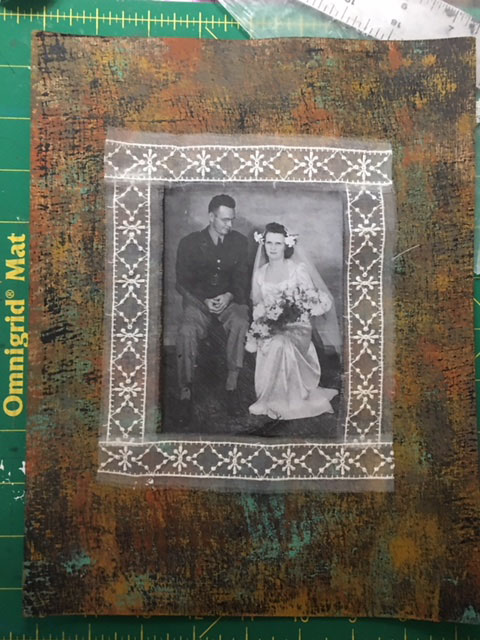
The final "1942 Wedding" artwork.
The football hero of 1936 became a groom in 1942, and later a WWII hero, receiving a Purple Heart medal.
I just may get orders for a bunch of these from my extended family--my brothers, sisters, nieces and nephews all love the family history and vintage photos.  But, even if I do make a few more, each one will be unique, depending on which colors of paint, embossing powder, lace, trim or sari scraps that I decide to use.

Friday, February 23, 2018

Raidiant Rust Workshop


When I saw that Ink Pad NYC was offering a class called "Radiant Rust" with the super talented Seth Apter, I jumped at the chance to sign up. I love his work--the way he creates art that has a grungy look, but artfully so. And he had just debuted a line of new embossing powders--Baked Texture, produced by Emerald Creek--so I couldn't wait to learn from the master himself. The class was held in the small West Village shop, so it was cozy and intimate.

We all followed Seth's directions for layering on the paints (we used Seth's line of Fresco Finish chalk paint, which dries faster than regular acrylic) and distressing them to get the signature grunge look. But...we also added sprays of gold and a stamped, embossed texture with both the Patina Oxide and Chunky Rust, which added extra depth and texture to the grungy background.

Seth's Chalk Paints were used to create our Radiant Rust pieces.
A background of midnight chalk paint was covered with strokes of terracotta and smoked paprika.
Layers and layers of paint were added, in different colors, to achieve the grungy look.
On the left, textured paper was used to apply the paint; on the right is the finished background.
Step two was creating a stamped center piece to go on top of the rusted background. We started with a piece of watercolor paper, and painted it with Green Patina chalk paint, then added texture with Terracotta. I liked the painted aqua piece, which would then get stamped with one of Seth's designs, and placed on top of the larger, darker rusted background.

Top: painted green patina/terracotta piece. Bottom: textured paper that was used to apply the colors.
 The sample that Seth showed us looked fabulous. We all aimed to have a finished product that would look as good. Mine, however, did not. I went a little overboard with the stamping and basically made a mess.
Finished Radiant Rust piece by Seth Apter.
I added a few of Seth's stamps, but wasn't happy with the color choices.
I added more and more stamps in the hope that it would look better.
I wasn't happy with the designs I stamped, or the colors I chose, so I didn't finish my piece, but brought it home and worked on it the next day. I used  Gwen's Art Deco Sun Medallion stencil with with acrylic paint on some aqua painted deli paper and liked the effect. While it was wet, I sprinkled Patina Oxide powder on it, then blasted it with my heat gun. Later, I added more of the chalk paints over it and around the edges to create a distressed look and a rusted edge.

The deco stencil with Patina Oxide.
Various chalk paints were added to achieve a distressed, rusty look.
Below is the finished deco center section, with a black paper border, placed on top of the rusted background. It looked good so far, but kind of empty, and I knew it needed more.
I auditioned several items to possibly go in the center of the green deco design. While at the Ink Pad workshop, I purchased some Lynne Perrella stamps, so I printed two of them to see how they worked. I decided on a small face, printed it in black on deli paper, and once dry, also distressed it to create a rusty, aged look.

One of the arrangements I considered for the center included the word "seek."
She seemed to need a crown, so I chose one of the Dresden Trim Bourbon Crowns from Gwen's website. It was way too shiny to go with the rest of the elements, so I used a little of the chalk paint to distress it.

The piece seemed to need more, but I wasn't sure what, so I send a few "process photos" to my Artist Tribe sister Jackie Neal for her input. She suggested adding something organic. Since I live in midtown Manhattan, organic matter is in short supply, so Jackie, who lives upstate and has lots of woods and lakes near her, mailed me off a "care package." I received dried flowers from her garden, feathers, rocks, ferns, sticks, bark, dried berries and tree fungus.

Tree bark and fungus were auditioned for the center of the piece.
A feather might have worked, but this one was too large and too dark.
The final choice was a rusted crown, fungus and dried berries.
I settled on using the dried tree fungus and dried berries, and was really happy with the way they looked together. The tricky part was getting them to stay on the artwork. A strong glue worked for the fungus, but the berries and branch were too delicate and didn't sit flat, so I carefully poked a few strategic holes with my awl and stitched them to the piece.

A closeup of the organic matter in the piece. A few of the stitches are visible around the berries.
I love the combination of the faux rust with the forest elements...it might just be my favorite piece ever!

In February, many of the Gwen Lafluer Artist Tribe members are showcasing creations that honor Chinese New Year. You can check out their work here, and also save 15% on any of the items in the Exotic Orient section of the website with the coupon below.


For information on Ink Pad NYC, click here.
For Seth Apter's website, click here.
For Lynne Perrella's stamps, click here.