Saturday, January 17, 2015

Paper Doll From Stencil Scraps


When I need to do a little art, something that always restores my sanity and puts me in a happy place is making paper dolls—I immediately go back to a safe, happy childhood place. As a personal challenge, I decided to see what I could do using ONLY what was already in my art bins and scrap boxes.

First, I found a paper doll template that I had already printed out. (There are many free sources online; Retro Café Arts has a variety of doll templates that you can purchase.) The graphics fairy blog has free, downloadable vintage images—I love their shoes, hats, faces and clothing, and often use them in my doll-making.

I looked through my reject projects, imperfect printmaking work, and bits left over from other projects to see what inspired me. For this doll, I started with some of my own paper, which I had designed in Photoshop and printed from a color laser. I applied white printmaking paint onto my paper through various stencils, such as compass rose, steampunk and harlequin.

Using the doll parts template, I cut the body pieces out of the scraps of stenciled paper, and connected them with mini-brads. For the legs, as well as the belt and the ribbon on the hat, I used a bit of paper that had accidentally been sprayed with lime and turquoise Dylusion ink. (The hat is a Graphics Fairy image.)

I cut the skirt from a circle of the compass rose stencil, and the fleur de lis on the hat is from the same stencil.

The doll’s face is a Dina Wakely stamp, applied with black archival ink stamp pad. It was a “reject” because the ink printed a little sketchy, but I used a black pen to touch up the imperfect sections. A touch of blue was added to the hair using a Derwent block and a koi brush, and a tiny bit of skin-toned peach chalk in was applied to the face.


Sunday, January 11, 2015

Desert Dreams


If you are a mixed media artist and haven’t heard of Mary Jane Chadbourne or her Desert Dream Studios, you have been missing some inspirational work. She is a master of whimsy, color and design, and her work keeps getting better and better.

I have been trying to put my finger on what it is that draws me to her work because there are so many elements and factors that make it so special. Maybe the most important element is color, so I analyzed some pieces of Mary Jane’s and decided that, among many other factors, it was the use of earthy golden ochres with turquoise that speaks to my heart.


I started this journal page in Photoshop, and layered vintage handwriting, old newsprint, and several shades of yellow, brown and orange. Next, I started using the eraser tool (in varying percentages) so that it would “age” and have layers peeking through layers. I varied the brush size and shape, and experimented with bringing different layers to the front or back to get the effect I wanted. Next, I added a heart shape in a pretty shade of turquoise.

I printed the design out on ordinary copy paper from a color laser printer and glued it to my journal page with matte medium. Then I tried to figure out what to do next, especially since I needed to cover up the marks that were already on the page, made from testing new stencils. But first I wanted to highlight the heart, so I used a Balzer Deco Doily stencil with viva décor inka gold—a creamy paint that goes through a stencil beautifully with no bleeding or smearing. I also used the edge of the doily at the top and bottom to fill in the blank space. Next, I used the inka gold through a section of the Cathedral Series Amiens stencil, placed in the center of the heart.

The page needed more turquoise, so I applied a soft chalk pale turquoise ink through a Balzer Flower Piecing stencil at the edges. Pretty, but still…something was missing. I decided that it needed whimsy and magic, so I added a blue Graphics Fairy vintage butterfly to match the heart, but decided to cut it in half and apply to the edges of the heart with matte medium. A few pieces of washi tape with French words, measurements and mini butterflies, and my homage to Mary Jane was done.


1960s Tie Dye Power


While experimenting with watercolors, Derwent blocks and Dylusion spray inks one afternoon, I used some white paper towels underneath my artwork to soak up excess color. When I saw the color stained paper towels afterward, I immediately thought they looked like 1960s tie-dye.
So, once it dried, I flattened out the “trash” and, using matte medium, glued it to a blank white page in my journal. I wasn’t quite sure where to go from there, so it sat in my journal, just looking pretty for a week or so.
 

While I was rummaging through my art supplies (looking for something else entirely), I spotted the Jane Davenport "coy" stencil and thought I’d give it a try on the tie-dye background. I used a black Sharpie marker since I thought I might add more color later, and I didn’t want the outline to run or smear.

The black face outline looked pretty good, but the head was just floating, which was kind of disconcerting, so I sketched in hair, ears and a neck with a pencil, then outlined it with the black marker. I gave her big hair—subconsciously thinking about the flower children and the 1960s big afro hairstyles popular at the time.

Flower power and tie-dye got me thinking about protests and social movements, and using the voting process to affect change. With that in mind, I added newsprint to the neck, cheekbone and hair. To me, newsprint represents information and knowledge.


To get the newsprint to fit just right on her neck, I traced the neck shape with tissue paper, and then cut both the tissue and newsprint at the same time to get a good fit. The newsprint section was randomly chosen, mostly for its spacing—the message in it was not intended to make any particular point. I adhered the newsprint to the neck with matte medium. I also added a few strips of newsprint to indicate a cheekbone and streaks in her hair.


The final touches were a tiny hint of soft pink chalk ink color on the lips, and the addition of some inspirational words in the hair and on the neck, which were printed on Avery peel and stick clear mailing labels.

The stencil is the one I used on my November 7, 2014 for my Artistcellar post called Lemonhead Art. Isn't it amazing how the same stencil has such a completely different effect when used with different materials and colors?

Harlequin Beach Journal Page


The minute it gets cold in New York, the newspaper is full of ads for tropical getaway vacations, clothes to wear on your tropical holiday, and food and drinks to enjoy while you relax on the beach. The aquamarine sea and sandy beach called to me from the magazine pages. The islands are not in my budget this year, but I had a little moment of relaxation while I collaged the images.

I started with a gorgeous turquoise beach, added vintage newsprint and a pretty bracelet using matte medium. Next, an interesting bottle top—maybe some rum to sip in the sunshine. My focal image was a pink rose-like photo—I think it was really some cleverly carved beets. After applying the first three parts with matte medium, I put the pink “roses” on at a slight angle.
 
 The page called out for stencils, so I used my new “go-to” favorite, the harlequin. I applied sections of it in three places using white printmaking paint on a makeup sponge.
 
The page looked a little empty at the top left, so I used another favorite “go-to” stencil—the Jill K. Berry Sunny compass rose, and applied a dusty aqua chalk ink through the stencil. I put a little star in the center of the first stencil.

It needed words, so I handwrote my feeling, starting in the center with: “I want to go to a tropical beach, sip fancy drinks, all my troubles melting away…” and ended with “…and stop to smell those roses.”


Saturday, January 3, 2015

More Quirky ATC Dolls


In the quest to use up more of my scraps before buying any more art supplies (who am I kidding? I went to the Ink Pad last weekend and got some new supplies...but only things that I use all the time and had run out of...and maybe a new product or two...) I have been making art from my boxes of paper scraps. I have a giant box under my worktable and a couple more in my art supply cubbies, so the scraps of scraps are either being used up or thrown away.

I used to be addicted to making arty paper dolls. I used a lot of vintage paper doll parts, combined with a basic template. Now that I have discovered a new twist--the ATC paper doll, I am having more fun than ever.

This quirky paper doll uses a leftover ATC made with with Artistcellar stencils that was a little bit imperfect, newsprint arms, legs from a free vintage Graphics Fairy paper doll, Graphics Fairy wings and hat, and an original face. The face was doodled during a phone conversation a few years ago...she is kind of my alter ego, who I call "Esme". She is the opposite of the inner-critic...more of an inner cheerleader, and her face shows up in various pieces of artwork.


The second doll has a face that started with a Dina Wakely stamp, purchased at the Ink Pad. I added Derwent watercolor blocks for color. the arms and legs are vintage advertising and newsprint, and the boots are a free downloadable image from Dover Books. The ATC body is a semi-reject ATC from a music themed trade, which used lyrics from one of my old favorite songs, Woodstock, made famous by Crosby Stills Nash and Young, and written by Joni Mitchell.

The really cool thing is that the ATC dolls fold up into a little 2.5" x 3.5" package, which makes them easy to store and mail to friends of all ages.

Sunday, December 28, 2014

ATC Dolls


When the Paper Traders Yahoo group posted a notice about trading ATC dolls, I was intrigued. For years I have been making and trading arty paper dolls, but making them with a rectangular ATC body instead of a human shaped or clothing shaped body was a new twist.

It seemed like a good way to use up leftover ATCs also...for almost every ATC project, I have extras--the ones that I love too much to give away, the ones that were imperfect and not good enough to trade, the false starts where a good idea didn't really quite work out, and the over-runs of extra 2.5x3.5 rectangles that just didn't get used up. The center one is has stencils from Artistcellar.com, and was a leftover piece from a recent Artistcellar ATC trade.

I added faces that began with Dina Wakely stamps, washi tape, Graphics Fairy shoes, hats and butterfly wings, and whatever else I found rummaging around in my paper scrap boxes. The pieces are attached with mini brads.

The charming part about these dolls is that they each fold up to exactly 2.5" x 3.5", perfect for fitting into an ATC plastic sleeve or tucking in one of those baseball trading card book sleeves.

These ATC dolls might just be my new favorite thing to trade!

Sunday, December 14, 2014

Mini Journals from Cereal Boxes

Yesterday, my daughter Amanda and I had a "mom and me" art afternoon. Amanda is a writer, and needs journals for her story ideas and "morning pages." She had told me a while back about making journals out of cardboard cereal boxes, so I had been saving them. I googled a few blog posts and got the general idea about how to make them.

We started with a basic cereal box, and cut the largest panel. That was folded in half, and made the cover. Amanda's journal (on the left) has vintage images from some "imperfect" old magazines that Susan Morgan Hoth gifted me with. She created a collage of vintage images on the inside and outside, and added washi tape at the edges and across the middle for a decorative effect.


Mine has vintage Graphics Fairy images that I combined in a Photoshop collage. I also added washi tape at the edges. Unlike Amanda's collage, mine was one sheet of 8.5x11 paper that I covered the box with.

We folded paper and cut it to size, poked holes with an awl, and hand stitched it to the spine of the book with waxed linen thread. I used cardstock since I plan to use mine as an art journal; Amanda used white computer printer paper for hers since she will be writing in it, and wanted more pages and less weight per page.

The journal, when finished, is about 8.5" high x 5.5" wide, but the size depends on the size of the box. The bigger the box, the bigger the journal. It is a little flimsy--the cardboard is not very thick or strong, so if you want a firmer book you can double the cardboard.

If you are adventurous, instead of folding the cardboard in half to make the book, you can score two lines in the cardboard  near the middle (cut a little with an exacto knife but don't go completely through) so that a spine is created. That will allow more pages to be inserted, giving you a fatter book.


Amanda did not add a closure, but I puttered with a couple ideas. I tried--unsuccessfully--a button closure and a wrapped silk cord--and finally settled on punching two holes, adding grommets, and looping elastic through it so the journal could be quickly and easily opened and closed. I wished I had some colorful elastic--the white is a little harsh, so I may try painting or dying the elastic to match.

These journals were quick and easy to make, so guess what I will be making more of  today?

Thursday, November 20, 2014

ATC Blues for Paper Traders


I joined a new Yahoo trade group recently, called Paper Traders. It's always a little scary entering new territory, with new people and new rhythms, but I really missed trading ATCs, and some of my old groups fizzled.

I have really made a shift in my artwork in recent years--I started out as an art quilter in 2006 when I bumbled onto a Quilting Arts Magazine in a bookstore. Since I had always loved sewing, art, and was for many years a fabric designer, I was hooked. I made a lot of art quilts, journal quilts, quilted postcards, quilted ATCs and various fiber projects. However, after living with neck and shoulder damage for overdoing my fiber work (from cutting through thick layers of cloth and batting with a dull rotary cutter, and painting directly on fabric using too much arm & shoulder pressure) I gradually switched to paper.

For me, paper is actually a lot easier to handle, it doesn't shift like fabric, usually doesn't bleed or fray, and you can still stitch through it if you want.

This trade required, in addition to the predominant use of the color blue, three layers. I was a little baffled because I never really consciously thought about how many layers I was or wasn't using. When the creative bug strikes, I go with the flow and what happens, happens. So, I had to really think about layers.


These pieces (I made 6...3 to trade and 3 to keep) started with a good quality heavy Japanese watercolor paper. I applied molding paste through a swirly Retro Café Art stencil, and when dry, painted the whole thing with shimmery Lumiere acrylic paint. I used a turquoise, then wiped on some indigo Lumiere. After the paint dried, I cut 6 atcs. I added layers of paper strips: vintage magazine text, French antique handwriting, and Chinese newsprint.

Embellishment was added in layers: first a brass Chinese "coin", attached with a brad. Next I added gold dots with dimensional paint. Each card got a tiny inspirational word, which was printed on clear Avery mailing labels. Last, I wanted more texture, so I punched a hole and added a blue grommet.

Monday, November 17, 2014

Artistcellar ATC Swap


I wasn't sure how many ATCs to sign up for to participate in the upcoming Artistcellar ATC swap, which is being done via Facebook. I love doing ATCs, but the choice was either 5 or 10, so I played it safe and chose 5. Well, I got into an ATC-making frenzy last weekend, and came up with about 30. Not that they were all fabulous...there were some ho-hum ones that didn't make the cut. But I managed to whittle the contenders down 6...I will keep one and mail off the other five. It will be interesting to see what I get in return.

I used the Artistcellar inspirational word pocket stencils...and had a "DUH" moment when I realized they were exactly the size of an ATC. Well, that sure made it easy to work with them! They also conveniently made a good template--not only were they good to trace around for a shape outline, but they are transparent, so I could lay them on top of a larger piece of artwork and see what section would look good cut down to an ATC.

I also used the Jill K. Berry compass rose and steampunk stencils, and layered the stencils on top of each other (after each section was dry, of course)

Thank you to my friend Sonja Hageman, who contributed some of the background paper and fabric. Sonja is a quiltmaker/teacher and fabulous artist who lives in Hawaii. She uses fabric and coffee filters to absorb spills when she is handpainting onto fabric, and then uses the "trash" to wrap ATCs and other small art exchanges in when she mails them out. Sonja's trash is definitely my treasure.

Saturday, November 8, 2014

Lemonhead


An old friend and wonderful artist, Susan Morgan Hoth, not only paints gorgeous, one-of-a-kind silk scarves, she also collects and sells vintage jewelry, ephemera and memorabilia in her LaVogue Esty shop. When she looked at my artwork created by collaging vintage images that I had been posting to my blog and facebook page, she offered to mail me some imperfect vintage magazine ads that were slightly damaged. Naturally I jumped at the chance.


Part of me wanted to scan them and use printouts to create new art. The other part of me said "she is going to throw them out anyway, so just dig in and use the originals." I started with an ad for lemons and timidly put some sections of Cecilia Swatton Kalidescope Stencils in the background using soft colored, brush tipped markers.


It looked kind of cool, but didn't make a statement, so I decided to try and emphasize the retro-housewife theme with a Jane Davenport face stencil. That looked interesting, but didn't make much sense, so I added lines for the neck, some color, and a Jill K. Berry compas rose star stencil on the cheek, and a steampunk stencil on the top of the head to suggest a hat, then on the neck to suggest a necklace or blouse. I used a big white brush marker on the face to add interest.


The piece seemed almost done, but I wanted the whites to pop more, so I used white gouache and re-painted the whole face. Gouache (prononuced g'wash) which is basically a high quality tempra, was the paint of choice when I was studying textile design, so it is often my "go-to" paint.


After the addition of the white gouache, I liked it. It didn't really say "retro housewife serving delicious homemade food made from lemons" as I had intended. The plate goes through the nose and ended up looking like a giant piercing, and the fork goes through her eye, which is kind of scary. The face ended up being more 2014 than 1940, but that's the way art is—you never know quite what will happen but the journey and process is always fun.

Thursday, October 30, 2014

Fashionista Day of the Dead

Day of the Dead is fascinating to me. The custom of leaving sweets for the dead, usually sugar skulls, combined with Mexican folk art, flowers and kind of creepy skeletal Halloween images is so unique and compelling.

This year, I made just one piece of art, which I traded with my friend Karen. I was tempted to keep it, but I let go of my inner hoarder and mailed it off, telling myself I can always make another.

I used a fashion figure from a perfume ad in a glossy magazine, added flowers from the Graphics Fairy and some bone pieces, and of course, a sugar skull. I collaged them all onto some paper I had created in Photoshop using my own printed teabags. The finishing touch was to add some brown chalk ink at the edges for an aged look.

Sunday, October 26, 2014

Return of the Pink Pup


I was stressed and tired the other night after work, so I thought painting in my journal might be just what I needed to do to relax and unwind. There’s nothing quite like randomly applying pretty paint colors to clear the mind.
I started by making scribbly marks in pinks and harmonious colors with Derwent blocks on a blank white page. I added water with a Koi brush and smushed it all around, and added more color here and there until the page was filled and it said “pretty” to me.
A few days later, I got a bunch of new stencils, so I decided to test them by applying molding paste through them onto the painted pink journal page. First, I used the harlequin stencil on the bottom two-thirds. When that was dry, I applied more molding paste through a Jill Berry compass rose stencil on the top of the page.
The look was soft and pretty, and I could have quit there, but the page seemed to want to be a background for something—a photo, some poetry, or maybe inspirational words. After auditioning a few items, I settled on a printout from a Photoshop® ATC collage I made a few seasons ago, and using matte medium, adhered it to the page.
The mischievous Coco Wyatt, with a dashing bowler hat, is at a table sipping tea. His face is pink not from the tea, but because of some artwork he “helped” with back in 2008 when he was just a young lad. If you follow my blog, you may know the story. If not, here is a link to why Coco is all pink!
 

Saturday, October 18, 2014

Tree of Life Triptych


A friend of mine has a cool tool that she uses to emboss paper. I love the effect, but wanted to see if I could achieve the effect without buying yet another fancy tool. I used a Tree of Life stencil that I had on hand and applied molding paste through the stencil onto a heavy watercolor paper.
Once dry, I painted it with shimmery acrylic in indigo and turquoise. The embossing effect worked, but I didn’t quite know what to do with the experiment, so it sat on my shelf for a few months.

When I got my pots of old gold and green viva décor inka gold, I rubbed it on the unfinished tree of life to see what happened. I liked the effect, but still didn’t know what else to do. So, I cut three of them to a uniform size and machine stitched them together into a triptych. The pieces were joined with a strip of wool felt.
I carefully applied molding paste through three of the Artistcellar pocket stencil inspirational words, and then when dry, enhanced the words with a white signo pen. The effect reminded me of old, tooled leather, and I added some “studs” made of brass-colored brads from the five and ten to give it an Old West look.
 

Saturday, October 11, 2014

Frida Kahlo Santos Style Day of the Dead Paper Dolls


With Halloween and Day of the Dead around the corner, what could be more fun than a Frida Kahlo paper doll, especially with a Santos doll base?

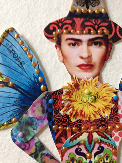
For this fun project, I collected a bunch of vintage Halloween images and searched online for Day of the Dead images. I used a paper doll template (If you do an online search of paper dolls, there are hundreds of resouces.) I adapted a free vintage paper doll bodice, making it thicker in the waist, and using matte medium, covered it with Halloween paper. I cut the arms in half so they could be posed, and made one arm flowered to simulate tattoos.The pieces are joined with mini brads.


For the Santos skirt/bottom, I designed my own using a vintage dress form photo as my inspiration. I drew it on some printed teabags that had been stamped a little, and adhered with matte medium to heavy watercolor paper, then carefully cut it out with an exacto knife.


After some puttering with the elements I wanted to use, and rummaging through my many boxes of papers and pieces, I had the skirt/base, bodice and head ready to assemble.


Here is the almost finished Frida. She looked a little unadorned, especially on the bottom, so I added a bunch of crazy elements: a couple of sugar skulls, a vintage cat, butterflies from washi tape, a chrysanthemum, a matching witch hat and wings. I added dabs of dimensional gold paint to give it some extra pizzaz.


Santos Frida needed words, so on the base, I added some inspirational words that were printed on silk, and trimmed the to fit. Using a black ink pad, I stamped some more inspirational words on the wings.

If you want to get in touch with your inner-child, or want to have some art fun with your very own child or grandchild,  please take a look at the paper dolls on my blog. I have many, many that will surely amuse, and maybe inspire you to play with dolls again.

Saturday, October 4, 2014

Tea With Helen

I had my "debut" as a member of the Artistcellar design team yesterday.
For my first Artistcellar blog post, I started with a favorite technique—printing on recycled teabags—and used a vintage photo of my mother, Helen, circa 1934. I printed the photo from an inkjet printer onto printable silk fabric, trimmed it to size, and removed the paper backing.
For the base, I started with used teabags. After drying them, I emptied out the old tea, carefully opened them, flattened them out, and printed on them using white printmaking paint applied to an assortment of hand-carved and commercial stamps.


Once the printed teabags were dry, I randomly collaged them onto cardstock using gel (matte) medium, which adheres like glue, but dries flat, and you can stitch through it with ease.
When I laid the translucent silk photo on the teabag print base, too much of the background showed through, so I applied viva décor inka gold old gold to the central area, which made the silk photo easier to see. I added a little matte medium to hold the photo in place, and edged it with a favorite sheer lace, also adhered with matte medium.
For strength, I added a felt backing, then clamped the artwork to the felt and carefully stitched the edges with a machine blanket stitch. To give the piece even more of a vintage effect, I sponged on extra viva décor inka gold old gold to the edges and corners.

The piece especially touches my heart because, growing up, the kitchen was the central gathering place in our house, and mom always had a pot of tea to share with friends and family around our kitchen table. The dress she wore in the photo was made of a rich indigo velvet and I remember feeling ever so beautiful in it when I played dress-up.

Sunday, September 28, 2014

Romantic Journal Collage Page

I have been working feverishly this weekend to get ready for my debut as the Friday Blogger on the Artistcellar website. I can't show any sneak peaks of that, but I hope you will go to http://www.artistcellar.com/ and read my blog, as well as all the other terrific artist who will be posting during the week.

As I was rummaging though my journal for inspiration, I saw this page. When I made it, about a month ago, I thought it was too "me" to post...too much what I always do, that I wasn't stretching myself.

Well, it IS very much in my comfort zone. I used a variety of soft colored papers and newsprint on the background and a giant floral--from the Graphics Fairy free online images--as the focal point. I used a variety of stamps, some with black ink and others with white printmaking paint, as well as a floral stencil.

Even though the page is very busy, it is soft and soothing with the muted colors and rounded shapes, and the little kitty and Japanese stamp are a surprise, as is the vintage typewriter on top of the flower. It is kind of a visual scavenger hunt to find the almost hidden elements.

Saturday, September 20, 2014

Inspiration & Joy: Artistcellar, Quilters Take Manhattan & Amy Butler

A few days ago, I was asked to join the Artistcellar http://artistcellar.com/ design team. Naturally I jumped at the chance to test the Artistcellar products, use them and blog about my experience and process weekly. I will be the new Friday blogger.

The good news is that there are pretty much no rules, so I can do what ever inspires me--art quilts, dolls, wall hangings, triptychs, journal pages or anything else I can think of. I just have to take photos of the process and write about it...which is something I do anyway.

To celebrate my recent birthday, I treated myself to today's Quilters Take Manhattan event at FIT. It was full of beauty, inspiration and really nice people. I met Jamie Fingal, and will be taking a class with her tomorrow at City Quilter.  http://www.jamiefingaldesigns.com/ I also met Stephen Fraser, owner of Spoonflower,  http://www.spoonflower.com/welcome who was super nice. I have a line of fabric for sale there (under the name Edzellinni) so it was great to chat with him. I met Allie Aller, and got an autographed copy of her book Crazy Quilting. http://alliesinstitches.blogspot.com/

The featured speaker was Amy Butler. http://www.amybutlerdesign.com/mainmenu.php She designs a gorgeous fabric line and was such a heartfelt, poignant speaker. Her presentation made me step back and realize that with the many things going on in my personal and business life,  I had slid away from the mind-body-spirit connection a bit and needed to clear my mind of clutter and negative thoughts, especially any worries about my new design project with Artistcellar.

I made this journal page a few weeks ago. It reminded me of Amy Butler's designs a little, with the rose, paisley and light airy feeling. It also made me think of Artistcellar since I used several stencils on top of the collaged base.