
While experimenting with the September 2022 StencilClub Boho Vibes designs from StencilGirl® (a beautiful mash-up designed by Gwen Lafluer and MaryBeth Shaw), the words "first, love yourself" popped into my head. Words and song lyrics often come to me as I do artwork—I think making art is a lot like meditation. While I am creating something new, I'm both relaxed and inspired, operating on pure instinct, and I can really hear my inner voice.
 |
| The starting point: stencils, paints, brushes, sponges, water, and a BIG table! |
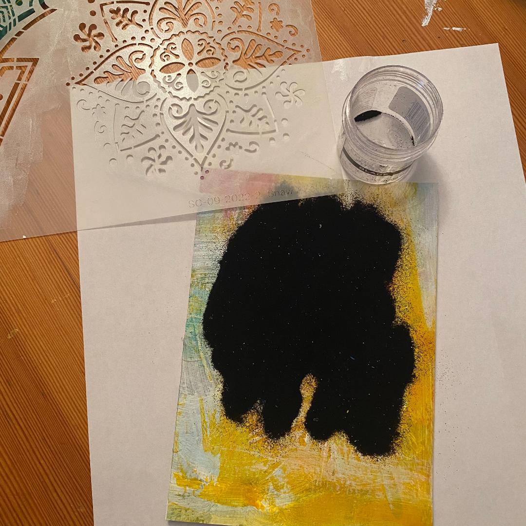 |
| I used a haphazardly painted piece of watercolor paper, the mandala stencil, and fine black embossing powder for what eventually became the left side of the gothic arch. |
After every paint session, I take a sheet of watercolor paper or an empty journal page and randomly cover the blank pages with leftover paint. It's a great way to use up paint, and gives a headstart on new backgrounds. I used part of one of those prepainted papers for the above background.
I started testing the stencils with a bunch of different colors, and settled on a blue/yellow/lavender palette. I thought I might make a greeting card with a coordinating envelope, but things just weren't gelling. The plaids I made with the ikat stencils looked masculine, and the deco/floral stencil didn't quite work with them yet.
 |
| The randomly painted paper looked good with just one ikat stencil done in black ink |
 |
| I couldn't resist adding some horizontal stenciling with Cobalt Archival ink, turning the stripe into a plaid. |
So, I put the first samples to the side and decided to work in my new lapbook the next day.
I began stenciling on a blank page spread, with shades of aqua and lavender, adding darker colors, then softening the contrast with white stencils over the top. I aimed to create a denim or indigo design, reminiscent of traditional ikat designs.


I also added some denim blue wavy lines with a posca pen. The pattern looked good, but I felt it needed more. So, using a cosmetic wedge with an cobalt archival ink stamp pad, I added the mandala-style stencil on top.

I wanted something that would harmonize with the blue shades, so I used another of the new stencil designs with black archival ink on 140 lb. white watercolor paper, then gave that an allover sheer aqua color using VersaMark embossing ink and salvaged patina Distress embossing glaze.
 |
| The salvaged patina glaze looked dark before heating, but dried a sheer pale aqua. |
 |
| The deco flower during the heat embossing. The shiny sections on the top left had melted, the dull sections elsewhere had not yet melted |
 |
| The deco floral shape seemed too monochromatic against the blue and lavender background. |
The background with the embossed deco flower looked pretty, but a little too safe. Even "auditioning" my favorite lace on the page didn't make it exciting.
While rifling through my storage cubbies looking for inspiration, a small piece of a gothic arch from Retro Cafe Art fell at my feet, and an idea came to me. I could use the arch shape and create a "tip-in" for my lapbook!
I took two of the pieces that I had thought were going to be made into cards—an ikat plaid of yellow, blue, lavender, and brown, plus a yellowish painted background with an embossed black mandala—and cut them to the gothic arch size.

To further unite the colors and jazz up the very blue deco stylized flower image, I cut a circle with yellowish painted paper that had been trimmed from one of the arches, and added it to the center of the blue flower. It was looking interesting.
To avoid wear and tear on the arches, I decided to put grommets in the edges, then stitched the arches into the plaid ikat background with a beautiful blue cord from Gwen's Boho Essentials Embellishment Kit.

I left the strings of the gothic arch long, and added beads and tassels hanging off the bottom. So far, so good!

But what about the backside of the arches? They needed to be finished. So, I used another plaid, one I had stenciled on a blue file folder. There was enough of the stenciled paper to cover both sides of the back of the arches.

Above is the stenciled file folder I used on the back of the arches, and below, a photo of them cut to size and glued in place.

It was looking pretty good, but more is more, right? For the first backside, I added some vintage photos, vintage-looking French correspondence strips, and a little stamped passport circle from Gwen's EGL-17 stamp set.

For the second backside, I used a vintage image tag from The Graphics Fairy, some washi-tape faux stamps, more of the vintage-looking French correspondence, and a New York City vintage postcard.

Here are the before and after photos for comparison:
 |
| Back of the left arch, before (left) and after (right) |
 |
| Back of the right arch, before (left) and after (right) |
 |
Here's the new "first love yourself" stenciled journal spread, along with some other pages in my lapbook. You can see a bit of the beaded Kuchi pendant that hangs on the outside spine, the paper doll on the large inside spine, and a black and white page done with pieces from Gwen's EGL-30, EGL-19, and EGL-27 stamp sets. The lapbook folds out horizontally, and is twice the width that you can see in the photo!
1 comment:
Beautiful little spread!! Great ideas!
Post a Comment