Showing posts with label Dina Wakley. Show all posts

Friday, October 27, 2017

Deco Dreams


One of the most therapeutic art things I do is create journal pages. Years ago I tried off and on to keep a journal. Mine never looked anything like the beautiful journals I saw in magazines and books. They were awkward and incomplete. I was intimidated by all the white pages staring back at me, and felt pressure to do a masterpiece…at least on the first page or two.

All that changed when I took a course offered by Ink Pad NYC with instructor Kelly Kilmer. Not only did I create my own handmade journal that day, I learned a step by step technique for journaling and created several good journal pages. Now I’m addicted to art journaling.

When I saw Gwen Lafleur’s Stencil Girl Art Deco stencil series, I just had to have the one with a triangular design that reminded me of the Chrysler building. I am inspired each time I see that art deco structure, and often pass through the lobby of the building on my way to take the subway to and from work. 
First, I gathered my stencil, paints and other supplies.
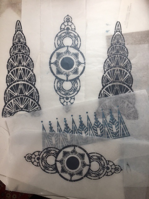
I tested the deco stencils on several kinds of paper, with several colors, and tried it out on my gelli plate as well. I selected the most perfect print—which was done on lightweight deli paper with a steel-gray paint—and decided it would be the centerpiece of my journal page.

Prints of the deco stencils done with acrylic paint on deli paper.
As I made the page, I was thinking about Sinatra’s song New York, New York—which has become the unofficial anthem of New York—and all the thousands of people who come to the city seeking fame, fortune, love and happiness.

Following Kelly’s formula, I rummaged through my scrap box and piles of hand-painted and commercial papers and pulled out whatever caught my eye at that moment. I also pulled out some papers that Gwen carries on her website. They were a miss-mosh of colors and styles from several different countries, but that seemed right. I also chose a strip paper from a Chinese newspaper, which added to the multicultural theme. I was aiming for a page about New York, with the many cultures and nationalities living and working side by side, so the unrelated designs made sense to me.

Blank journal pages, with assorted favorite papers and ephemera.
Final selection of papers, fabric and images for the journal collage.
I worked instinctively, tearing them to the size that, in that very moment, seemed right, and used both a glue stick and gel medium to adhere them to the page of my journal. Kelly’s method is to work quickly, without overthinking, choose 4-5 background papers, tear then to the size you want, and glue them down quickly. Then, add your focal point. Next, add a stamp or stencil somewhere on the page. Last, add some words or some handwritten marks.

For this page, the focal point was the deco stencil print. I carefully trimmed away the excess deli paper around the image, and later, used a glue stick to hold it in place.

Deco image, printed on deli paper, suggesting the top of New York City's famous Chrysler Building.
 Here is a step by step view of my base page creation process:

Liquitex matte medium was spread on the blank page with an old credit card, and first layer
(hand printed in white on blue painted deli paper with a Nathalie Kalbach art foamie set) was added.
More base layers from Gwen's paper collection were added instinctively.
Yet more layers of fabric and papers were added. Using two of my own fabrics (the green batik and dotted leaf)
seemed especially appropriate because I came to New York to fulfill my dream of becoming a textile designer.
The final base layer is finished, with the cutout deco stencil and butterfly positioned, but not glued.
 I was almost done, but felt it needed something soft to balance the deco building image, so, for an accent, I chose a butterfly from Gwen’s Beautiful Butterflies downloadable pdf. I gently tore the butterfly around the edges, and added Distress Stain and a little sepia ink to age it a bit.

A butterfly was torn from the Beautiful Butterflies sheet.
The edges of the butterfly were aged with distress stain and a sepia ink pad.
 The butterfly represents the hope that so many people have—hope that they will find success and happiness and maybe even love by coming to New York. Aging the butterfly kept it from looking too stark, and also reflects the fact that New York can be a sooty, dirty, noisy place but that doesn’t stop the butterfly or the hopeful people.

When the page was nearly done, I took an old favorite lacy stamp, and, with white printmaking paint, added some soft touches on the right side to represent clouds.

Last, I added a stamped (on deli paper) Dina Wakely quote: “Give the historians something to write about.” It seemed the perfect quote for a journal page about hopes and dreams. The page is a bit autobiographical; 39 years ago I was a bit of a starry eyed young woman, coming to New York to study textile design and hopefully find a fulfilling career. Almost four decades later, I am still inspired by New York, the Chrysler Building and other architectural wonders, and the energy of the millions of people who live and work here.

Close up of Deco Dreams journal page.
And here's some news...Gwen is going to be having a birthday / Halloween sale the 30th-31st on everything, including original artwork and jewelry! So mark your calendars and save the date. There will be a coupon code that has to be used in checkout. Click HERE to go to Gwen's website to see all her awesome merchandise and creations.


For more information about classes sponsored by Ink Pad NYC, click here.
To find out about Kelly Kilmer's technique, click here.
To see Nathalie Kalbach's art foamies, click here.


Saturday, January 14, 2017

Courage and Memories


 Life got in the way of blogging. Holidays got in the way of blogging. Work got in the way of blogging. Art and journaling got me through the holidays and life's curve balls. In August, our beloved fur baby Coco, aka Coconut Jenkins Wyatt, got sick. Had to be rushed to the Animal Medical Center hospital. He was treated (fluid drawn off sac around his heart) and they said to bring him back in three months for a checkup. In about a month we were back. More treatment, seemed okay. Then he had a seizure. Again rushed to AMC. Then he got sick again, this time the fluid was around his lungs. We couldn't touch his tummy, couldn't put a coat on him. Couldn't bathe him. Then he wasn't the same, got sicker every day. Wouldn't eat his favorite foods. The day after Christmas, we took him to AMC. He crossed the rainbow bridge. Somehow that week I managed to get to work and push my way through the loss. Concentrating on work was better than walking around the apartment crying. Every little thing was a trigger for crying and feeling the loss.

Journal memory written on December 30 after meeting a little girl on the 6 train
It was the Friday before New Year's Eve, a little after five, Coco had died just after midnight three days before. I was riding the 6 train home from work. A mother with a baby boy in a carriage (not a folding stroller, so they must have been from out of town) and a little girl about four got on the train and sat next to me. The girl was wiggly and jiggly and even with my headset on and iPhone music cranked up I could hear the mother asking her repeatedly (and patiently) to sit down, to turn around. After a few stops she was still wiggly, so instead of playing a new game of FreeCell, and grooving to my oldies, I went to my photo album and clicked on pictures a four-year old might like: paper dolls with wings, handmade sock monkeys, some of my more whimsical art and craft creations, and the occasional silly Barkpost dog doing silly human things. We didn't say anything to each other, just looked at photos together.

After a while the little girl--who interestingly looked a lot like me at four--pointed to a picture of Coco, so I made it larger for her to see. She bent over and kissed the screen and smiled at me. My heart melted. I felt like she was a little messenger from Heaven telling Coco that he was loved and remembered.

With all that happened in 2016--the changes at work, family health issues, the loss of Coco, the social and political climate in the country--I chose the word "courage" for my 2017 word of the year. I know I will need it and I hope I will find it when needed.

Courage journal page, with Dina Wakley face stamp and Artistcellar Om stencil.


Saturday, September 10, 2016

Just Paint

Back in college, there was a professor who taught a course called "The Teaching of Reading." Many years later, his favorite line still rings in my head: "It doesn't matter WHAT you read, it matters THAT you read." His idea was to instill a love of reading in kids and not judge them if they read comic books instead of literature.

A small abstract with layers of paint, painted deli paper, gesso and matte medium.


That is a pretty good idea to live by. An artist--or a writer or designer or any creative person--is constantly bogged down by the inner critic, who judges the work and squashes creativity. I recently took a day-long workshop with Dina Wakley; it was great fun and very productive. Dina is really funny and inspiring, urging us not to waste paint (wiping it on her apron instead of throwing it away). Dina has her inner critic's mouth taped shut. She would look a a work in progress and squeal "oooh, I loooove it!" One of her mantras is "done is better than good."

StayCation series of abstract art experiments using Dina Wakley's painting method.
On my recent summer PaintStayCation, I pulled out my paints, board, paper and tools and just created without too much thought. Lots of experiments, a few successes, and a few failures. A voice from another workshop rang in my ear...Julie Fei-Fan Balzer saying: "knock it back." Unlike working in watercolor, where it is hard to do things over and make corrections, with acrylic you can just gesso over areas that you don't like. Sometimes you get a shadow or hint of the underlayer, sometimes it is completely covered up. I kept layering and repainting until I kind of liked what was there.

Another goal with my art--in addition to shushing the inner critic--is not worrying about what anyone else thinks. Painting in public has always made me uneasy, thinking I am on display and need to be brilliant. On a long Amtrak trip, I pulled out my journal, watercolor pencils, watercolor set and a little koi paintbrush. The brush has a well that you can fill with water and squeeze, which makes a water jar unnecessary, and is idea for travel. I put in my earbuds, cranked up the music and painted away, ignoring my seatmate and other passengers. Here's the journal page that I made:

Abstract swirls and thoughts on a journal spread done while traveling.
Back in highschoool, I knew I loved art but didn't know who I was as an artist. I was experimenting with drawing fashion figures, painting and sketching interesting old homes, and trying to find the right box to fit in. My art teacher looked as some things in my sketchbook and pointed me to some freeflowing, swirly designs and said: "this is what is really special, unique to you." My doodle, my swirls, my musings and random thoughts are now part of my "toolkit" and what I incorporate into a lot of my work.

The journal pages were started on a recent Amtrak trip, and finished at home, with several layers of writing, paint, gesso, watercolor and markers.
It is still hard to squash that inner critic, easy to compare myself to other people, well-known people. Easy to feel discouraged. I remind myself often that art is more about the process than the product. I think of my long-ago professor's words and say my art mantra to myself: "It doesn't matter WHAT you paint, it matters THAT you paint."


Monday, January 18, 2016

"You Can't Always Be Pretty" Paper Doll

Paper doll with Dina Wakley stamp head
The head of this doll had been sitting around in my doll part box for months...maybe years. Of the set of four Dina Wakley heads that I purchased at the Ink Pad, it was the one that I used the least. There were two problems: the expression looked really sad, and when I stamped it onto yellow cardstock, the face image came out sketchy and uneven. Last night I challenged myself to use up some items that had been hanging around the doll box and make a new piece out of them.

The dress/body had been cut from a stamping experiment that was unsuccessful. It was blurry, and the splashed on paint didn't work with the purple ink and light green cardstock. I dressed it up a little with some punched out flowers, and attached them with mini brads. The legs are from a 1960s "go-go girl" paper doll, and I added a curlicue stamp to the bottom of the legs to give a look of boots. The arms are from a Victorian child paper doll, and are a little too short and fat to go with the long thin legs, but since people often have their limbs out of proportion, it seemed okay.

The "fix" for the face was easy, and I should have thought of it ages ago--I simply went over the sketchy parts and darkened it with a marker. The arms got a partial stencil to simulate a "sleeve" of tattoos. The doll seems to say, "I am not beautiful, I am unique and interesting." She looks like an urban hipster intellectual who shops in thrift stores and spends her money--instead of on clothes--on books...and probably art supplies. She is the anti-fashion doll, and is a reminder that it is okay to be serious and that you don't always have to be perky and smiling.


Saturday, October 17, 2015

Beauty is Relative

What is beauty? If you are selling beauty, that is especially an important question. It varies from day to day, year to year, culture to culture. On one of my daily dog walks, I picked up a brochure from a small local beauty salon that uses only organic products. The top right image is from that brochure, and it got me thinking about why the model has super pale skin and lips and very dark eyebrows. The flowers in the hair made sense, but the pale, elongated face didn't, at least to me.

I started this unplanned journal page with a strip of painted paper that had the two black Dina Wakley face stamps, and using a glue stick, adhered it to the bottom of the page. At the top of the page, I used a tea bag that had been stamped with white paint. The center strip is one of my fabric designs, but printed on paper. I added a few small torn strips of antique music, a snipped with a book page number and some Chinese newsprint.

The central figure, the organic model, reminded me of a geisha, so I used an Artistcellar stencil at the top with a purple VersaMagic chalk ink to play up the Japanese undertone. The purple dots were added with marker, and  the words about beauty were added with a fine line black gel pen.

Sunday, June 28, 2015

Empowerment Paper Doll

This post from a couple months ago somehow got deleted from my queue...no idea how, but I love this little paper doll so here it is...


Lately, my personal challenge has been to use up what I have on hand before buying new art materials. I have boxes and boxes of paper scraps, unfinished projects and things that just didn’t turn out quite right. On Sunday mornings my husband watches all the news shows for hours, so I have a window of undisturbed art time to putter and sip my coffee.

 
This Sunday, I pulled out my boxes of little bits and pieces to see what I could do. As I was sorting, I came upon a little brown cardstock figure that I purchased from Retro Café Art. It was smaller than I was comfortable with, and I had put it together with little star brads just to see what it looked like, and then put it aside.

I decided that one of the problems was that the star brads were too big, especially since they had points sticking, out so I took the doll apart. Next, I sifted through my piles of scraps to find something just right to cover the body parts. For the face, I thought I might use a mini-self-portrait from an old business card. The template had a teeny tiny head, so I cut mine a little bigger. I found some old ATCs that weren’t quite right, and used the sections I liked for the arms, legs and body.

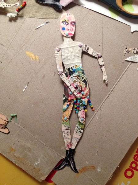
With matte medium, I glued some vintage advertising typography from the Graphics Fairy to the arms. The legs are floral sections of cast-off ATCs, and the upper body has printed tea bags with a snippet of sheer lace. The bottom torso has a stamp of the OM symbol—also from a section of an imperfect ATC—and some beaded trim at the bottom edge for the suggestion of a skirt.
This time, I put the parts together with tiny mini brads in pastel colors, which worked better than the stars. Any points that were sticking out from the backside were snipped shorter with a jewelry wire cutter.

One of the fun parts of art paper doll making is putting it together—you never quite know what the doll will look like, and what kind of “personality” it will have until all the parts are connected. I often switch out faces or clothing until it seems right. I didn’t like the face as much as I thought I would, so I rummaged through my baggie of faces and found one I had made a few months before. I made a bunch of heads when I tested some Dina Wakely face stamps, using Artistcellar's black ink pad and Derwent blocks for spots of color. (Non-water soluble ink works best if you are planning to add color after the stamped image dries.)
 
The new head was oversized for the body, but it added to the eccentricity of the doll. It also wasn’t a happy, beautiful face—it is actually kind of sullen—but then, who is always happy and beautiful?
For pizzazz, I added a pair of vintage boots, also from the Graphics Fairy. Somehow my dolls don’t seem complete without wings and a hat, so I added a bowler hat and my favorite Graphics Fairy butterfly (cut in half and glued to the upper arm with matte medium, carefully avoiding gluing the brads, so that the doll will still be poseable.) The finishing touch was a saying from a Yogi tea bag: You are unlimited.

 
The doll reminded me of an angst-filled teenager who doesn’t fit in anywhere. It seemed that she needed the extra oomph of the inspirational words from the tea tag, the OM symbol and the butterfly wings, to empower her and know she is okay just the way she is.

Sunday, May 24, 2015

Just Be

At a recent Ink Pad-sponsored Julie Fei-Fan Balzer art class, some of the attendees were talking about an online course they were taking. I don't have time for online classes since I work full time, but one of the aspects of the class that struck me was that you choose one word each year as your special word.

That got me thinking about what word, of all the endless possibilities in the English language, I would choose. After a day or two of mulling it over, I chose the word BE.

Simple, right? Two letters, one syllable, no real hidden meaning or nuances. But as an introvert, a Virgo perfectionist, a wife and mother and career woman who squeezes art in whenever there is a free 10 minute window, BE means more than it appears to.

Be still. Be comfortable with yourself. Stop competing, judging, going, moving, striving. Get comfortable in your own skin. Stop beating yourself up and measuring achievements and failures.

I happened to pick up a couple new art/craft/mixed media items at the Balzer workshop--a stamp of a crazy little girl and some of Julie's new woodcut stamps.

Here's how this page came together:
1-the background is a digital collage that I did from a photo of my Rumi Valentine page. I flipped and repeated the background image, using Quark and Photoshop, and printed it out on ordinary paper.
2-the center section is made of recycled tea bags that were overprinted with stamps using a white stamp pad
3-I stamped the little girl on deli paper, then cut it out carefully, and used a glue stick to adhere it to the page
4-I put a strip of commercial beige paper with vintage handwriting on it
5-I cut out a rectangle of a Balzer woodcut stamp and placed it below the girl. At first I was going to have her standing on it, but then I decided that she would be more magical if she floated above it
6-I added words with my Dina Wakley empowerment words, which came with some face stamps I purchased about a year ago. I also added words with mini alphabet stamps

Saturday, May 23, 2015

Throat Chakra Journal Page

When a new box of art supplies I recently ordered arrived, the first thing I wanted to use were the new Artistcellar chakra stencils. They still have the little ATC-sized chakras stencils too, but some of the fine detail is hard to get (if you are a messy, loose-handed artist like me!)

Well, I am a little rusty on my symbolism, and pulled out the first one that caught my eye, a pretty triangle/heart combination. After I looked up what it symbolized I should not have been surprised--it is the throat chakra symbol.

For at least the past 20 years, that has been the chakra that I needed to work on. Why? Panic disorder overwhelmed me back in about 1992 and I got to the point where I couldn't even speak. I had agoraphobia also. I suffered from frequent sore throats, and even had a barium x-ray to see what was wrong.

 Finding my voice, using my voice, getting over the fear of speaking, and even being able to actually speak took a long time and a lot of work.

Although I had a problem using my voice, I did express myself through art and writing, and also began to study reiki as part of my healing process. So, 20 years later the throat chakra is still the one that calls to me from a pile of stencils.

I used a painted deli paper background on the journal page...something that I learned about (and love) from taking a recent Julie Fei-Fan Balzer class. I chose to use one of my painted papers that had a lot of turquoise; blue is the color of the throat chakra. I used an ordinary pen to trace the shape, then filled in with lime green marker and lime silk acrylic paint. Why lime? Well, I love it, but also, it is the color of the heart chakra.

After the chakra design was done, it seemed that the page needed more, so I added some words that felt appropriate using little alphabet stamps and Dina Wakely empowerment words, applied with a black archival ink stamp pad. Last, I added little dots of turquoise lumiere paint. I always seem to put dots in my journal pages...why, I don't know. They probably symbolize something, so if you know, leave me a comment please.

For the extroverts of the world, this the reason I repeated the word "brave" many times: it takes an enormous amount of energy and focus and bravery to beat panic disorder, and to learn to speak up without stuttering, stumbling, opening your mouth and having no sound come out, or worse--crying.

Sunday, May 3, 2015

Painting on Newsprint and Jane Davenport Face Stencils


The latest challenge from the Paper Traders Yahoo group that I belong to is to use newsprint as a background, then add paint or other elements. These pieces are unfinished, and will be 5x7 when I trim then down.
 
After using matte medium to adhere sections of the New York Sunday Times and strips of painted deli paper to recycled cardboard, I traced my artistcellar Jane Davenport face stencils with a black sharpie onto the newsprint. Next, I added Dina Wakley white gesso in the face and randomly in the background.
 
After it was dry, I added stars with my Jill K. Berry stencils using pastel brush-tipped markers.  It needed a little more oomph, so I added my newly acquired Julie Fei-Fan Balzer stamps using a black ink pad. A little extra color was added here and there with markers, pale Tim Holtz distress stain and a lime silk acrylic glaze. 
 
Two of these will be traded with Paper Traders, one will become a thank you card for a friend who got me tickets to see Eric Clapton at Madison Square Garden this weekend (!!!!) and one I will keep. Now I just have to decide who gets which one.
 
If you think this design looks familiar, you're right. I used the Jane Davenport stencil for one of my Artiscellar Friday posts last fall, and liked it so much it became my facebook photo.

Friday, February 13, 2015

Love According to Rumi


The minute I opened my jar of Dina Wakely Crackle Paste, I knew wanted to use it for a Valentine’s Day project. Somehow I felt that it would work well in a heart shape with pink shades, and represent how the human heart stays whole and strong even though it may have cracks and scars from a lifetime of emotion.


I tested the paste on several kinds of paper—it worked great on cardboard, cardstock and heavy colored paper, especially black. On shiny surfaces, it cracked and peeled off. When I tried it on red tissue paper, it shriveled the paper too much. For this piece, I selected a small piece of heavy orange paper, and, after taping the corners down, pulled the crackle paste through a harlequin stencil using a big plastic flat-edged spatula.


Some of the paste leaked under the stencil…mostly due to the fact that I was hurrying. It wasn’t that I didn’t have enough time—I hurry because I am excited and impatient when I am in the “art zone.” Once the paste dried, it didn’t matter—the smears added to the textured effect. I decided to cut it into a heart shape.


For the background, I used Derwent blocks in shades of pink, red and orange on a white journal page. After smearing the color with a very wet paintbrush and mushing it around, I added some white Crayola slick stix to soften it in the center.


The paper I used was a little too thin—next time I would use a true watercolor paper so it didn’t buckle. I considered ironing the page, but was afraid that the I would lose the design and it would bleed off like when you iron the wax out of batik. I did hurry the drying along with a blowdryer, which helped flatten it a bit.


Once the background was dry, I added a variety of stenciled images with a Faber-Castell white PITT pen. The effect was soft and watery, which was just what I wanted. I used the chakra pocket stencils, mini damask, the edge of the Balzer deco doily stencil and sections of the garden gate.


Next, I “auditioned” the orange crackle heart on the page to see if I liked it, and to see where I wanted to glue it. After deciding on placement, I added some brown chalk ink to the heart edges to age it, and smeared a bit lightly over the stencil to add to the aging and enhance the crackle. I also tore the background page out of the spiral journal, trimmed the torn edge away and added a strip of solid orange paper on the side.

A favorite Rumi quote seemed to be just the right words for the page.  After I selected the types sizes and fonts I wanted, I printed the Rumi quote out on Avery clear mailing labels and applied them to my page.

My thought for Valentine’s Day is that everyone should celebrate self-love, and not be afraid to chase their dream, go after what they love, and follow the little voice in their head that is whispering the way.


Sunday, February 8, 2015

Dina Wakely Faces ATCs for Roses on my Table

When I saw the theme for the February Roses on my Table ATC trade, it was right up my alley. I love faces of all kinds. The face seems to be my "go to" ideas. I have all kinds and sizes of face stamps, face stencils, vintage photos of odd looking people and many self portraits.

The problem for this trade was...which kind of face? Since an ATC is only 2.5" x 3.5", that limited the field. There was also a time factor...I only had a week to do it, and with a full time job (and you thought maybe I was a full-time artist?) there was a time crunch.

I settled on my Dina Wakely stamps. For the background, I used the stamp with Stazon ink on vintage newspaper prints for some, and a white painted background for some others. I used white paint and a white paint pen in the background and gave it a grungy, aged effect. On the ones with the whiteish paint background, I used a Retro Café Arts Tree of Life stencil with a pencil, then filled in color with pastel TomBow brush tipped markers. I added words that had been printed on clear Avery mailing labels, and edged them with distress ink.

Wednesday, January 21, 2015

Hipster ATC Doll

Discovering that you could make paper dolls using an ATC as a base opened up a new range of possibilities for me.

I have hundreds of leftover ATCs, in various stages of development. When I make a batch, I trade a few, keep a few special ones in my ATC binder with clear pockets, and stash the rest in an ATC limbo box, which has pieces that are too nice to throw away, but I somehow never used.

A year or two ago I did a trade with butterflies, and used lyrics from Janis Ian's song, At Seventeen. This card has one of the lines: "one of these days I'm gonna lift my glistening wings and fly." I printed the words out in white on a green background, then used a butterfly stamp with white printmaking paint on top.

The butterfly wings started with a stamp I purchased at The Ink Pad. I added color with Tombow brush tip markers. The face is a Dina Wakely stamp, also from The Ink Pad. I added color with Derwent blocks. The arms and legs are from my "doll part" stash box that I have collected over the years. The "tattoos" are part of a Balzer Deco Doily Stencil that I got from artistcellar.com. I used a brown chalk ink through the stencil.

At first, the doll had a different face, but it didn't work, so I auditioned a few from the stash box. This one looked like a man, but a cool guy, so I thought, "why not?" A really cool hipster would not be afraid to wear butterfly wings, right? Or carry a rose in his hand?

Saturday, January 17, 2015

Paper Doll From Stencil Scraps


When I need to do a little art, something that always restores my sanity and puts me in a happy place is making paper dolls—I immediately go back to a safe, happy childhood place. As a personal challenge, I decided to see what I could do using ONLY what was already in my art bins and scrap boxes.

First, I found a paper doll template that I had already printed out. (There are many free sources online; Retro Café Arts has a variety of doll templates that you can purchase.) The graphics fairy blog has free, downloadable vintage images—I love their shoes, hats, faces and clothing, and often use them in my doll-making.

I looked through my reject projects, imperfect printmaking work, and bits left over from other projects to see what inspired me. For this doll, I started with some of my own paper, which I had designed in Photoshop and printed from a color laser. I applied white printmaking paint onto my paper through various stencils, such as compass rose, steampunk and harlequin.

Using the doll parts template, I cut the body pieces out of the scraps of stenciled paper, and connected them with mini-brads. For the legs, as well as the belt and the ribbon on the hat, I used a bit of paper that had accidentally been sprayed with lime and turquoise Dylusion ink. (The hat is a Graphics Fairy image.)

I cut the skirt from a circle of the compass rose stencil, and the fleur de lis on the hat is from the same stencil.

The doll’s face is a Dina Wakely stamp, applied with black archival ink stamp pad. It was a “reject” because the ink printed a little sketchy, but I used a black pen to touch up the imperfect sections. A touch of blue was added to the hair using a Derwent block and a koi brush, and a tiny bit of skin-toned peach chalk in was applied to the face.


Saturday, January 3, 2015

More Quirky ATC Dolls


In the quest to use up more of my scraps before buying any more art supplies (who am I kidding? I went to the Ink Pad last weekend and got some new supplies...but only things that I use all the time and had run out of...and maybe a new product or two...) I have been making art from my boxes of paper scraps. I have a giant box under my worktable and a couple more in my art supply cubbies, so the scraps of scraps are either being used up or thrown away.

I used to be addicted to making arty paper dolls. I used a lot of vintage paper doll parts, combined with a basic template. Now that I have discovered a new twist--the ATC paper doll, I am having more fun than ever.

This quirky paper doll uses a leftover ATC made with with Artistcellar stencils that was a little bit imperfect, newsprint arms, legs from a free vintage Graphics Fairy paper doll, Graphics Fairy wings and hat, and an original face. The face was doodled during a phone conversation a few years ago...she is kind of my alter ego, who I call "Esme". She is the opposite of the inner-critic...more of an inner cheerleader, and her face shows up in various pieces of artwork.


The second doll has a face that started with a Dina Wakely stamp, purchased at the Ink Pad. I added Derwent watercolor blocks for color. the arms and legs are vintage advertising and newsprint, and the boots are a free downloadable image from Dover Books. The ATC body is a semi-reject ATC from a music themed trade, which used lyrics from one of my old favorite songs, Woodstock, made famous by Crosby Stills Nash and Young, and written by Joni Mitchell.

The really cool thing is that the ATC dolls fold up into a little 2.5" x 3.5" package, which makes them easy to store and mail to friends of all ages.

Saturday, June 28, 2014

Priming the Well of Creativity After 26 Years

I was long overdue for a new art challenge--26 years overdue. The last formal course I took was a night course at FIT right before my daughter Amanda was born. Not that I stopped creating--I constantly draw, paint, collage, make fiber art pieces and mixed media work--but I hadn't done an in-person course in such a long time.

Last weekend I took a course at The Ink Pad--well it was really at the Westbeth building, but sponsored by the Ink Pad. I took a course from Kelly Kilmer and learned how to make an accordion journal from scratch, including using an awl to poke holes and waxed linen thread to hold the book together.

After the book was constructed, we did some journaling. Her collage technique and my new journal really has fanned my creative flame. Well, after 26 years, it's about time I took a course.

I also picked up some Dina Wakley stamps and tried them out on a paper doll. I was really happy with the results. I was in a rut using either my own hand drawn and painted faces, Graphics Fairy vintage images, or old photos.

Here is my finished doll, which uses my own printmaking work, painted newsprint, Graphics Fairy shoes, some hands I found online, washi tape, a painted Dina Wakely head, and a snippet of a photoshop collage.

I am also working in my new journal. Somehow having a journal that isn't "precious", one that I am not afraid to mess up, makes it easier. I have several beautiful journals that are just too pretty to mess up, so they sit empty. Maybe messing them up will be next on my agenda.

Here is my new, handmade journal, with just the first page. I snapped a shot after I finished making it. The cover is an olive rice paper. It is smallish--8.5" x 5.5"--but each of the five signatures have about 10 pages.