Showing posts with label newsprint. Show all posts

Friday, April 27, 2018

Vintage Photos With Grunge and Bling

I have always loved vintage photos. After taking a course called "Radiant Rust" with Seth Apter at Ink Pad NYC a few months ago, I got addicted to the grunge effect, and love combining it with vintage photos to enhance the aged look of my art pieces. These two pieces use similar techniques and materials, and both honor my own parents, and turn old faded photos into keepsake artwork. 

On the left is the piece I call "Football Hero Circa 1936," and on the right is "1942 Wedding." Both pieces developed as I went along, rather than being carefully thought out and sketched in advance. 


During the Radiant Rust workshop, I had created a center piece that I didn't like at all. (Click here for my blogpost about the workshop.) Rather than trash the imperfect artwork and fine watercolor paper, I decided to paint over it and keep experimenting.
This was the painted, stamped center piece that I didn't like and decided to paint over.
After painting over the original artwork with Seth's chalk paints, I added some of my favorite stamps--a dragonfly and a Julie Balzer geometric--with radiant rust and patina oxide Baked Texture.
The dragonflies and geometric stamps didn't work with the painted background.
I didn't love it, so I added more texture with a woodblock stamp from Gwen Lafluer. It was better, but still needed something more.
A little rust baked texture powder was added to the background.
One of Gwen's carved wooden stamps was added around the edges with rust baked texture.
I thought a steampunk image look might be cool with the rusty grunge effect, so I set to work with a few steampunk stencils. This time, I used an olive green embossing powder that I had on hand.

The olive embossing powder didn't work with the background, so it was covered with chalk paints.
It was pretty much a disaster. The olive was hideous, so I  painted over sections with the chalk paint and cheesecloth, and eventually ended up with a rusty, grungy background that I liked.

Eventually the color and texture looked just right.
The football hero photo was "auditioned" on another grungy background, which was later used in the "1942 Wedding" piece.
I was working on a few backgrounds at the same time. I auditioned a photo reprint of my father in his football uniform on one of the other backgrounds; I liked the effect. He was born in 1918 and the photo was taken in high school, so it is probably from 1936. He had been the quarterback for his team--what a difference from today's uniforms!

My father loved to read, so I found some old dictionary pages and tore them to give a frame effect. To go with the grungy idea, I decided to use distress stain to age the paper.

A frame effect was created around the photo with torn vintage dictionary pages.
The distressed paper frame looked good, but the piece still needed more.
A little more distress ink was added to the paper, as well as some extra rust baked texture.
The final touch was trying some baked texture Beeswax over the photo and dictionary paper.


 I was really happy with the final piece. The beeswax baked texture united the background and foreground, and added to the aged effect.


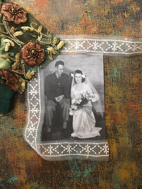
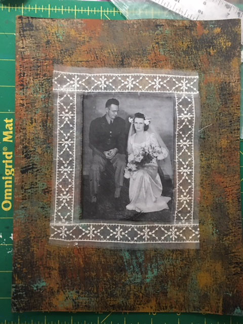
For the 1942 Wedding piece, I used one of the grunge backgrounds that I had considered for the Football Hero. The wedding photo contrasted nicely with the grungy background, but I knew it needed more. I auditioned a lot of elements until I found just the right combination.

A piece of sari scrap was just the right color for the background.
Sheer lace added contrast with the earth-toned background and sari scrap.

I liked the idea of lace with some of Gwen's Sari Scraps from the online shop. The colors were great with the grungy background and they added a nice contrast. I set about carefully cutting some coffee-colored silk and beaded medallions. 

I also decided that rather than pasting the photo on top of the background, I would cut out a center section and use the grungy background as a frame. Not only did this add depth, I also ended up with a nice little piece of the grungy background for later use in another project.

On the back of the background, I carefully measured and marked before cutting the frame.


The photo was mounted on some heavy, smooth paper before placing the frame over it.


I used some ink and a dabber tool around the edge of the cut-out center to give a more finished, professional look.

A small piece of the background was cut out, and the photo inserted.
The hard part was deciding on exactly how many medallions to use, where to place them, how much and what kind of lace to use, and how to arrange it all so it didn't look too busy or too stagnant.

Audition 1
Audition 2
Audition 3
Audition 4
Audition 5
Audition 6
Audition 7
Audition  8
Audition 9
Audition 10
I finally decided on an arrangement, and set about adhering the elements. I used a gluestick for the lace, and heavy gel medium for the Sari Silk scrap medallions. The gluestick went on purple, which is great because it shows where the glue is and is not, but it dries clear.


Just before the glue had dried, I decided I didn't love Audition 10, so I added some triangular shapes of lace at the top and bottom, which kept the design from being too square and boring.
The final "1942 Wedding" artwork.
The football hero of 1936 became a groom in 1942, and later a WWII hero, receiving a Purple Heart medal.
I just may get orders for a bunch of these from my extended family--my brothers, sisters, nieces and nephews all love the family history and vintage photos.  But, even if I do make a few more, each one will be unique, depending on which colors of paint, embossing powder, lace, trim or sari scraps that I decide to use.

Saturday, June 6, 2015

Hope But Anticipate Journal Collage

 
This journal page started with the idea of experimenting with transparency--while at the Ink Pad, I saw some a big pad of gorgeous, preprinted transparent paper by a very well-known mixed media artist with his own line of supplies. I mulled over the idea of buying it, but being frugal, decided to print my own. And after all, why use somebody else's designs when I have a computer full of my own designs and collaged images that I created in Photoshop?
 
So, I found some similar paper, cut it to size, and printed a few sheets on my laser color printer. It came out beautiful and printed easily. Today, I dared cut it up and experiment. I tried two different journal pages.
  • I loved the sheerness of the semi-transparent paper
  • I didn't love the lack of stickability...I tried matte medium and also my favorite glue stick. With the matte medium, it buckled and didn't stick very well. With the glue stick, it stuck a little better. I placed the experiment (covered with waxed paper) under a heavy cast iron pot and will see soon what a little time and pressure does to it.
On the piece above, I recycled a hideous painting I did recently as lunch-hour therapy. By laying a section of partially painted deli paper over the watercolor and adhering it with matte medium, I was able to keep some of the underneath image, yet partially mask the ugly parts. After it dried, I then added some of the new transparent paper--the stripe of vintage French script and the butterfly. Next, I put a lacey stamp and a Julie Fei-Fan Balzer stamp made from one of her woodcuts. At the top I used a strip of newsprint from the New York Times.
 
Reflecting what is going on in both my life and in the world, and probably inspired by the butterfly image, the words "hope for the best, anticipate the worst" came into my head, so I wrote the words on the page freehand with markers.

Sunday, May 3, 2015

Painting on Newsprint and Jane Davenport Face Stencils


The latest challenge from the Paper Traders Yahoo group that I belong to is to use newsprint as a background, then add paint or other elements. These pieces are unfinished, and will be 5x7 when I trim then down.
 
After using matte medium to adhere sections of the New York Sunday Times and strips of painted deli paper to recycled cardboard, I traced my artistcellar Jane Davenport face stencils with a black sharpie onto the newsprint. Next, I added Dina Wakley white gesso in the face and randomly in the background.
 
After it was dry, I added stars with my Jill K. Berry stencils using pastel brush-tipped markers.  It needed a little more oomph, so I added my newly acquired Julie Fei-Fan Balzer stamps using a black ink pad. A little extra color was added here and there with markers, pale Tim Holtz distress stain and a lime silk acrylic glaze. 
 
Two of these will be traded with Paper Traders, one will become a thank you card for a friend who got me tickets to see Eric Clapton at Madison Square Garden this weekend (!!!!) and one I will keep. Now I just have to decide who gets which one.
 
If you think this design looks familiar, you're right. I used the Jane Davenport stencil for one of my Artiscellar Friday posts last fall, and liked it so much it became my facebook photo.

Thursday, November 20, 2014

ATC Blues for Paper Traders


I joined a new Yahoo trade group recently, called Paper Traders. It's always a little scary entering new territory, with new people and new rhythms, but I really missed trading ATCs, and some of my old groups fizzled.

I have really made a shift in my artwork in recent years--I started out as an art quilter in 2006 when I bumbled onto a Quilting Arts Magazine in a bookstore. Since I had always loved sewing, art, and was for many years a fabric designer, I was hooked. I made a lot of art quilts, journal quilts, quilted postcards, quilted ATCs and various fiber projects. However, after living with neck and shoulder damage for overdoing my fiber work (from cutting through thick layers of cloth and batting with a dull rotary cutter, and painting directly on fabric using too much arm & shoulder pressure) I gradually switched to paper.

For me, paper is actually a lot easier to handle, it doesn't shift like fabric, usually doesn't bleed or fray, and you can still stitch through it if you want.

This trade required, in addition to the predominant use of the color blue, three layers. I was a little baffled because I never really consciously thought about how many layers I was or wasn't using. When the creative bug strikes, I go with the flow and what happens, happens. So, I had to really think about layers.


These pieces (I made 6...3 to trade and 3 to keep) started with a good quality heavy Japanese watercolor paper. I applied molding paste through a swirly Retro CafĂ© Art stencil, and when dry, painted the whole thing with shimmery Lumiere acrylic paint. I used a turquoise, then wiped on some indigo Lumiere. After the paint dried, I cut 6 atcs. I added layers of paper strips: vintage magazine text, French antique handwriting, and Chinese newsprint.

Embellishment was added in layers: first a brass Chinese "coin", attached with a brad. Next I added gold dots with dimensional paint. Each card got a tiny inspirational word, which was printed on clear Avery mailing labels. Last, I wanted more texture, so I punched a hole and added a blue grommet.

Tuesday, November 27, 2012

Dreaming of Art


A few months ago there was a Cloth Paper Scissor challenge for quilted postcards. I have been making them for years, so it was right up my alley. I combined an old photo [my kindergarten portrait, circa 1960] along with a Graphics Fairy http://graphicsfairy.blogspot.com/ hat and a pair of clipart scissors. I used a background of newsprint, and made skyscrapers out of more newsprint. A little lace for a pinafore and accents with water-soluble oil pastels, a little stitching, and the postcard was done.

The basic design was done in photoshop, and I output it directly on fabric. Somehow streaks appeared in the face, but I kind of liked it because it reminded me of lined paper that schoolchildren use. In the background is a portion of my favorite quote, from Buddha, which says: “Your work is to discover your work and then with all your heart to give yourself to it.” If five year old Linda knew that she would make a living one day doing art [fabric design, newspaper & magazine layout design] she probably wouldn’t believe it possible.