Showing posts with label graphics fairy. Show all posts

Wednesday, March 6, 2019

Summer of Love Envelopes and Paper Doll

The sweet little motifs in the March 2019 StencilClub designs by Ann Butler evoked images of the late 1960s and early 1970s, and propelled me back to my younger years. I remembered the special dresses and hats my mother made for me to wear on Easter, and the outfits that, later on, I made for myself to wear to school, dances, proms, and even my graduation. The stencils also reminded me that my first calling, as an artist, was fabric design. Back in the 1980s I worked as a print stylist for a fabric manufacturer in NYC's famous Garment Center. Ann's stencils reminded me of some of our patterns, which were fondly called "dumb florals" or "bread and butter" designs because they were so popular and saleable.

I happily  mixed up some '70s-inspired pastels with my acrylics and got busy making some textiley designs.
Painted and stenciled deli paper
First, I painted sheets of deli paper with the pastel colors. Once dry, I started stenciling randomly with the new set.

I had a big supply of clear mailing sleeves leftover from a recent mail art exchange, so decided to use the painted deli paper to make envelopes, and sized them to fit.
Templates for the envelope and card
The gold circles are washi tape. I miscalculated the shape of one of the flaps, and, with washi tape, added extra paper to my template so it would overlap properly.
 
First, with a piece of heavy watercolor paper, I made a card template slightly smaller than the sleeve. Next, I folded, measured, and cut some paper to make an envelope template. I traced around the envelope template to create the shape of the envelope on each of the five painted and stamped sheets of deli paper.


Painted and stenciled deli paper, cut and ready to fold

Pale blue embossing powder was sprinkled over the floral image, which was made by stamping VersaMark through a stencil, and on to the painted envelope
The painted and stenciled unglued envelope, ready to assemble.
On the front bottom and on the back flap, decorative edging was applied with VersaMark and gold embossing powder.

I added some magic with more stenciling, but this time, instead of paint, I used a VersaMark stamp pad and embossing powder. In addition to the March 2019 club set, I used the April 2013 Stitchery set, designed by Stencil Girl founder Mary Beth Shaw. The Stitchery set fit perfectly with my Summer of Love theme.

 
Five finished handmade deli paper envelopes.
I was really happy with the set of envelopes, but I had quite a few scraps left. Rather than stuffing them in my scrap box for later use, I decided to make one of my favorite "go to" things: a paper doll.

Scraps of painted deli paper were glued to heavy watercolor paper, then cut to create the doll.
Using a template, intentionally mismatched doll parts were cut for the body and limbs.
A dark edge was added by running a mini dauber and sepia Archival Ink along the edges.
Wanting to keep the same Summer of Love theme going, I searched for just the right face to evoke the era. I found a face in an ad that reminded me of Julie from The Mod Squad, a show that was the epitome of cool in its day. I carefully glued the face to some heavy watercolor paper, cut it out, and ran the sepia mini dauber around the edges.
I fashioned a Woodstock-worthy floral crown from a little piece of pink scalloped edging and added some tiny satin rosettes. Some "granny boots" from The Graphics Fairy completed her hippie look. Still, something was missing...wings!
Using a butterfly stencil from Gwen Lafluer, I applied VersaMark onto black paper, then sprinkled gold embossing powder, and zapped it with my heat gun. The final touch was adding pink circles at the edges of the wings, which I punched out from the deli paper leftover scraps.
The finished Summer of Love doll, atop a pile of matching envelopes.
Doesn't this just make you want to go home, pull out the old Simplicity patterns, play the Mamas and Papas, and watch reruns of The Mod Squad? Or at least attend the next Coachella festival?


Saturday, February 23, 2019

Intention Cards

In early 2019 I was introduced to new idea in small art: Intention Cards. My friend Karen Musgrave had been making them, and we decided to trade a few. We have been cyber friends for years, first "meeting" in art quilting groups, then being part of several splinter groups that traded small art like ATCs, tags, bookmarks and prayer flags.

We decided to trade five, but made them double sided so there were 10 designs in all. There would be enough for each day of the week plus a few extra. I debated about whether to use inspirational quotes or just a word or two, and ended up keeping the words very simple. Rather than choosing a word and making art to illustrate it, I chose to make the art, then let the images inspired the words for each card.
At the top of the post, side one of the Intention Cards, and just above, the flip sides.
I used a combination of my favorite techniques: stamping, stenciling, and collage. Most of the stencils were from StencilGirl, especially from one of my favorite artists, Gwen Lafluer. I used grunge techniques that I learned during a workshop at Ink Pad NYC with the fabulous Seth Apter, and embellished many of the cards with my go-to supply: embossing powder. Vintage images from The Graphics Fairy were printed on paper and used in the collages.

I also added strips of washi tape and dots of Nuvo Drops and edged the cards with Archival Ink in sepia and/or black, using a fingertip dauber. The words were added last, hand written or hand printed. I debated whether to use pre-printed words, word stamps, word stencils...or whether to try and use perfect calligraphy, but in the end, I threw caution to the wind, grabbed an ordinary Sharpie and wrote freehand on the cards.


The idea is to place one Intention Card in your home in a room where you will glance at it several times a day, and change them daily. It is intended to be a gentle reminder. I chose reminders to be myself, to not be afraid of expressing my feelings, to notice the little things that are beautiful and often forgotten in our daily rushing. Some people choose to make their intention cards with religious quotes or universal symbols. Whether religious or not, the cards should be positive, inspirational and gentle.

I am busy making more cards to add to my collection, and hope to teach a class on Intention Cards later this year at The Ink Pad NYC.

Friday, February 8, 2019

Sweet Valentine ATCs

I love the color pink. I love the heart shape. And lace ...and cherubs ...and vintage images, which pretty much makes creating valentines irresistible.

This year, one of my art groups, StencilClub, hosted a small art trade with a valentine theme. So, I create these sweet little Artist Trading Cards.

First, I took a sheet of watercolor paper, squeezed out magenta and white paint onto my teflon® craft mat, mixed up some delicious pink shades, and sponged the colors through some of my favorite StencilGirl and StencilClub designs.

After it was dry, I cut the stenciled paper (using a cutting mat and exacto knife) into 10 little pieces (2.5" x 3.5") for the ATC base. I decided to keep half of them without any more embellishment, and added lace and vintage images to the other half.

One of my "go to" sites is the Graphics Fairy. They have a huge and wonderful selection of all kinds of vintage images. Along with the Graphics Fairy images, I used a beautiful rose from Gwen Lafluer's website.

For all of the cards, I used sepia archival ink and a fingertip dauber (purchased at The Ink Pad NYC) to finish the edges and add to the vintage look. A happy accident was realizing that I could use a thin strip of the leftover paper, instead of ribbon, to thread through the eyelets on the lace.

For some of the images, I tore them and aged the paper with an ecru stain. I love the antique linen Tim Holtz distress stain, but it is not being made any more. A light tan watercolor or solution of coffee achieves the same effect. After aging the paper roses, angel, and vintage French postmarks, I again added sepia ink to the very edges.

To adhere the lace, flowers and hearts, I used either a glue stick or heavy gel medium.

Here's my set of ATCs...I wonder if my trade partner can guess which one will be landing in her mailbox?


Friday, August 3, 2018

Romantic Collage with Stencils

Artists, including me, tend to hoard beautiful and/or interesting things. Sometimes we save paper goods or fabrics, sometimes it is three dimensional objects like sticks, stones, pieces of metal, beach glass, vintage game pieces, or broken jewelry. Living and creating in a small space, my hoarded treasures are usually paper.  Sometimes the paper is brand new, but often times it is a snippet of paper leftover from a project, a beautiful card, mailing envelope or paper napkin.

When I need to unwind, my favorite creative outlet is collage. I pull out the bits and pieces of papers I have stuffed into shoeboxes and storage drawers and pull out about 10 or 20 scraps that speak to me at that moment. Next, I choose one or two that might be the focal point and set them aside. I choose about 10 favorites out of the remaining papers and put the rest to the side to use another time.

Without a lot of overthinking, I start tearing them into pieces and gluing them to a journal page. Depending on how heavy the paper is, I use either a glue stick or matte medium to adhere the papers.

When I am feeling cozy and soft and romantic, I tend to like earth tones and old text--especially old fashioned script and foreign words. Used teabags have a nice aged quality and add textural interest as well. Flowers, especially roses, add to a romantic feel, as does sheet music.

For the collage above, here's a few shots of how the page came together:
Torn pieces of French handwriting, vintage sheet music, the inside of an envelope, a printout of my own blockprint on teabags, and an old medical journal formed the first layer.
I knew I wanted to use a photo from a fashion magazine that I had been saving. The woman was wearing an old-fashioned lacy dress and I loved the style of her up-swept hairdo and the shape of the dress. I debated about whether to keep the background--the chandelier light was really interesting--but it was large and covered too much of the page so I opted to carefully cut the figure out and place it on my background. I tested the figure in several locations on the page.
The magazine photo of a woman in an old-fashioned dress was my choice for the focal point.
Testing the focal image on the left of the page.
Testing the focal image on the right side of the page.
It was hard to decide quite where to place the lady in white, but I decided to place her slightly to the right of center. I could have stopped here, but I pushed myself to go a little farther. I added a little stamp of a key from a set by Lynne Perrella by Paper Artsy that I had printed on black ink on deli paper. It seemed just right in the background, so I carefully trimmed it with a pair of tiny, sharp scissors and used a little matte medium to adhere it. The deli paper is very thin, and when used with matte medium, makes the deli paper nearly invisible so that the image appears to have been stamped directly on the page.
The page still cried out for more, so I softened and united the page by adding Gwen Lafluer's Ornamental Compass stencil in white. It magically pulled the elements together and made the figure blend effortlessly into the background. The white paint on the delicate stencil added softness and enhanced the romantic feel. I could have stopped here, but there was a big, open space on the left side and I decided it needed words, so I pushed ahead.

The question was: What kind of words? Should I hand-write some words? Use a stencil? Use a stamp? Find some large words in a book or magazine and glue them in? I'm not a particularly talented calligrapher, so I decided to try one of Gwen's new stencils from the Boho collection. Among the butterflies on the Boho Butterflies stencil are a couple of words; I chose "change" and carefully stenciled it on the page using black ink and a fingertip dauber tool (after securing it in place using some washi tape). To emphasize the word and add a little more interest, I also stenciled a small circle and arrow tip from the deco alphabet stencil. One word and the small design filled in the empty space, and added a nice graphic contrast to the soft, romantic page. The contrast between the soft, old fashioned figure makes me think about how far women have come. A Gibson Girl of the 1860s was considered a modern woman of her time, but the great change--women having the right to vote--would not come for another 60 years, and we would not have a female presidential candidate from a major political party until 2016.

Final "change" romantic collage journal page
A similar technique was used on another favorite journal page. I had been home sick for several days and was feeling better and getting pretty bored. I decided to set up a mini studio on my bed atop a tray table, so I pulled out a few boxes of papers and a gluestick and got to work. First, I tore up some of the favorite leftover bits and pieces and glued them down until the journal page was covered. Some of the papers were my own designs done in Photoshop, some were papers printed with images from The Graphics Fairy, and a few were commercial scrapbook paper. It looked pretty good and I was tempted to stop there. But, I pushed myself to take it further.
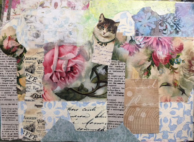
Step 1 of the kitten and rose collage.
Next, I added to the romantic feel with some corner stencils in black ink, using the deco flower medallion repeating corner stencil.

I loved it! What a difference the stenciling makes in uniting the collage papers and drawing the eye to the center of the page. But...it also seemed to need just a little more.
Step 2 of the kitten and rose collage
I decided it needed something to tie the corners into the center. Thinking of wrought iron, I took a black sharpie and started drawing freehand curlicues all over the page. The curvy lines reminded me of vines, and seemed to go with the rose and other flowers. Song lyrics and words flowed into my head as I was drawing, so with a fine tipped black marker, I wrote them down, and the page was finished. The eye still goes to the center of the page, but the curlicues and words also make the viewer want to look all around the page, read the words, and linger a little longer.
Final kitten and rose journal collage page
__________________________________________________________________________

To see a great selection of vintage graphics from The Graphics Fairy, click here.
For Lynne Perrella's Paper Artsy stamps, click here.
For Gwen's website, click here.
To see what Gwen and the Artist Tribe members have been creating, click here.


Friday, January 26, 2018

More is More


Weekend puttering seems to often result in art pieces that I like, often more so than projects that I plan in advance and carefully create. Maybe it is that when I don't plan, and just dive in, I am more relaxed and more in touch with my instincts than when I follow a careful plan. (Some carefully designed and planned posts were the Humong Star Medallion Choker and the Deco Dreams journal page.)

Similar to the process used when I created the Vintage Circus Journal Page, this page started with a "mop-up page" where I simply cleaned my paintbrush on a blank white page.

A journal page background was created by using leftover black paint,
and cleaning my paintbrush on top of the painted black pages.
I selected a few background papers to go behind a copy of a vintage photo.
I kind of liked the colors, and thought I'd use it as a base for a collage page. I rifled through my boxes of paper scraps, photos and ephemera and pulled out a few things I liked. Next, I "auditioned" them on the page to see what colors and shapes and images worked together.

A leftover scrap of an original flora and fauna
Photoshop collage was placed on the page first.
 The background paper was something I created in Photoshop with many, many layers, using royalty-free flora and fauna images from The Graphics Fairy. The page had both a dog and part of a kitten. The dog ended up being covered, but I did take care to keep the kitten unobscured. The copy of a vintage photo of children was gifted to me in an art exchange, and had been sitting around in my art box for a while. The whitish paper (with a touch of blue) is painted deli paper. I intentionally tore the edges rather than cutting, and did not make perfect corner angles so that it would go with the roughly painted background.

Painted deli paper was added to the page, with the vintage photo on top.
It was intentionally not centered.
After I had decided on a few papers and adhered them to the page, it said "scrapbook" to me. Not that scrapbooking is a bad thing, but it wasn't what I was in the mood for creating. If the children in the photo were actual relatives and I were making a family scrapbook, I might have stopped here and called the page done. Since I wasn't honoring some of my own relatives, and was using the photo as a design element, I wanted to kick it up a notch. I decided to add some stencils. I started with the Ornamental Petals mask.

I selected a stencil/mask combo and decided where it would be placed on the page.
The mask was used with white acrylic paint.


After the white paint dried a bit, I lined up the stencil to fit in the masked area.
With a dabber tool, I carefully applied brown ink through the stencil.
The first stencil/mask test (center left) was successful, so I repeated it on the right page.

One stencil was not enough, so I added it in a few more places. The words of a favorite college art teacher rang in my head. In a world where the sophisticated fashion people were saying "less is more," my textile design teacher shouted repeatedly, "More is more!" and "Schmaltz it up!" I decided to add white Nuvo Drops to tie the elements together.

I glanced at the page late in the evening as I was walking by my art table, and decided it needed some washi tape. I knew that the beauty of washi tape is that if you change your mind, you can easily peel it off without damaging the layers underneath. I stuck on some beautiful yellow floral washi tape and went to bed. In the morning, I still liked the washi tape, so it stayed on the page.

The yellow washi tape added a nice burst of color and
enhanced the vintage look.
 But still, the voice in my head said "more more more." Inspired by a bloghop celebrating Emerald Creek's embossing powders, I decided to give the page some bling. The left side of my journal became the test area, and the right side the finished area. Using the art deco corner medallion stencil, I tried an olive green embossing powder that I had in my stash. No good. It blended into the page too much and seemed wimpy. Next, I tried the same stencil with a gold embossing powder over white acrylic paint through a stencil. Not bad, but the details got lost. Then I went back to the old standard: a dabber tool with ink. Bingo! That worked beautifully.

Step one: testing the stencil with embossing powder over a base of white paint.
Step two: sprinkling gold embossing powder over the wet paint.
Step three: the embossing powder adhered to the wet stenciled image.
Step four: the heated embossing powder beginning to melt and shine.
I added gold embossing powder here and there on the right side of the journal until I was happy. I used ink and a dabber tool, then quickly sprinkled on the embossing powder, tapped off the excess, and heated it until it the magic happened.

Sections of a corner stencil were masked off, leaving a petal shape.
I decided it needed a touch more gold here and there, but only in small doses. So, I masked off most of the corner stencil until I had just one petal shaped area, and used that in strategic areas with gold embossing powder.

The final pages. On the left, the test area, and on the right, the finished journal page.
On the final journal spread, you can see the test areas on the left, and the finished page on the right. Note the difference in appearance between the gold shape on the top right and the one on the top left. The gold stencil on the left had a base of acrylic paint, and the details are not as distinct as the one on the top of the right hand page.

Although the left side is somewhat imperfect and I didn't spend much time worrying about the design and placement of elements, both pages look good side by side. One of the quirky aspects of the page that I really like is that down at the bottom right corner, the little kitty face is still visible. How sweet is that?
A little kitty peeks out from underneath the gold stencil.