Showing posts with label stencils. Show all posts

Monday, July 27, 2020

New Age A-Z: StencilGirl Art Journal Collaboration


Back in December 2019, artist Tina Walker posted an idea for a group project: an art journal using the alphabet. Each person would choose their own theme and the only real rule was that we use StencilGirl® products along with our other art materials. At first I was baffled about what theme to choose, but the light bulb went off in my brain as I realized that it was the perfect way to synthesize all of my years of reading about, and practicing, alternative healing and energy concepts.

My interest in things alternative started over 25 years ago. I had suffered from debilitating panic disorder--I was more than stressed or occasionally nervous. It was like the feeling of losing your child in a crowded store, or the panic when a plane is in a storm's turbulence. The fear didn't peak then subside--it peaked and stayed and stayed and stayed for hours.

I had to stop working. I could barely eat. I spent days in bed, in the dark, medicated and groggy. I missed my seven-year-old daughter's summer theater production because I simply couldn't leave the house. Fear of extreme heat was a trigger, so I had a some agoraphobia. I had the air conditioning so high my family was shivering, but freezing was the only way to stay calm. I discovered--as I bravely drove through the Midtown Tunnel one summer afternoon--that pharmaceutical medications for panic disorder didn't work. They also had side-effects I couldn't live with. After reading an article on reiki, I went for treatments, which led to rediscovering myself as an artist and practicing, in addition to reiki, xi gong and meditation.

The block in a circle is the Antahkarana healing energy symbol done in fabrics. The surrounding Japanese symbols are from a stencil designed by Jill McDowell.

A friend mentioned the book "Indigo Children" to me, and that further sparked my interest in New Age concepts. That interest continued over the years, and I found books by Lee Carroll and Monika Muranyi fascinating.

This Indigo Child illustration uses a stencil by Judy Wise.

I decided to call my book "New Age A-Z." I combined concepts from different New Age paths. Some of the pages are general, and others, like the X page, deeply personal. For X, I chose Xanthic, meaning yellowish, because during one of my first reiki treatments, my reiki master asked what was my favorite color. I replied "yellow" so she said "go home and paint yellow." That simple idea led me down the artistic path that I am now on. It gave me permission to be me, rather than try to paint what other people considered the right colors, subjects or styles. I had shied away from using straight out of the tube colors, such as yellow, for fear of being considered unsophisticated and artistically immature.
Shades of yellow, my favorite color, and a tapestry stencil make up this special page.

I started my A-Z New Age journal by making my own journal from 140 pound watercolor paper. I hand-stitched the binding and constructed a book with 6" x 9" pages, and the cover slightly larger. The cover background is made from recycled teabags, with a white tapestry stencil over the teabags, and a golden angel figure on top. It is accented with some gorgeous lace, and the tie closure has some of my own handmade tyvek beads.

On each top corner, I stenciled the letter of the alphabet for that page using an art deco alphabet stencil designed by Gwen Lafluer. Rather than working methodically from A-Z, I worked on each page as inspiration struck.

Some letters were easy, like A for angels or E for earth. Some were challenging, like X for xanthic, and Y for Yawee, an ancient name for a doctor who is pioneering studies in energy healing and macro-entanglement.

Here's a few of my favorite pages. Some are bold and simple, some are muted and subtle, some have notes written on them explaining my ideas and thoughts.

A golden rooted, blooming flower grows out of the Earth

Gaia, or Mother Earth, with a crown of leaves

The background of a geometric Earth-shaped stencil was overprinted with leaf and thistle stamps for a very organic look.

Freehand circles, spirals and joyful shapes were overprinted with a favorite shape--the paisley. A loosely painted flower adds to the joyful feel.


A feminine, pink and gold portrait represent Mrs. Takata, who brought reiki to the Western hemisphere.

A favorite stencil, Lacy Lotus, done in pink and white forms the background for the bold, loose flower, and vibrates with positive female energy.

Here's my video of the whole book.


Saturday, May 11, 2019

Dawn in the Garden

Years ago I began studying reiki and investigating alternative healing methods. One idea and image that stayed with me was the idea that energy is especially powerful at dawn and dusk. Meditating or doing reiki in a garden at either sunrise or sunset would not only have a calming and healing effect on the person, but would also help the plants grow better. The idea stayed in the back of my mind for a long time.
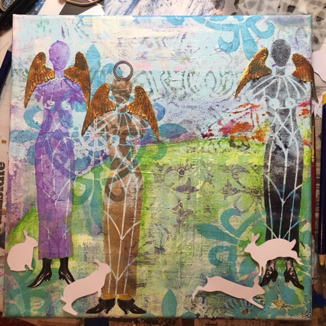
For my painting Dawn in the Garden, I started and stopped over a course of a few months. I did a background that was pretty, but I didn't quite know what to add to it to make it more interesting. I kept painting and adding more stencils (especially my favorite compass rose from Gwen's Ceramic Tiles club set) until eventually I was ready to add the foreground.
When I got a new shipment of StencilGirl® stencils, I knew that Carol Wiebe's Sacred Feminine angelic beings were just right for my foreground. I used black and sepia archival ink and a purple acrylic paint.
Of course the angels needed wings, so I added some Dresden wings and grunged them up with some ink.

When I lived in the country the little bunnies were always having a delicious dawn a dusk meal. They seemed to me perfect companions for the angelic beings.

First I cut them out of white paper and placed them around the canvas. I used a rabbit stencil from Tracie Lyn Huskamp. Then I sponged them on with white acrylic, but they were too sheer, so later I redid them using white crackle paint. I also added some vintage shoes from The Graphics Fairy.
I added a bunch of stencils in greens and yellows to suggest foliage, including one of my favorite stencils, Lacy Lotus by Jessica Sporn, and using circles from Carolyn Dube's Playtime StencilClub set, a sunrise/sunset with pinks, oranges and yellows.
 
I also added some grunged gold Dresden crowns with faux gems. I also used a black General's Scribe All pencil to add some shadows around the bunnies.

The figures weren't quite the colors I wanted, but fortunately, Gwen Lafluer's new Boho Blends worked perfectly to give the angelic figures some depth and shine. I used Wrought Iron on the far right figure, carefully masking over the shoes and bunnies with blue painter's tape.
 
 On the middle figure, the Cinnamon Boho Blend from the Spice Market trio was just right.
On the far left figure, the original purple was not working at all. I carefully placed the stencil back on the painting, added some VersaMark embossing ink, then sprinkled Lapis Lazuli embossing powder generously. I tapped off the excess powder, carefully poured it into the container, then zapped the figure with my heat gun.
What a huge difference! The figures were more harmonious, and had shine and depth.

The foreground still wasn't quite right, and I put the canvas away for a while. I wanted to add some flowers at the bottom of the canvas, but they just didn't come out right when I tried stenciling them with acrylic paint.

It dawned on me that some tiny flowers with the Paprika embossing powder would be just the perfect final touch! I used a flower stencil from Ann Butler's March club set for the flowers, then added a drop of gold Nuvo Drops for the centers.
Truthfully, I have never tested out the garden meditation theory...but I do aim to one day be a serene being gathering and giving energy in a garden of my own!

Friday, August 3, 2018

Romantic Collage with Stencils

Artists, including me, tend to hoard beautiful and/or interesting things. Sometimes we save paper goods or fabrics, sometimes it is three dimensional objects like sticks, stones, pieces of metal, beach glass, vintage game pieces, or broken jewelry. Living and creating in a small space, my hoarded treasures are usually paper.  Sometimes the paper is brand new, but often times it is a snippet of paper leftover from a project, a beautiful card, mailing envelope or paper napkin.

When I need to unwind, my favorite creative outlet is collage. I pull out the bits and pieces of papers I have stuffed into shoeboxes and storage drawers and pull out about 10 or 20 scraps that speak to me at that moment. Next, I choose one or two that might be the focal point and set them aside. I choose about 10 favorites out of the remaining papers and put the rest to the side to use another time.

Without a lot of overthinking, I start tearing them into pieces and gluing them to a journal page. Depending on how heavy the paper is, I use either a glue stick or matte medium to adhere the papers.

When I am feeling cozy and soft and romantic, I tend to like earth tones and old text--especially old fashioned script and foreign words. Used teabags have a nice aged quality and add textural interest as well. Flowers, especially roses, add to a romantic feel, as does sheet music.

For the collage above, here's a few shots of how the page came together:
Torn pieces of French handwriting, vintage sheet music, the inside of an envelope, a printout of my own blockprint on teabags, and an old medical journal formed the first layer.
I knew I wanted to use a photo from a fashion magazine that I had been saving. The woman was wearing an old-fashioned lacy dress and I loved the style of her up-swept hairdo and the shape of the dress. I debated about whether to keep the background--the chandelier light was really interesting--but it was large and covered too much of the page so I opted to carefully cut the figure out and place it on my background. I tested the figure in several locations on the page.
The magazine photo of a woman in an old-fashioned dress was my choice for the focal point.
Testing the focal image on the left of the page.
Testing the focal image on the right side of the page.
It was hard to decide quite where to place the lady in white, but I decided to place her slightly to the right of center. I could have stopped here, but I pushed myself to go a little farther. I added a little stamp of a key from a set by Lynne Perrella by Paper Artsy that I had printed on black ink on deli paper. It seemed just right in the background, so I carefully trimmed it with a pair of tiny, sharp scissors and used a little matte medium to adhere it. The deli paper is very thin, and when used with matte medium, makes the deli paper nearly invisible so that the image appears to have been stamped directly on the page.
The page still cried out for more, so I softened and united the page by adding Gwen Lafluer's Ornamental Compass stencil in white. It magically pulled the elements together and made the figure blend effortlessly into the background. The white paint on the delicate stencil added softness and enhanced the romantic feel. I could have stopped here, but there was a big, open space on the left side and I decided it needed words, so I pushed ahead.

The question was: What kind of words? Should I hand-write some words? Use a stencil? Use a stamp? Find some large words in a book or magazine and glue them in? I'm not a particularly talented calligrapher, so I decided to try one of Gwen's new stencils from the Boho collection. Among the butterflies on the Boho Butterflies stencil are a couple of words; I chose "change" and carefully stenciled it on the page using black ink and a fingertip dauber tool (after securing it in place using some washi tape). To emphasize the word and add a little more interest, I also stenciled a small circle and arrow tip from the deco alphabet stencil. One word and the small design filled in the empty space, and added a nice graphic contrast to the soft, romantic page. The contrast between the soft, old fashioned figure makes me think about how far women have come. A Gibson Girl of the 1860s was considered a modern woman of her time, but the great change--women having the right to vote--would not come for another 60 years, and we would not have a female presidential candidate from a major political party until 2016.

Final "change" romantic collage journal page
A similar technique was used on another favorite journal page. I had been home sick for several days and was feeling better and getting pretty bored. I decided to set up a mini studio on my bed atop a tray table, so I pulled out a few boxes of papers and a gluestick and got to work. First, I tore up some of the favorite leftover bits and pieces and glued them down until the journal page was covered. Some of the papers were my own designs done in Photoshop, some were papers printed with images from The Graphics Fairy, and a few were commercial scrapbook paper. It looked pretty good and I was tempted to stop there. But, I pushed myself to take it further.
Step 1 of the kitten and rose collage.
Next, I added to the romantic feel with some corner stencils in black ink, using the deco flower medallion repeating corner stencil.

I loved it! What a difference the stenciling makes in uniting the collage papers and drawing the eye to the center of the page. But...it also seemed to need just a little more.
Step 2 of the kitten and rose collage
I decided it needed something to tie the corners into the center. Thinking of wrought iron, I took a black sharpie and started drawing freehand curlicues all over the page. The curvy lines reminded me of vines, and seemed to go with the rose and other flowers. Song lyrics and words flowed into my head as I was drawing, so with a fine tipped black marker, I wrote them down, and the page was finished. The eye still goes to the center of the page, but the curlicues and words also make the viewer want to look all around the page, read the words, and linger a little longer.
Final kitten and rose journal collage page
__________________________________________________________________________

To see a great selection of vintage graphics from The Graphics Fairy, click here.
For Lynne Perrella's Paper Artsy stamps, click here.
For Gwen's website, click here.
To see what Gwen and the Artist Tribe members have been creating, click here.


Monday, July 23, 2018

Magical Mini Book

I recently joined The Stencil Club, an offering from StencilGirl Products. It is an online community with a private Facebook group where ideas and tips and creations are shared. Each month, members are shipped three exclusive stencils created by their team of designers. In addition to the online community, there is an exclusive "how to" video and pdf. The Stencil Club designs are only available to club member; they are not sold to the general public.

I joined in time to receive the July set, Ceramic Tiles, created by one of my favorite artists, Gwen Lafluer. I can't stop using these stencils, especially the mid-sized one with the fluer de lis accent. In the exclusive club video (about 45 minutes long), Gwen demonstrated how to create a gorgeous mini book from one large stenciled paper. I decided to give it a try. Gwen shares all her tips and techniques on how to stencil, and if I had wanted to, I could have used exactly the same colors, placed the stencils in the same positions, and made my little book just like Gwen's.

Being a practical Virgo, I decided it would be the perfect opportunity to use up some unfinished designs. So, I started by gathering all my miscellaneous stenciled, unfinished papers that I had hanging around. None of them matched but I knew I was going to use them as a background so it didn't matter too much.

I started with a heavy, good quality piece of fairly smooth watercolor paper (about 12" x 18") that had a couple of perfectly stenciled deco images. I squeezed a large blob of matte medium on the paper, spread it with an old credit card, and started collaging the other pieces in place.
Some of the stencils were printed on heavy paper, like the green and aqua image above. I carefully split the paper, pulled the the two-ply layers apart, and kept only the top layer.
The first layer I added was the green and aqua area. The gray, lavender and turquoise stencils were already on the paper.
Next, I added a purple deco stencil. It had been printed on deli paper and was very lightweight.
A large sheet of olive-green deco stencils was peeled apart, then cut and added around the background.
The empty white areas were filled in with torn pieces of stenciled deli paper in shades of aqua and green.
Once the background was covered with stencils (most from the Art Deco collection), it needed to be united and softened. I added the circular background stencil in white over the areas that were too dark.
The brand-new Ceramic Tile Stencil Club collection
 
I also added the fluer de lis 6" square stencil in white. The background still looked too dark in places and also didn't feel unified, so I mixed up some light turquoise acrylic paint and dabbed it through the fluer de lis medallion stencil until the darkest colors were muted. Here and there I added some pale green, light aqua, and a golden umber with the same two stencils.
Once I had a background that pleased my eye, I wanted to add some "bling" so I used a VersaMark stamp pad with the fluer de lis medallion, sprinkled on some champagne embossing powder, blasted it with my heat gun until is melted and shimmered.
The embossing powder stuck to the areas where the VersaMark was used. This is the way the embossed areas look unheated. A blast from the heat gun melts the powder and turns the soft brown areas into a rich gold color.
I liked the way the underlying deco stencil, done with lime green paint and Seth Apter's Emerald Creek Patina Oxide Baked Texture looked, so I again used the VersaMark stamp pad, but this time with sections of the background circle stencil in Patina Oxide. Finally, using only the center of the fluer de lis stencil, I added a few x-o shapes with Ancient Amber Baked Texture.
It was time to stop painting and stenciling and start folding. To be sure it was nice and dry before folding, I gave the paper some extra heat with my blow dryer, which is gentler on the paper than the heat gun, and more diffused rather than directed at one section.

I booted up my laptop and carefully watched the Stencil Club video of Gwen's technique for folding the paper, and followed along. There is also a pdf that I could have used, but it has words like "vertical" and "horizontal" and I am directionally-challenged, so my brain fried...I needed the visual help of the video, and paused it and/or replayed when I wasn't sure how to proceed.
The back of the folded artwork. The bone folder ensured that the folds were crisp.
The artwork, folded into 8 sections and ready to be turned into a book.
One cut in the right place is needed to separate the pages.
With just the right twist, the book pops together.
My book was a little wonky--probably because the paper was quite thick. I decided to use some heavy gel medium to glue the folded parts together. I applied the gel, separated the sections with parchment paper, and put it under a big cast iron pot to flatten the book and ensure that the pages stuck together.
I darkened all the edges with a brown chalk ink, and it was almost finished. Something was missing. I decided to add a closure. After some debate and auditioning possible closures, I opted to use a simple ribbon closure.
A vintage dragonfly button, tiny elephant, and dangly Turkmen jewelry part were auditioned for the closure.
I added grommets halfway up the front and halfway up the back, and fed ribbon through them. For the front, I used a Turkmen jewelry part, fed turquoise ribbon (from the packaging that Gwen ships her website orders in!) through the loop on the back, then pulled the ribbon through the grommet and tied it. 
A simple bow at the side is easy to tie and untie.

Now the question is: what should go inside the pages of the book? Poetry? Special photos? Other keepsakes and memorabilia? Inspirational quotes? Prayers? Or nothing at all?