Showing posts with label baked texture. Show all posts

Friday, December 28, 2018

Faux Antique Ephemera Box

Serendipity would have it that for my very first StencilClub Voices post, I had the joy of working with some brand new Stencil Club designs that were a collaboration between Seth Apter and MaryBeth Shaw. Using Seth's grunge technique and his Emerald Creek Baked Texture Embossing Powder seemed like a perfect compliment to the new designs.

I live in a small space, so storage solutions have to be both functional and attractive. I keep many of my supplies in decorative shoeboxes, which are then artfully arranged on my tables, bookshelves and closets. Since I had recently purchased some new clogs, there was a nice clean Dansko box waiting to be transformed.

Last winter I took a class given by Seth at the Ink Pad NYC. (And I am happy to announce that I am now teaching there! Can you see me happy dancing?)  The class was called Radiant Rust. I decided to apply the grunge and bling techniques I learned from Seth to my humble shoebox.
Ready to paint the shoebox with black gesso.
I started by painting the outside with black gesso.

When it was dry, I began the grunge process.
The box was dry and ready for the "grunge" process.
Color 1 was applied with Seth's special technique.

Color 2 was added.

Color 3.

Almost done with the grunge technique.

Grunged box, ready for the "bling" of Baked Texture through the new stencils.

Once the grunge effect was dry, the magic began: I added Ancient Amber embossing powder through the new set of stencils. I used a VersaMagic stamp pad first, then sprinkled on the powder, tapped off the excess, and zapped it with a heat gun. I repeated the process all over with most of the January StencilClub set. When the light catches it right, the effect is magical, like petrified wood in an ancient forest.
The VersaMark goes on clear, but is sticky and holds the embossing powder.

Ancient Amber embossing powder was generously sprinkled on.

Excess embossing powder was tapped off, leaving the stencil design.

After a few minutes with the heat gun, the embossing powder melted and shimmered.
A closeup of the new stencils over the grunged background.

 The effect was great, but I felt that a central focus was needed, so I pulled out one of my "go-to" stencils: a fleur de lis compass rose, which was part of Gwen Lafluer's recent StencilClub set. This time, I used Patina Oxide embossing powder. The fleur de lis compass rose was just what the box needed to add some extra magic.
One of the stencils from the July 2018 Ceramic Tiles design set was added to the box.

I added the fleur de lis compass rose on the top and half on the front.

An extra touch was a keyhole shaped brad that I placed in the center of the outside.
I decided that it needed just a little something more...maybe legs? Maybe a knob to open it? I searched around my art storage drawers and found a set of beautiful aqua floral knobs that I picked up on sale a while ago. The color worked...the design was not a perfect match, but the shape and color were right. I threw caution to the wind and poked a hole right through the center of the compass rose fleur de lis shape.
 
It was just right!

 
Now the big decision: do I fill the box with stamps? stencils? pencils? paper scraps? Decisions, decisions! Maybe I'll have to make a few more of these Faux Antique Boxes since I'm always adding to my art supply collection!

Monday, July 23, 2018

Magical Mini Book

I recently joined The Stencil Club, an offering from StencilGirl Products. It is an online community with a private Facebook group where ideas and tips and creations are shared. Each month, members are shipped three exclusive stencils created by their team of designers. In addition to the online community, there is an exclusive "how to" video and pdf. The Stencil Club designs are only available to club member; they are not sold to the general public.

I joined in time to receive the July set, Ceramic Tiles, created by one of my favorite artists, Gwen Lafluer. I can't stop using these stencils, especially the mid-sized one with the fluer de lis accent. In the exclusive club video (about 45 minutes long), Gwen demonstrated how to create a gorgeous mini book from one large stenciled paper. I decided to give it a try. Gwen shares all her tips and techniques on how to stencil, and if I had wanted to, I could have used exactly the same colors, placed the stencils in the same positions, and made my little book just like Gwen's.

Being a practical Virgo, I decided it would be the perfect opportunity to use up some unfinished designs. So, I started by gathering all my miscellaneous stenciled, unfinished papers that I had hanging around. None of them matched but I knew I was going to use them as a background so it didn't matter too much.

I started with a heavy, good quality piece of fairly smooth watercolor paper (about 12" x 18") that had a couple of perfectly stenciled deco images. I squeezed a large blob of matte medium on the paper, spread it with an old credit card, and started collaging the other pieces in place.
Some of the stencils were printed on heavy paper, like the green and aqua image above. I carefully split the paper, pulled the the two-ply layers apart, and kept only the top layer.
The first layer I added was the green and aqua area. The gray, lavender and turquoise stencils were already on the paper.
Next, I added a purple deco stencil. It had been printed on deli paper and was very lightweight.
A large sheet of olive-green deco stencils was peeled apart, then cut and added around the background.
The empty white areas were filled in with torn pieces of stenciled deli paper in shades of aqua and green.
Once the background was covered with stencils (most from the Art Deco collection), it needed to be united and softened. I added the circular background stencil in white over the areas that were too dark.
The brand-new Ceramic Tile Stencil Club collection
 
I also added the fluer de lis 6" square stencil in white. The background still looked too dark in places and also didn't feel unified, so I mixed up some light turquoise acrylic paint and dabbed it through the fluer de lis medallion stencil until the darkest colors were muted. Here and there I added some pale green, light aqua, and a golden umber with the same two stencils.
Once I had a background that pleased my eye, I wanted to add some "bling" so I used a VersaMark stamp pad with the fluer de lis medallion, sprinkled on some champagne embossing powder, blasted it with my heat gun until is melted and shimmered.
The embossing powder stuck to the areas where the VersaMark was used. This is the way the embossed areas look unheated. A blast from the heat gun melts the powder and turns the soft brown areas into a rich gold color.
I liked the way the underlying deco stencil, done with lime green paint and Seth Apter's Emerald Creek Patina Oxide Baked Texture looked, so I again used the VersaMark stamp pad, but this time with sections of the background circle stencil in Patina Oxide. Finally, using only the center of the fluer de lis stencil, I added a few x-o shapes with Ancient Amber Baked Texture.
It was time to stop painting and stenciling and start folding. To be sure it was nice and dry before folding, I gave the paper some extra heat with my blow dryer, which is gentler on the paper than the heat gun, and more diffused rather than directed at one section.

I booted up my laptop and carefully watched the Stencil Club video of Gwen's technique for folding the paper, and followed along. There is also a pdf that I could have used, but it has words like "vertical" and "horizontal" and I am directionally-challenged, so my brain fried...I needed the visual help of the video, and paused it and/or replayed when I wasn't sure how to proceed.
The back of the folded artwork. The bone folder ensured that the folds were crisp.
The artwork, folded into 8 sections and ready to be turned into a book.
One cut in the right place is needed to separate the pages.
With just the right twist, the book pops together.
My book was a little wonky--probably because the paper was quite thick. I decided to use some heavy gel medium to glue the folded parts together. I applied the gel, separated the sections with parchment paper, and put it under a big cast iron pot to flatten the book and ensure that the pages stuck together.
I darkened all the edges with a brown chalk ink, and it was almost finished. Something was missing. I decided to add a closure. After some debate and auditioning possible closures, I opted to use a simple ribbon closure.
A vintage dragonfly button, tiny elephant, and dangly Turkmen jewelry part were auditioned for the closure.
I added grommets halfway up the front and halfway up the back, and fed ribbon through them. For the front, I used a Turkmen jewelry part, fed turquoise ribbon (from the packaging that Gwen ships her website orders in!) through the loop on the back, then pulled the ribbon through the grommet and tied it. 
A simple bow at the side is easy to tie and untie.

Now the question is: what should go inside the pages of the book? Poetry? Special photos? Other keepsakes and memorabilia? Inspirational quotes? Prayers? Or nothing at all?


Friday, May 25, 2018

Sari Scrap Flower Child Fairy

Every artist has their default zone, the supplies and techniques they turn to when they don't know what to work on or where to start. Sometimes artists have the need to putter with supplies as therapy and make art that feels comfortable and familiar and makes them happy. Sometimes we want to stretch, to try something new, different or even scary. But sometimes we just want to putter and be in the happy, familiar place. And both the new places and the familiar ones are good and necessary.

For some people the default zone is journaling, for others it is splattering paint, or drawing, or collage. For me, the happy, puttery place is making paper dolls.

My worktable, covered with paints, ink, scissors and bags of doll parts.
Sometimes my puttering is not even doll making, it just finding scraps of leftover projects and cutting arms, legs and torsos. Sometimes it is cutting interesting faces or clothing from a fashion magazine that may later become doll parts. I often use a doll body template that is available from Retro Cafe Arts, an online craft supplier. I also collect images of vintage paper dolls from sources such as The Graphics Fairy.

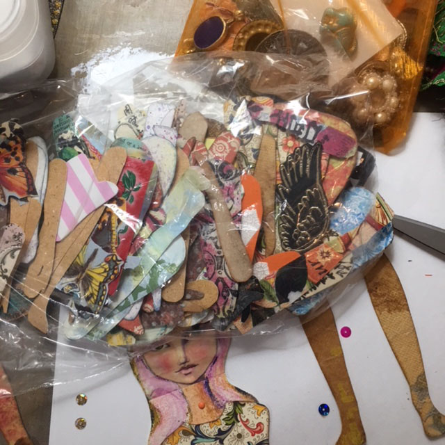
I keep a bin of doll components, and within that bin, baggies of faces, wings, shoes, hats, tops, bottoms, legs, arms and unfinished dolls. When I feel the need to regroup and relax, it is very meditative to pull out the parts and give birth to a new doll.

On top, a baggie full of some favorite paper doll components, and below, the start of a doll.
As I rifle through the baggies of parts, I select the ones that--in that moment--really strike me. Next, I move them around and audition the parts until the doll begins to speak to me. 
The head, from a fashion magazine, was too small, the skirt too short, and shoes too big.

This head was a vintage photo reprint with strips of Jane Davenport washi tape.
This face looked good, but was unfinished.

I liked the arrangement above the best, but the face was incomplete. Her eyes, nose and mouth are strips of Jane Davenport's washi tape that were placed on watercolor paper. I sketched in the rest of her head and hair with a pencil, added a neck and shoulders, then used Derwent watercolor pencils to complete the face.

I thought about leaving the green background, but decided a square head would look weird, so I cut away the greenish background, leaving only the hair and shoulders.


Strips of Jane Davenport washi tape formed the center of the face.

I cut a half-circular slit in the neck so the torso could be inserted, then secured it with a mini brad.
A piece of orange silk sari scrap fabric made a wonderful skirt. I gathered it at the waist, pulled the strings until it was the right size, and tied it in the back. A little dab of gel medium was added to keep it in place.

Once the skirt was stitched on, I discovered a couple of tiny holes in the orange silk, so I added a magenta sequin and clear gem, hand-stitching them carefully to cover the holes.
A hole in the silk skirt was challenging to fix.

A sequin and a bead covered up the holes and matched the mood of the fabric.

Arms, legs and wings were auditioned, chosen, and attached with mini brads and the doll was nearly complete. The torso and legs I selected are made from florentine paper, available on Gwen's website. I used some cardstock underneath the paper for added strength. The arms have a combination of commercial scrapbook paper and fabric covered with recycled teabags.

The finishing touch was special accent chain that was part of a shipment of Turkmen Jewelry Parts. It made a perfect belt, and was hand-stitched in place.

Detail shot of the fairy doll on my worktable.
The wings were made from a butterfly stamp on watercolor paper, and little peach floral brads attaching the wings to the arm add charm and whimsy. Layers of Baked Texture Embossing Powder were added on top of the stamped butterfly image. Dots of gold fabric paint were placed on the wing edge for contrast.

With her pink hair, wings, and fluttering sari skirt, she is a magical fairy, evoking spirit of a1960s flower child--perhaps my own inner child!

If you want to purchase any of Gwen's fabulous supplies, now's the time! There is a sale going on; just use this coupon when you check out.