Showing posts with label sari scraps. Show all posts

Friday, May 25, 2018

Sari Scrap Flower Child Fairy

Every artist has their default zone, the supplies and techniques they turn to when they don't know what to work on or where to start. Sometimes artists have the need to putter with supplies as therapy and make art that feels comfortable and familiar and makes them happy. Sometimes we want to stretch, to try something new, different or even scary. But sometimes we just want to putter and be in the happy, familiar place. And both the new places and the familiar ones are good and necessary.

For some people the default zone is journaling, for others it is splattering paint, or drawing, or collage. For me, the happy, puttery place is making paper dolls.

My worktable, covered with paints, ink, scissors and bags of doll parts.
Sometimes my puttering is not even doll making, it just finding scraps of leftover projects and cutting arms, legs and torsos. Sometimes it is cutting interesting faces or clothing from a fashion magazine that may later become doll parts. I often use a doll body template that is available from Retro Cafe Arts, an online craft supplier. I also collect images of vintage paper dolls from sources such as The Graphics Fairy.

I keep a bin of doll components, and within that bin, baggies of faces, wings, shoes, hats, tops, bottoms, legs, arms and unfinished dolls. When I feel the need to regroup and relax, it is very meditative to pull out the parts and give birth to a new doll.
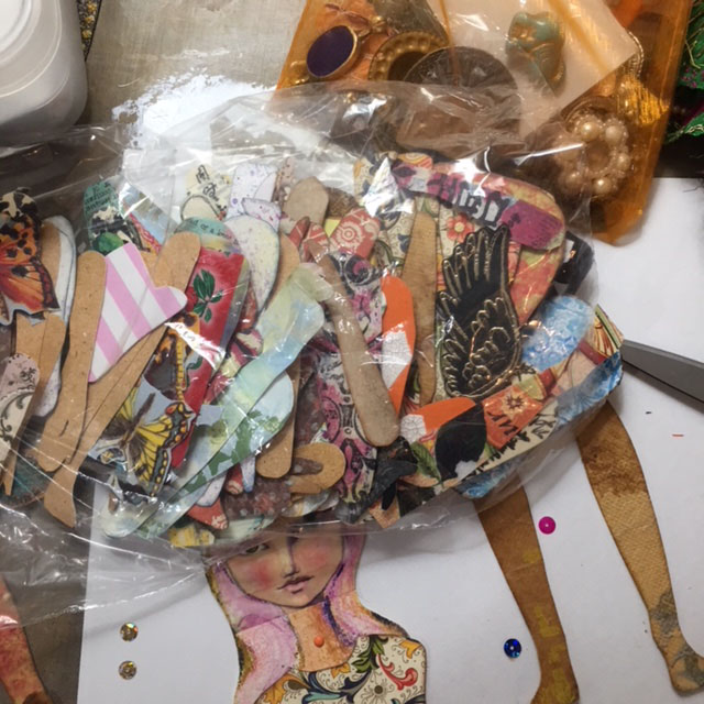
On top, a baggie full of some favorite paper doll components, and below, the start of a doll.
As I rifle through the baggies of parts, I select the ones that--in that moment--really strike me. Next, I move them around and audition the parts until the doll begins to speak to me. 
The head, from a fashion magazine, was too small, the skirt too short, and shoes too big.

This head was a vintage photo reprint with strips of Jane Davenport washi tape.
This face looked good, but was unfinished.

I liked the arrangement above the best, but the face was incomplete. Her eyes, nose and mouth are strips of Jane Davenport's washi tape that were placed on watercolor paper. I sketched in the rest of her head and hair with a pencil, added a neck and shoulders, then used Derwent watercolor pencils to complete the face.

I thought about leaving the green background, but decided a square head would look weird, so I cut away the greenish background, leaving only the hair and shoulders.


Strips of Jane Davenport washi tape formed the center of the face.

I cut a half-circular slit in the neck so the torso could be inserted, then secured it with a mini brad.
A piece of orange silk sari scrap fabric made a wonderful skirt. I gathered it at the waist, pulled the strings until it was the right size, and tied it in the back. A little dab of gel medium was added to keep it in place.

Once the skirt was stitched on, I discovered a couple of tiny holes in the orange silk, so I added a magenta sequin and clear gem, hand-stitching them carefully to cover the holes.
A hole in the silk skirt was challenging to fix.

A sequin and a bead covered up the holes and matched the mood of the fabric.

Arms, legs and wings were auditioned, chosen, and attached with mini brads and the doll was nearly complete. The torso and legs I selected are made from florentine paper, available on Gwen's website. I used some cardstock underneath the paper for added strength. The arms have a combination of commercial scrapbook paper and fabric covered with recycled teabags.

The finishing touch was special accent chain that was part of a shipment of Turkmen Jewelry Parts. It made a perfect belt, and was hand-stitched in place.

Detail shot of the fairy doll on my worktable.
The wings were made from a butterfly stamp on watercolor paper, and little peach floral brads attaching the wings to the arm add charm and whimsy. Layers of Baked Texture Embossing Powder were added on top of the stamped butterfly image. Dots of gold fabric paint were placed on the wing edge for contrast.

With her pink hair, wings, and fluttering sari skirt, she is a magical fairy, evoking spirit of a1960s flower child--perhaps my own inner child!

If you want to purchase any of Gwen's fabulous supplies, now's the time! There is a sale going on; just use this coupon when you check out.


Friday, April 27, 2018

Vintage Photos With Grunge and Bling

I have always loved vintage photos. After taking a course called "Radiant Rust" with Seth Apter at Ink Pad NYC a few months ago, I got addicted to the grunge effect, and love combining it with vintage photos to enhance the aged look of my art pieces. These two pieces use similar techniques and materials, and both honor my own parents, and turn old faded photos into keepsake artwork. 

On the left is the piece I call "Football Hero Circa 1936," and on the right is "1942 Wedding." Both pieces developed as I went along, rather than being carefully thought out and sketched in advance. 


During the Radiant Rust workshop, I had created a center piece that I didn't like at all. (Click here for my blogpost about the workshop.) Rather than trash the imperfect artwork and fine watercolor paper, I decided to paint over it and keep experimenting.
This was the painted, stamped center piece that I didn't like and decided to paint over.
After painting over the original artwork with Seth's chalk paints, I added some of my favorite stamps--a dragonfly and a Julie Balzer geometric--with radiant rust and patina oxide Baked Texture.
The dragonflies and geometric stamps didn't work with the painted background.
I didn't love it, so I added more texture with a woodblock stamp from Gwen Lafluer. It was better, but still needed something more.
A little rust baked texture powder was added to the background.
One of Gwen's carved wooden stamps was added around the edges with rust baked texture.
I thought a steampunk image look might be cool with the rusty grunge effect, so I set to work with a few steampunk stencils. This time, I used an olive green embossing powder that I had on hand.

The olive embossing powder didn't work with the background, so it was covered with chalk paints.
It was pretty much a disaster. The olive was hideous, so I  painted over sections with the chalk paint and cheesecloth, and eventually ended up with a rusty, grungy background that I liked.

Eventually the color and texture looked just right.
The football hero photo was "auditioned" on another grungy background, which was later used in the "1942 Wedding" piece.
I was working on a few backgrounds at the same time. I auditioned a photo reprint of my father in his football uniform on one of the other backgrounds; I liked the effect. He was born in 1918 and the photo was taken in high school, so it is probably from 1936. He had been the quarterback for his team--what a difference from today's uniforms!

My father loved to read, so I found some old dictionary pages and tore them to give a frame effect. To go with the grungy idea, I decided to use distress stain to age the paper.

A frame effect was created around the photo with torn vintage dictionary pages.
The distressed paper frame looked good, but the piece still needed more.
A little more distress ink was added to the paper, as well as some extra rust baked texture.
The final touch was trying some baked texture Beeswax over the photo and dictionary paper.


 I was really happy with the final piece. The beeswax baked texture united the background and foreground, and added to the aged effect.


For the 1942 Wedding piece, I used one of the grunge backgrounds that I had considered for the Football Hero. The wedding photo contrasted nicely with the grungy background, but I knew it needed more. I auditioned a lot of elements until I found just the right combination.

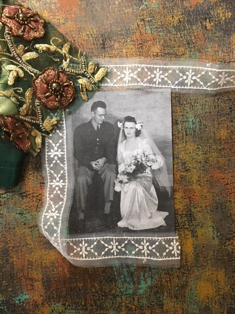
A piece of sari scrap was just the right color for the background.
Sheer lace added contrast with the earth-toned background and sari scrap.

I liked the idea of lace with some of Gwen's Sari Scraps from the online shop. The colors were great with the grungy background and they added a nice contrast. I set about carefully cutting some coffee-colored silk and beaded medallions. 

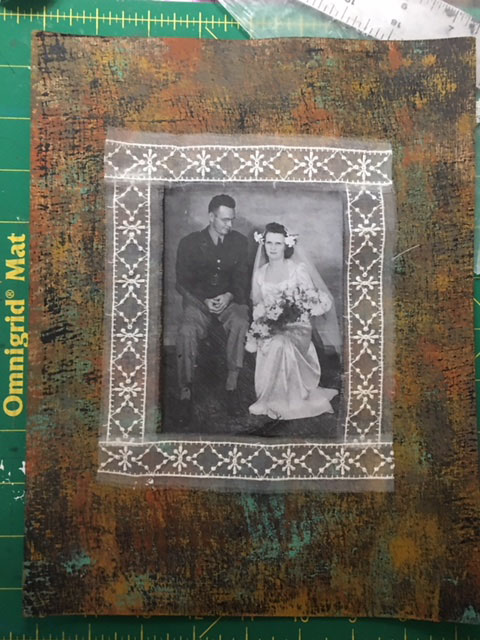
I also decided that rather than pasting the photo on top of the background, I would cut out a center section and use the grungy background as a frame. Not only did this add depth, I also ended up with a nice little piece of the grungy background for later use in another project.

On the back of the background, I carefully measured and marked before cutting the frame.


The photo was mounted on some heavy, smooth paper before placing the frame over it.


I used some ink and a dabber tool around the edge of the cut-out center to give a more finished, professional look.

A small piece of the background was cut out, and the photo inserted.
The hard part was deciding on exactly how many medallions to use, where to place them, how much and what kind of lace to use, and how to arrange it all so it didn't look too busy or too stagnant.

Audition 1
Audition 2
Audition 3
Audition 4
Audition 5
Audition 6
Audition 7
Audition  8
Audition 9
Audition 10
I finally decided on an arrangement, and set about adhering the elements. I used a gluestick for the lace, and heavy gel medium for the Sari Silk scrap medallions. The gluestick went on purple, which is great because it shows where the glue is and is not, but it dries clear.


Just before the glue had dried, I decided I didn't love Audition 10, so I added some triangular shapes of lace at the top and bottom, which kept the design from being too square and boring.
The final "1942 Wedding" artwork.
The football hero of 1936 became a groom in 1942, and later a WWII hero, receiving a Purple Heart medal.
I just may get orders for a bunch of these from my extended family--my brothers, sisters, nieces and nephews all love the family history and vintage photos.  But, even if I do make a few more, each one will be unique, depending on which colors of paint, embossing powder, lace, trim or sari scraps that I decide to use.