Showing posts with label reiki. Show all posts

Monday, July 27, 2020

New Age A-Z: StencilGirl Art Journal Collaboration


Back in December 2019, artist Tina Walker posted an idea for a group project: an art journal using the alphabet. Each person would choose their own theme and the only real rule was that we use StencilGirl® products along with our other art materials. At first I was baffled about what theme to choose, but the light bulb went off in my brain as I realized that it was the perfect way to synthesize all of my years of reading about, and practicing, alternative healing and energy concepts.

My interest in things alternative started over 25 years ago. I had suffered from debilitating panic disorder--I was more than stressed or occasionally nervous. It was like the feeling of losing your child in a crowded store, or the panic when a plane is in a storm's turbulence. The fear didn't peak then subside--it peaked and stayed and stayed and stayed for hours.

I had to stop working. I could barely eat. I spent days in bed, in the dark, medicated and groggy. I missed my seven-year-old daughter's summer theater production because I simply couldn't leave the house. Fear of extreme heat was a trigger, so I had a some agoraphobia. I had the air conditioning so high my family was shivering, but freezing was the only way to stay calm. I discovered--as I bravely drove through the Midtown Tunnel one summer afternoon--that pharmaceutical medications for panic disorder didn't work. They also had side-effects I couldn't live with. After reading an article on reiki, I went for treatments, which led to rediscovering myself as an artist and practicing, in addition to reiki, xi gong and meditation.

The block in a circle is the Antahkarana healing energy symbol done in fabrics. The surrounding Japanese symbols are from a stencil designed by Jill McDowell.

A friend mentioned the book "Indigo Children" to me, and that further sparked my interest in New Age concepts. That interest continued over the years, and I found books by Lee Carroll and Monika Muranyi fascinating.

This Indigo Child illustration uses a stencil by Judy Wise.

I decided to call my book "New Age A-Z." I combined concepts from different New Age paths. Some of the pages are general, and others, like the X page, deeply personal. For X, I chose Xanthic, meaning yellowish, because during one of my first reiki treatments, my reiki master asked what was my favorite color. I replied "yellow" so she said "go home and paint yellow." That simple idea led me down the artistic path that I am now on. It gave me permission to be me, rather than try to paint what other people considered the right colors, subjects or styles. I had shied away from using straight out of the tube colors, such as yellow, for fear of being considered unsophisticated and artistically immature.
Shades of yellow, my favorite color, and a tapestry stencil make up this special page.

I started my A-Z New Age journal by making my own journal from 140 pound watercolor paper. I hand-stitched the binding and constructed a book with 6" x 9" pages, and the cover slightly larger. The cover background is made from recycled teabags, with a white tapestry stencil over the teabags, and a golden angel figure on top. It is accented with some gorgeous lace, and the tie closure has some of my own handmade tyvek beads.

On each top corner, I stenciled the letter of the alphabet for that page using an art deco alphabet stencil designed by Gwen Lafluer. Rather than working methodically from A-Z, I worked on each page as inspiration struck.

Some letters were easy, like A for angels or E for earth. Some were challenging, like X for xanthic, and Y for Yawee, an ancient name for a doctor who is pioneering studies in energy healing and macro-entanglement.

Here's a few of my favorite pages. Some are bold and simple, some are muted and subtle, some have notes written on them explaining my ideas and thoughts.

A golden rooted, blooming flower grows out of the Earth

Gaia, or Mother Earth, with a crown of leaves

The background of a geometric Earth-shaped stencil was overprinted with leaf and thistle stamps for a very organic look.

Freehand circles, spirals and joyful shapes were overprinted with a favorite shape--the paisley. A loosely painted flower adds to the joyful feel.


A feminine, pink and gold portrait represent Mrs. Takata, who brought reiki to the Western hemisphere.

A favorite stencil, Lacy Lotus, done in pink and white forms the background for the bold, loose flower, and vibrates with positive female energy.

Here's my video of the whole book.


Wednesday, July 15, 2020

Lemurian Garden Stencil Debut!


One of my lifelong dreams has been seeing my own designs used in fabrics, wallpaper, clothing, packaging, paper goods, sheets other useful products. After finishing college with a degree that didn't really suit me, I went back to school and studied Textile and Surface Design at the Fashion Institute of Technology. For about 10 years, I worked in the fashion industry as a print stylist, selecting designs, patterns and colors for a textile converter, and going to the mills to oversee the production quality. The company's look was different than my personal style, so I rarely produced my own designs. After my daughter was born, I shifted into layout design for magazines and newspapers. Still, in the back of my mind a little voice kept asking: "What about YOUR designs?" I often sketched ideas and doodled and imagined what my own designs would be.

Finally I had the opportunity to produce stencils for StencilGirl. Out of the hundreds of designs I had scribbled on sticky notes and doodled on the edges of notepads over the years, I selected five. They are all designs I doodle, sketch and draw over and over--shapes that have showed up in my paintings and drawings for many years. Realizing that they were all designs based in nature, I named the group Lemurian Garden, after a magical place that some believe was the Garden of Eden, located in the area where the Hawaiian Islands are now.

The five designs in the group are the Spiral, Leaf, Pansy, Tulip and Lily, and they work beautifully together, but also stand on their own individually.

Here's some samples of how the stencils look with various methods and colors. The earrings and necklace were stenciled onto shrinkydink film, then baked in the oven. Some are Intention Cards, some are journal pages. There's also a greeting card and handmade envelope as well as a little gift box.

LEAF

TULIP

SPIRAL

For the birthday card and envelope, I started with a piece of deli paper that had blobs of paint on it. My silicone mat had been covered with paint, and it looked really pretty, so I covered the mat with thin matte medium, placed deli paper over it, pressed out the excess with a credit card, and let it dry. I carefully peeled away the paper from the mat and was left with some pink., orange and green splotches. Next, I used black archival ink through the spiral stencil in a random, allover pattern until the paper was covered. Using an opened, flattened envelope as a template, I cut the envelope shape, folded it, and glued the sides. With the leftover bits, I used a folded 8" x 5" white index card to make the birthday card. I stamped "happy birthday" onto deli paper, then glued it in place with matte medium. 

Click HERE to see a short video on the making of the card and envelope.


PANSY

LILY

 And here's a few things I made using ALL the stencils together. I liked the pastel (on the left) so much that I scanned it and printed out paper from my inkjet printer, which I used for the limbs of the paper doll.


I'm so excited about the stencils, and can't stop using them. They are full of energy and life. I hope you enjoy using them as much as I do!

Saturday, May 11, 2019

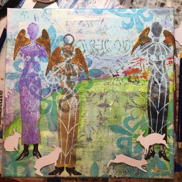
Dawn in the Garden

Years ago I began studying reiki and investigating alternative healing methods. One idea and image that stayed with me was the idea that energy is especially powerful at dawn and dusk. Meditating or doing reiki in a garden at either sunrise or sunset would not only have a calming and healing effect on the person, but would also help the plants grow better. The idea stayed in the back of my mind for a long time.
For my painting Dawn in the Garden, I started and stopped over a course of a few months. I did a background that was pretty, but I didn't quite know what to add to it to make it more interesting. I kept painting and adding more stencils (especially my favorite compass rose from Gwen's Ceramic Tiles club set) until eventually I was ready to add the foreground.
When I got a new shipment of StencilGirl® stencils, I knew that Carol Wiebe's Sacred Feminine angelic beings were just right for my foreground. I used black and sepia archival ink and a purple acrylic paint.
Of course the angels needed wings, so I added some Dresden wings and grunged them up with some ink.

When I lived in the country the little bunnies were always having a delicious dawn a dusk meal. They seemed to me perfect companions for the angelic beings.

First I cut them out of white paper and placed them around the canvas. I used a rabbit stencil from Tracie Lyn Huskamp. Then I sponged them on with white acrylic, but they were too sheer, so later I redid them using white crackle paint. I also added some vintage shoes from The Graphics Fairy.
I added a bunch of stencils in greens and yellows to suggest foliage, including one of my favorite stencils, Lacy Lotus by Jessica Sporn, and using circles from Carolyn Dube's Playtime StencilClub set, a sunrise/sunset with pinks, oranges and yellows.
 
I also added some grunged gold Dresden crowns with faux gems. I also used a black General's Scribe All pencil to add some shadows around the bunnies.

The figures weren't quite the colors I wanted, but fortunately, Gwen Lafluer's new Boho Blends worked perfectly to give the angelic figures some depth and shine. I used Wrought Iron on the far right figure, carefully masking over the shoes and bunnies with blue painter's tape.
 
 On the middle figure, the Cinnamon Boho Blend from the Spice Market trio was just right.
On the far left figure, the original purple was not working at all. I carefully placed the stencil back on the painting, added some VersaMark embossing ink, then sprinkled Lapis Lazuli embossing powder generously. I tapped off the excess powder, carefully poured it into the container, then zapped the figure with my heat gun.
What a huge difference! The figures were more harmonious, and had shine and depth.

The foreground still wasn't quite right, and I put the canvas away for a while. I wanted to add some flowers at the bottom of the canvas, but they just didn't come out right when I tried stenciling them with acrylic paint.

It dawned on me that some tiny flowers with the Paprika embossing powder would be just the perfect final touch! I used a flower stencil from Ann Butler's March club set for the flowers, then added a drop of gold Nuvo Drops for the centers.
Truthfully, I have never tested out the garden meditation theory...but I do aim to one day be a serene being gathering and giving energy in a garden of my own!

Sunday, July 19, 2015

The Reiki Master Said to Go Home and Paint Yellow


Embracing yellow, musing about ideas running through the inside of the brain, experimenting. That’s what is going on during my lunch hour. Trying to learn how to make drawings and paintings of people look kind of realistic by using Jane Davenport’s techniques, and trying to make them kind of pretty but unique, quirky and interesting.
This piece started out as a randomly painted piece of deli paper…mostly yellow acrylic with strokes of red, orange and white. Twelve years ago, when I was having some serious health issues, I went for reiki treatments since conventional medicine wasn't helping much.  My reiki master told me to “go home and paint yellow.” I did go home and paint yellow then, and found it very freeing and healing.
I never forgot about the simple truth of the reiki master giving me "permission" to use my favorite color. I had been trying to stay away from colors right out of the tube, trying to be more urban and sophisticated in my color choices. I later realized, in the line made famous by Popeye, that "I yam what I yam" and that I should embrace my artistic instincts. Once again, I am following her instructions and using lots of yellow.

 
First, I sketched a face outline using an Artistcellar JaneDavenport face stencil and a prismacolor pencil. Next, following the advice on Jane's DVD about Whimsical Faces, I painted the face with a flesh-tone acrylic and added some pinks on the cheekbone and lips.
 
Then I brightened up the features with more pronounced cheeks, lips and eyes and added white accent strokes and added flowing lines to indicate hair. I debated about stopping here, but decided to push on and see what developed.
 
I wanted to make the hair more interesting so I painted it white and added some dots—somehow I always feel inclined to add dots. I also am inclined to make swirly spiral lines. These shapes probably have some deep-rooted psychological meaning, but I have no idea what it would be. Again, I considered stopping at this point, but felt the need to push on and fill in the empty spaces.
 
The piece called out for words, so I used the negative space between the hair to write—first with a pencil and then with a sharpie—the thoughts that were going through my mind. Random thoughts…some big, some small. Some heavy, some light. Things I wonder about daily and wonder about occasionally. And mostly things that have no answer.
 

Saturday, May 23, 2015

Throat Chakra Journal Page

When a new box of art supplies I recently ordered arrived, the first thing I wanted to use were the new Artistcellar chakra stencils. They still have the little ATC-sized chakras stencils too, but some of the fine detail is hard to get (if you are a messy, loose-handed artist like me!)

Well, I am a little rusty on my symbolism, and pulled out the first one that caught my eye, a pretty triangle/heart combination. After I looked up what it symbolized I should not have been surprised--it is the throat chakra symbol.

For at least the past 20 years, that has been the chakra that I needed to work on. Why? Panic disorder overwhelmed me back in about 1992 and I got to the point where I couldn't even speak. I had agoraphobia also. I suffered from frequent sore throats, and even had a barium x-ray to see what was wrong.

 Finding my voice, using my voice, getting over the fear of speaking, and even being able to actually speak took a long time and a lot of work.

Although I had a problem using my voice, I did express myself through art and writing, and also began to study reiki as part of my healing process. So, 20 years later the throat chakra is still the one that calls to me from a pile of stencils.

I used a painted deli paper background on the journal page...something that I learned about (and love) from taking a recent Julie Fei-Fan Balzer class. I chose to use one of my painted papers that had a lot of turquoise; blue is the color of the throat chakra. I used an ordinary pen to trace the shape, then filled in with lime green marker and lime silk acrylic paint. Why lime? Well, I love it, but also, it is the color of the heart chakra.

After the chakra design was done, it seemed that the page needed more, so I added some words that felt appropriate using little alphabet stamps and Dina Wakely empowerment words, applied with a black archival ink stamp pad. Last, I added little dots of turquoise lumiere paint. I always seem to put dots in my journal pages...why, I don't know. They probably symbolize something, so if you know, leave me a comment please.

For the extroverts of the world, this the reason I repeated the word "brave" many times: it takes an enormous amount of energy and focus and bravery to beat panic disorder, and to learn to speak up without stuttering, stumbling, opening your mouth and having no sound come out, or worse--crying.

Thursday, February 14, 2013

Reiki Pyramid Treasure Box


A few months ago Cloth, Paper, Scissors Magazine had a challenge called “Make Mine Mini”. You could make anything, but the one rule was that whatever you made could be no bigger than 4”. I decided to make a mini pyramid treasure box out of some purple stretch velour fabric that I had screen printed with gold acrylic paint. My screenprinting was done with Thermofax screens that Lynn Krawczyk made for me in her Esty Shop called Fibra Artysta. http://www.etsy.com/shop/FibraArtysta
On the outside of the box, I alternated a spiral leaf and an energy symbol. The leaf shape with a spiral inside it is my own design…it is something that I doodle a lot. I am not sure exactly what it means, but it seems to belong to me. The one that looks like a musical note is the reiki energy symbol. On the inside, there are four heart shapes that have a spiral design in them, which is also an original design. The purple color is the reiki healing color.


I glued the fabric to heavy cardboard that I had pre-cut to make the pyramid. After I glued it all together, I put 2 grommets in each triangle top and threaded a shimmery gold ribbon through to make the closure.

The pyramid is intended to be a safe place to keep little pieces of paper inside—things that are hoped for, dreamed of, and prayed for. It seems a quite magical, with the special symbols and the healing color, so I hope that the all dreams and wishes I write down and put inside will come true.

Tuesday, July 24, 2012

Feeling Blue

When Marie Johansen suggested that we revisit the typography theme for our next Arts in the Cards ReVisioned http://artsinthecardsrevisioned.blogspot.com/ project, I had an idea of what I wanted to do--Character Study, in the style of Lisa Occhipinti. http://www.locchipinti.com/ Lisa wrote an article for ClothPaperScissors back in May/June 2010...it was one of those articles that I just couldn't forget, and I had been meaning to give her technique a try. The idea was to use text not to say something that the viewer would read, but just to appreciate a letter, or a part of a letter as a design element. The concept really appealed to me--I am a writer and magazine/newspaper layout designer and on a daily basis I work with, and love, fonts. I had a 'duh' moment when I realized what a good idea it was to use just letters, or just a swoop of a q or point of an M, as a design element. And it only took me two years to find the time to try out her technique! However, it was harder than I thought. For this challenge, we threw all rules out, so I was free to choose any size, any material, anything at all that had a theme of typography. I chose a favorite size, 12" x 12" and a favorite material, paper. I do love quilting and fabric, but paper behaves so much better--it doesn't wiggle, doesn't bleed when you paint it (unless you want it to) and is easier to cut.
I studied Lisa's guide, and began with choosing some letters and fonts, arranging them in Photoshop, printing them out, cutting them, and coloring them. I chose a horizontal design and a blue color theme, with water and waves in mind. I added painted strips of paper from my husbands newspaper to honor him (he has been a journalist and publisher for many years), a strip of fabric with the name and copyright in the selvedge from the company I used to work for (Leon Rosenblatt), some woven, rustic ribbon from Tinsel Trading, and painted some stripes with energy and om symbols silkscreened and stamped on. I couldn't resist adding my favorite Buddha quote, which I printed on Extravorganza. I used, along with the fabric and paper, a base of coquille watercolor paper, Derwent blocks, and Lumiere paint. It took a lot of puttering, painting and repainting, and many, many trials and errors before I had a piece that I was fairly happy with.

Sunday, April 15, 2012

Reiki-Inspired Art-O-Mat Blocks: Energy-Growth-Bloom


Here is my newest batch of Art-o-Mat blocks, packed and ready to ship out.
I used small silkscreens, well, really thermofax screens, which fiber artist Lynn Krawczyk makes.

The silkscreens come out soooo much better than trying to block print onto fabric, and it is really fast, easy and inexpensive. Lynn's esty site is http://www.etsy.com/shop/FibraArtysta. You can send her your own designs or purchase some of her pre-made screens. I also purchase screen printing paint from her, which stays moist and doesn't clog the screens like acrylics sometimes can. The gold paint, however, is an acrylic that I get at my local five and ten.

These blocks are made from my own designs. The one that looks like a musical note is the reiki energy symbol; I printed in gold on purple batik since purple is the healing color in reiki.

The floral is from a hand carved stamp I made, which I then had made into a small screen. I printed it on a rose colored cotton batik. The spiral-leaf is a doodle I make constantly, so I had that made into a silkscreen also, and printed it on both colors of batik.

This is my process in making the blocks:
1-iron the fabric so there are no wrinkles
2-print the small silkscreens on the fabric
3-cut peltex rectangles the size to fit an artomat block (you can also size them for quilted postcards or ATCs)
4-put the silkscreened piece on top of the peltex, stitch the edges of the piece with a zig-zag, and add quilting with a plain stitch
5-glue the artwork to the artomat block (I use sobo)
6-decorate the edges with dots of dimensional fabric paint
7-put a back label on with the name of the artwork and other info
8-wrap them with little pieces of cellophane so they will vend properly from the artomat machines
9-pack and ship, and pray that they sell.

If you want to find out more about art-o-mat, also known as Artists in Cellophane, go to: http://artomat.com/