Friday, January 26, 2018

More is More


Weekend puttering seems to often result in art pieces that I like, often more so than projects that I plan in advance and carefully create. Maybe it is that when I don't plan, and just dive in, I am more relaxed and more in touch with my instincts than when I follow a careful plan. (Some carefully designed and planned posts were the Humong Star Medallion Choker and the Deco Dreams journal page.)

Similar to the process used when I created the Vintage Circus Journal Page, this page started with a "mop-up page" where I simply cleaned my paintbrush on a blank white page.

A journal page background was created by using leftover black paint,
and cleaning my paintbrush on top of the painted black pages.
I selected a few background papers to go behind a copy of a vintage photo.
I kind of liked the colors, and thought I'd use it as a base for a collage page. I rifled through my boxes of paper scraps, photos and ephemera and pulled out a few things I liked. Next, I "auditioned" them on the page to see what colors and shapes and images worked together.

A leftover scrap of an original flora and fauna
Photoshop collage was placed on the page first.
 The background paper was something I created in Photoshop with many, many layers, using royalty-free flora and fauna images from The Graphics Fairy. The page had both a dog and part of a kitten. The dog ended up being covered, but I did take care to keep the kitten unobscured. The copy of a vintage photo of children was gifted to me in an art exchange, and had been sitting around in my art box for a while. The whitish paper (with a touch of blue) is painted deli paper. I intentionally tore the edges rather than cutting, and did not make perfect corner angles so that it would go with the roughly painted background.

Painted deli paper was added to the page, with the vintage photo on top.
It was intentionally not centered.
After I had decided on a few papers and adhered them to the page, it said "scrapbook" to me. Not that scrapbooking is a bad thing, but it wasn't what I was in the mood for creating. If the children in the photo were actual relatives and I were making a family scrapbook, I might have stopped here and called the page done. Since I wasn't honoring some of my own relatives, and was using the photo as a design element, I wanted to kick it up a notch. I decided to add some stencils. I started with the Ornamental Petals mask.

I selected a stencil/mask combo and decided where it would be placed on the page.
The mask was used with white acrylic paint.


After the white paint dried a bit, I lined up the stencil to fit in the masked area.
With a dabber tool, I carefully applied brown ink through the stencil.
The first stencil/mask test (center left) was successful, so I repeated it on the right page.

One stencil was not enough, so I added it in a few more places. The words of a favorite college art teacher rang in my head. In a world where the sophisticated fashion people were saying "less is more," my textile design teacher shouted repeatedly, "More is more!" and "Schmaltz it up!" I decided to add white Nuvo Drops to tie the elements together.

I glanced at the page late in the evening as I was walking by my art table, and decided it needed some washi tape. I knew that the beauty of washi tape is that if you change your mind, you can easily peel it off without damaging the layers underneath. I stuck on some beautiful yellow floral washi tape and went to bed. In the morning, I still liked the washi tape, so it stayed on the page.

The yellow washi tape added a nice burst of color and
enhanced the vintage look.
 But still, the voice in my head said "more more more." Inspired by a bloghop celebrating Emerald Creek's embossing powders, I decided to give the page some bling. The left side of my journal became the test area, and the right side the finished area. Using the art deco corner medallion stencil, I tried an olive green embossing powder that I had in my stash. No good. It blended into the page too much and seemed wimpy. Next, I tried the same stencil with a gold embossing powder over white acrylic paint through a stencil. Not bad, but the details got lost. Then I went back to the old standard: a dabber tool with ink. Bingo! That worked beautifully.

Step one: testing the stencil with embossing powder over a base of white paint.
Step two: sprinkling gold embossing powder over the wet paint.
Step three: the embossing powder adhered to the wet stenciled image.
Step four: the heated embossing powder beginning to melt and shine.
I added gold embossing powder here and there on the right side of the journal until I was happy. I used ink and a dabber tool, then quickly sprinkled on the embossing powder, tapped off the excess, and heated it until it the magic happened.

Sections of a corner stencil were masked off, leaving a petal shape.
I decided it needed a touch more gold here and there, but only in small doses. So, I masked off most of the corner stencil until I had just one petal shaped area, and used that in strategic areas with gold embossing powder.

The final pages. On the left, the test area, and on the right, the finished journal page.
On the final journal spread, you can see the test areas on the left, and the finished page on the right. Note the difference in appearance between the gold shape on the top right and the one on the top left. The gold stencil on the left had a base of acrylic paint, and the details are not as distinct as the one on the top of the right hand page.

Although the left side is somewhat imperfect and I didn't spend much time worrying about the design and placement of elements, both pages look good side by side. One of the quirky aspects of the page that I really like is that down at the bottom right corner, the little kitty face is still visible. How sweet is that?
A little kitty peeks out from underneath the gold stencil.


Friday, January 12, 2018

Vintage Circus Journal Page

Sometimes I have a concept, sketch it in my idea journal, then work to create a piece of artwork based on the idea in my mind and sketches in my journal. Sometimes I just start painting and--without a plan--go down the path that unfolds.
The Vintage Circus Journal page emerged without a vision or plan--I just took out my journal, paints, stencils and craft bits and pieces and let my imagination wander. I also was working in two or three journals and a few sheets of watercolor paper at the same time...while one section dried I started another page because I am really impatient. When I get in the "zone" my studio space (aka my living room!) looks like an assembly line with papers and journals all over, in various stages of development.

About a year ago, I took a class at the Westbeth Community Room, sponsored by Ink Pad NYC, with the fabulous Dina Wakley. Among the many tips she kept repeating was to never, ever, waste paint. She recommended cleaning your brushes on blank journal page or painting a page with the leftover puddles of paint. (Dina even cleans her brushes on her apron!)

On the page below, I had cleaned up leftover ochre and green paint on a page in my khadi journal. Since it was just a cleanup page, I decided to test Gwen's 
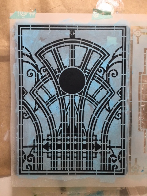
Decorative Medallion stencil to see how it worked with molding paste for texture. I loved it. So, on the other paintings and journal scattered around my table, I added the same stencil/paste combination.
The Decorative Medallion stencil, with molding paste, on a "clean up" journal page
I loooooved the stencil so much that I started testing it in turquoise and white acrylic paint around the page. I especially wanted to tone down the bright lime green corner and unite the page. In my mind, it was still a test page, so I decided to play with my stencil/mask duo, Gwen's Ornamental Compass Mask. I am new to using a mask with a stencil, so it took some practice to get the effect I wanted. I used an ochre shade for the mask, then, using a wedge cosmetic sponge and tiny dabber tool, stenciled over it with a brown chalk ink. It was looking like more than just a test page, but I didn't know what to add as a focal point or quite where to go next.
The brownish-ochre compass blobs seemed too dark and overshadowed the central textured stencil shape, so I softened the whole page by adding another stencil here and there. I used portions of the Decorative Medallion stencil with white acrylic over the compass to soften and unite the page. I loved it--I was finally getting the "Lafluerish" effect I admire in Gwen's work. But the question remained: what should I DO with the page?
The finished background was beautiful, but needed a central focus
I rummaged through my boxes of ephemera and tried out a couple items to place on the page. I considered a sepia-toned vintage family photo and some inspirational words written on a see-through paper. Nothing was quite right. Then I found a quirky reproduction of a vintage French Circus poster which was kind of odd, but kind of worked. It had been gifted to me in a trade of small artwork, and had been hiding in one of my paper scrap boxes.

Quite a few images were auditioned for use as the central focus on the journal page
After much deliberation, I decided on a strip of green paper and a
small reproduction of a vintage circus poster
A strip of greenish India-inspired commercial scrapbook paper, placed behind the circus poster, seemed to work. I trimmed the mini poster and used my brown chalk ink pad to darken the edges of it as well as the edges of the green paper strip. I still wanted to add something special, something three dimensional--however, I didn't want something lumpy that would prevent the journal from closing.

 It occurred to me that if I had a dangly piece at the bottom, instead of directly on the page, the journal would still close. I set to work auditioning my collection of jewelry parts from Gwen's website and my own boxes of jewelry components.


I chose some Turkmen Jewelry parts, and used some lime-green grommets to strengthen the hole where the dangly pieces would be attached. I used a decorative headpin that had a turn-of-the-20th century feeling, put it through the grommet, then created a loop with my jewelry pliers, and attached the Turkmen pieces. Next, I attached the circus image to the page (with dangly pieces attached) by using mini brads on each corner.


The dangly pieces can swing and pivot, which echos the trapeze artists movements in the mini poster focal point. Best of all, the journal closes flat, yet the little dangly silver Turkmen jewels invite you to open the journal and see what else is inside.


In case you were wondering what else was created while the circus page was drying, here's some of the other unfinished journal pages that I puttered with that day.


Monday, January 1, 2018

Courage to Flourish

In late December 2016, I chose the word "courage" for my 2017 word of the year. My beloved pet, Coco, had just died and we were devastated. (Here's the link to my "courage" blogpost.) There were also some serious health issues among family members, and I knew courage would be required. Little did I know that six months later I would need even more courage to face sudden unemployment when the corporation I work for reorganized and decided that they didn't need someone to write, edit, do graphic design, gather news and perform public affairs duties. I was devastated. (Here's my link to my post about the corporate downsizing axe.) But, when one door closes another opens and I found a new job. A very, very different job, but a decent job with healthcare and a pension and a degree of security, so I counted my blessings, put one foot in front of the other, and forged ahead.


For 2018, I want to do more than survive. More than endure. More than count the days until I can retire--which is quite far away. I feel like a delicate plant that was accidentally ripped out of a garden and tossed to the side like a weed. I decided to be the weed, to let myself take root where I have landed, and bloom. So, my word of the year is "flourish."

To celebrate my word of the year, I wanted to use it on the cover of the blank handmade journal that Gwen Lafleur gifted me with for Christmas. Being part of Gwen's Artist Tribe creative design team helped me get through the rough patches of 2017, so the new journal seemed an appropriate place for my new word of the year.

I decided to use some of my favorite stencils from artists Jessica Sporn, Tim Holtz and of course, Gwen. I pulled out my favorite colors of paint, some molding paste for texture, and got to work. It started off okay--a little messy, but okay. Then the colors got ugly and muddy and I was discouraged. I painted over it. And painted over it all again. And yet again until I had just a textured black page.

Here's the process I went through:


A wash of yellow ochre muddied up the design

I tried wiping off the yellow ochre with a baby wipe

I tried adding a mask/stencil combination to fix the design

Even with the addition of the mask/stencil, I wasn't happy with the design
I refit the first stencils, and tried adding a darker blue accent
Still messy, and not at all what I envisioned, and the black word is too harsh.
White gesso fixes everything, right?
Or does lime green fix everything?
I gave up and decided to paint over it with lime green. It was hideous. So, as a last resort, I covered it all with black paint. Once dry, I added a few stencils with white acrylic. When the white was dry, I covered any smears and smudges with a black textile marker.


Instead of using the handwritten word "flourish" that I had intended, I used circular mini alphabet stamps for the word, which I applied carefully to a piece of cardstock, then attached with metal brads. I liked the contrast between the feminine stencil shapes, the geometric lettering, and the metal brads. I also embraced the imperfection of both my stenciling and stamping techniques. The flip side of having a "loose hand" is that it is really hard for me to be neat and tidy.


While the black was drying, I had smeared the leftover aqua texture paste on a piece of deli paper. Once it dried, I used the leftover white paint to randomly stencil designs onto it. I liked the result. It also reinforced that I am, at my roots, a textile designer. Can't you just see this on fabric or wallpaper or as gift wrap? I used the same Gwen Lafluer, Jessica Sporn and Tim Holtz stencils I had been working with all afternoon.

With the tiny bit of blue textured paste that remained, I stenciled one of Gwen's Art Deco designs onto my new bullet journal. It fit perfectly!

  I covered the imperfections (because I am not a perfect stenciler!) with a black textile marker, then with a fine tip sharpie, added 2018 into the center circle.