Saturday, May 9, 2020

Shrinky Dink Earrings!

This post originally ran on Nathalie Kalbach's N*Studio blog on March 24, 2020. Click HERE to see that post.


What keeps me motivated to create art? New products!

For March, Nat asked us to think about what motivates us. I’m motivated by sooooo much: a shadow on the sidewalk, a pretty leaf changing colors, buds beginning to grow, architectural details on my daily walk, and advertising I see on a billboard or in a magazine. But, one thing that really gets me percolating with ideas is discovering a new product. Often, it’s a new stencil or stamp. But my latest discovery is something I totally missed in my childhood: shrinky dinks! One of my artist friends included a few sheets in a recent package, and I have to say, I’m addicted. It is so magical to watch it suddenly start to shrivel and buckle and turn into a miniature piece of art in minutes.
When I got the shrinky dink film, I thought, “Let me test that beautiful fan-shaped Van Vorst art foamie and see what happens.” It 
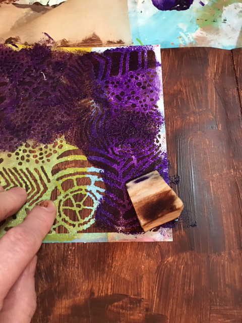
printed beautifully on the film using black Archival ink. I also tested a few stamps and stencils with both ink and acrylic paint.

I punched holes in the top center of all the stamped, stenciled and painted pieces with the idea of using them in the future to make jewelry. I heated the oven, put in my shrinky dinks, and waited for the magic.
Once the stamped film had shrunk, flattened, and cooled I painted the back of the shrunken Van Vorst pieces with white acrylic. It looked fine without painting the back, but I wanted to make the design pop a little more.

I got out my jewelry-making components and tools and rummaged around in my containers to find some earring wires that would work with the stamped design. I also selected a small silver ring to connect the fan design to the earring wire.


Carefully, I opened the small, round ring and threaded it through the fan and the hole on the earring wire, then closed it with my jewelry pliers.

Take a look at the final earrings with the art foamies fan stamp for comparison. The design shrunk to about one quarter to one third of its original size, and also got much thicker. The details of the design were even more crisp and clear.

Here’s the “how-to” steps:
1-carefully stamp the chosen design onto the shrink film. Press carefully, being careful not to slide the stamp. Lift the stamp straight up to avoid smearing.
2-cut the shape out with scissors. I cut close to the design edge, but you can also leave a little border.
3-punch a ¼” round hole near the top of the earring so that you can attach the earring wire or a jump-ring loop. (It will look way too big but once it shrinks the hole will be just the perfect size.)

NOTE: Be very careful when you cut and punch so that the ink does not smear. Hold the stamped design by the edges only.

4-bake in the oven or a toaster oven according to the directions on the shrink film package until the design shrinks. It will cool quickly. If your piece looks curved or buckled, quickly flatten with a spatula. Once it is fully cooled you cannot reheat to take out any curve or buckle.

5-attach earring components to shrinky dink artwork and, viola! You’re done.
You can also use the shrink film to make necklaces or pins—the possibilities are endless!


Tribute to Tennyson


This post originally ran on the StencilGirl blog on March 3, 2020. The theme was "poetry" and I illustrated a Tennyson poem in a journal spread. Click HERE for the link to the original post.

I was inspired by a Loft shopping bag.


Here's some photos of my process:


Romantic Triptych

This post originally ran on February 25, 2020 on Nathalie Kalbach's N*Studio blog. I used Nat's stamps on painted papers and a paper bag, plus some of my own small collages made from vintage images, washi tape, stamps and stencils.


I also made a little video that shows my process:


In November 2019, I participated in Nat’s “Deck of Cards” challenge. By the end of the month, I had 30 pretty cool pieces of artwork that were just the right size for greeting cards. I felt a little too attached to some of them to actually use as cards and send off in the mail to friends and family, so I bundled them up and propped them up on my display shelf. Here’s a few of them:

But…I wanted a prettier way to display the cards, so I hit on the idea of creating a free-standing triptych to showcase them. I had too many to display all at once, so I decided to attach little pieces of Velcro to my favorites so the display could easily be changed.

I started by mixing up my favorite shades of pink and yellow and painting some 140 lb. watercolor paper. In addition to the painted paper, I also used a piece of recycled brown paper bag. Next, I spread white acrylic onto my geli plate and picked up paint with Nat’s positive/negative Hamilton rubber stamps, then stamped all over the three surfaces. (Once the geli plate was full of marks, I also pulled prints off it with deli paper.)

Once I had plenty of printed paper, I auditioned different cards and lace to see what would work best for my triptych. I folded and cut a fresh piece of watercolor paper to the triptych shape.

Next, I glued the printed papers on and cut them to size. With a glue stick, I added some gorgeous thick lace.

The final step was attaching the Velcro dots to both the triptych and the cards.

The hardest part was finding a space in my small apartment to display my new creation!

Recycling is My Superpower!

This originally ran on January 28, 2020 on the N*Studio blog. Click HERE for the original post. I recycled a Raisin Bran box and teabags to create the box.


What’s My Superpower? Recycling!

For the New Year and new decade, Nat had us thinking about what our art superpower is. As a mixed media artist, I think of myself as a “jack of all trades, master of none” since I dabble in any and all art forms. So, choosing an art superpower was hard. I paint, draw, make jewelry, stencil, stamp, design fabrics, build stuff, putter in PhotoShop®, take photos and pretty much try all kinds of art. None of my art skills are quite at a superpower level so I was stumped. In both my daily life and my art life, I love to recycle and often repurpose bags, boxes, packaging and other materials into my artwork. With that in mind, I decided to embrace recycling as my superpower and use recycling to showcase Nat’s new stencils from StencilGirl®.
 
I save wrapping paper, newspapers, magazines, ribbons, teabags, strings, packaging materials, and all kinds of boxes, especially cereal boxes, which I often use to make journals, tags and ATCs. This time, I pulled a family-size empty Raisin Bran box out of my recycling stash and started thinking about making a gift box or Artist Trading Cube.

I decided to make a small sketch of a cube on paper to figure out how the six sides would fit together and where the folds, tabs, and cuts should go. Once that was done, I drew it to scale on the inside of the opened Raisin Bran box, designing a 4” cube. In pencil, I marked the areas that I would keep with “OK” and put an X through the sections I would cut away. I left some tabs to tuck in at the sides and top.
Using a Cricut exacto knife and my green cutting mat, I very carefully sliced the cereal box according to my plan. The 4” square box that emerged, once I cut and folded it, was a little flimsy, so I made a duplicate, then glued the colorful sides together. I also cut the interior pieces just a little smaller (about 1/16” smaller on all sides) so that there would be less bulk when I folded the sides and flaps. Once the piece was dry, I folded the box up carefully to be sure it was designed properly. (I kept thinking of those Iowa IQ tests we took in elementary school where they gave you a flat shape made of dotted and solid lines and ask you what it would be as a 3-dimensional object. My art brain was kind of exploding but I pushed on ahead.)

Structurally, it worked out well: the angles were 90 degree and it all fit together even better than I expected. No wonky edges or crooked sides!
Now for the fun part…decorating my little Raisin Bran box! I decided to double the recycling fun and glued recycled (dry and empty) teabags over the gray box shape. For this project, I used bags from black tea, but I often use turmeric tea or black cherry for color variety.

Next, I tested the new stencils. On an interior flap, I used Titanium White Liquitex Basics white acrylic and sponged it through the Art Nouveau Wallpaper stencil. I loved the effect, and decided to use that technique and stencil all over the exterior sides of the box.

I also wanted to test the new Tokyo stencil, so I taped off the section that would be the interior bottom and tested the Tokyo design with sepia Archival ink on a fingertip dauber. That looked great too, so I decided to use the Tokyo design throughout the inside.

I had a little “oops” sad moment when I realized that I had stenciled the Art Nouveau Wallpaper stencil going the wrong direction on some of the exterior panels. I didn’t mind that the left and right sides were upside down (it added a little visual interest) but the very front was also upside down!

Rather than giving up, I decided to cover the upside-down area of the front with sepia Archival ink. It matched the teabag color perfectly and covered the imperfectly stenciled section perfectly! Later, I carefully positioned the stencil (facing the correct direction this time!) and again used white paint with a cosmetic wedge to reapply the Art Nouveau Wallpaper stencil.

I glued the box and tabs together with Liquitex gloss heavy gel, used small clips and little pieces of waxed paper to keep the clips from sticking to the box, and left it overnight to dry. I also added some extra strips of teabag on the untabbed sides to reinforce the box.

It needed a closure and I thought about what style to use. I could have simply tucked the top front tab inside the box and called it done…but I didn’t.  Since the box is cardboard, I also didn’t want to use something that would wear out, shred or rip over time. The perfect solution was sticky-backed Velcro. I chose some round pieces of tan Velcro from my stash, which matched quite well. I aligned each piece of Velcro carefully, removed the backing, and pressed it in place. It worked perfectly, but I still felt it needed a little more visual interest for the closure.

One of my textile design teachers often shouted, “More is More!” to the class, and thinking of her, I decided to embellish the box further. I wanted the closure to be pretty, easy to open, but still hold securely. There was something old-fashioned about the combination of teabags with the Art Nouveau Wallpaper stencil, so I went through my electronic file of vintage images from The Graphics Fairy, printed a sheet of images sized to a 2” scale, then “auditioned” them to see which would go best with the little box.

I settled on an image of a French postage stamp and postmark—it was the right color, shape and, I think, actually from the Art Nouveau era. I wanted the closure to have some depth and durability, so I used a small piece of corrugated cardboard cut about ½” larger than the postmark design, covered it with a teabag, edged it with sepia ink, then glued the stamped postmark to the center. I attached the rectangular vintage stamp with the heavy gel at the edge of the front tab, but also added two brads for extra strength and visual interest. Finally, I darkened all of the edges of the box with sepia ink applied using a fingertip dauber.

Would you ever guess that this adorable little Art Nouveau-inspired treasure box was once a family-sized box of Raisin Bran?