Thursday, December 29, 2022

Quilted Stenciled Apron


(This post originally ran on the December 21, 2022 StencilTalk blog)

Aprons are a signal to my brain that creative joy is about to commence. When I put on an apron, my inner child starts percolating with ideas and excitement. Whether I'm cooking a meal or about to start making a beautiful artistic mess with paints, or collage, or stencils, or a gelliplate, donning an apron means I'm sliding into my happy place, and ready for some serious fun.

Tucked into my very small studio space (also known as a corner of my bedroom!) is a special box, full of fabric scraps and samples. Some large, some small, and all dear to my heart. There are tests on fabric of almost all my stencil designs. Also in the box are scraps from fabric that I designed myself and printed at Spoonflower.

Here's a few of my original fabric designs that I printed at Spoonflower on 100 percent cotton.

One of my favorite stenciled fabrics was an allover design in bright, summery colors made with some of the designs from my Wyatt ATC MixUp, Blooming Violet, and Lemurian Leaves.

This is one of my favorite stenciled fabrics. It was hard to cut it up for the apron, but fabrics are for sewing, so I sliced it into ATC sized pieces! I also used a strip of it for the neck ties.

I decided to finally do something with the fabrics and debated just what to create...a throw pillow for my couch? A patchwork teddy bear? A tote bag? A blouse? I didn't want to make something that I would wear once, then tuck away in the closet, saved for special occasions only. It occurred to me as I was putting on my apron to prepare dinner that a patchwork apron would be just the right thing.

So, the next day, I took inventory of what I had. There were lots of little ATC sized pieces from testing my Wyatt ATC Mixup stencil in dark and light colors, brights, and pastels. Since I had so many ATC sized test prints, it seemed logical to make my patchwork rectangular (2.5" x 3.5") rather than the standard square shape. Using a piece of mylar, I cut my template 3" x 4", which allowed for a 1/4" seam on all sides. I also had stenciled fabric samples left over from the clothing I made for my Wisdom Doll last year.

I got out my green cutting mat, my metal-edged yardstick, and my rotary cutter and set about carefully cutting the blocks. 

Here's the old, worn, favorite apron that my mother made years ago. I love the way it fits and feels, so I decided to use it as a pattern. 

I measured the size I would need for the top and skirt of the apron. Next, I arranged the blocks, shuffling them to get a good distribution of dark and light, while being careful not to have the same stencil shape too close to itself. I took pictures so that I didn't forget what the arrangement was.

I tried to balance the light and dark fabrics, the large and small patterns, and have variety in the colors.

Once the arrangement of the squares in rows was decided, I clipped each batch together. On the right, you can see my notes, measurements, and sketches.

Here I have more of my Spoonflower fabric yardage, and in the background, some of the cut and uncut stenciled fabric pieces.

Next, I carefully sewed the rows together, pressing the seams open with my steam iron. When the rows were done, I sewed the top pieces together, then the bottom sections.

I pressed the seams open carefully on the ironing board after stitching each row.

I used chalk and a clear ruler to mark where I wanted my quilting lines to be. It easily brushed off when I was finished quilting.

I decided to quilt the top piece; it seemed a logical next step. I used a full piece of one of my fabrics, stitched a 1/4" seam on all three sides, turned, and pressed it. I cut a piece of felt to fit just inside, pinned it in place, and stitched.

The original apron has two patch pockets, which are very handy, but I decided it would be too busy and bulky with the patchwork fabric, so I omitted the pockets from my new design.

I hung the finished top and bottom pieces from a shelf and stepped back to see how the apron was shaping up.

The old apron had a gathered skirt, so I put in two rows of machine basting across the top of the skirt, pulled it until it was the same length as the top, adjusted the gathers so that they were even, and pinned it in place. Just to be extra careful, I hand-basted the gathered section to the top, removed the pins, checked to be sure the gathers were distributed evenly, then slowly stitched the pieces together.

The backside of the apron shows my mini paisley Spoonflower fabric that I backed the quilted top with, as well as the basting on the gathered bottom.

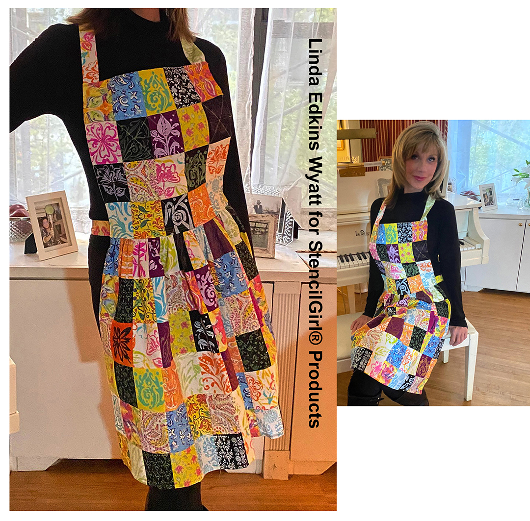
Here's the almost-finished apron. The finishing touch was adding long strips of fabric for ties at the neck and waist.

It was a bit of a happy accident that my stencil of the word ART fell right in the middle, above the waistline!

I'm really pleased with the way my quilted patchwork apron came out, and the best thing is that 100 percent ME...my own fabric designs, my own stencils, even my own pattern design. While I kind of want to save it for special occasions, I also can't wait to put it on and make some creative mischief!

Many thanks to Jeanne Waller for modeling my special creation!


Wednesday, October 26, 2022

Up-cycled Calendar Pages


One of my favorite projects for 2022 was up-cycling a calendar that arrived in the mail, unsolicited, from a charity. It was not particularly beautiful, but it was free, so I hit on the idea of using each of the 12 existing calendar photos as a background and painting, gluing, or collaging my own creations over them.

When the package of new goodies from Gwen Lafluer landed at my doorstep, I thought it would be fun to use some of her new PaperArtsy stamps from set EGL31, along with her gorgeous new embossing powders from WOW, to start on my 2023 calendar.

Here's my worktable as I was about to start testing all the stamps with black Archival ink in my art journal.

I also tested the embossing powder (EP) with a couple of my older favorite stamps to see how the colors looked.


And then I wondered...hmmm, how would the stamps and embossing powders look on black? (I felt like a bit of a mad scientist!)

I randomly stamped the geometric tile-inspired designs on black paper using VersaMark embossing ink. Next, I sprinkled the whole page with Tarnished Brass, shook off the excess, and heated it. It looked a little dark in powder form, but the minute I blasted it with my heat gun, magic happened: the color lightened and brightened, and the lines reproduced clearly. Like the manufacturer's name, the look WOWed me.

From left to right: embossing powder covering the page; images before heat was applied; the page with applications of tarnished brass and Chinese lantern.

I used Vintage Turquoise EP for the small star stamps, and also Chinese Lantern EP with the 12 small circles stamp on the black paper. Although the EP colors looked much different on black than on white, the resulting shades of blueish gold and reddish gold gave depth to the piece.

Here you can see the process of applying the different stamps with assorted embossing powders until nearly all the solid black areas were covered.

While the shades of gold and the stamp details were gorgeous on the black page, I knew I needed a central focus. I tested several companion elements: shipping tags stenciled with gold molding paste, a circular artist trading coin with the cyrillic writing stamp on a silver disc, and several stamps on black with the Tarnished Brass EP. I played around with the arrangement of the various elements until I was happy, then glued it all in place.

I debated whether to use the cyrillic alphabet tag or my own Tossed Poppies stencil on my up-cycled February calendar page.

This arrangement  of the tossed poppies tag with the embossed pieces looked okay, but I liked the final choice, a symmetrical arrangement, more.

Here's a couple close-ups of the final calendar page. I used a tag made with my Tossed Poppies pattern, which nicely compliments Gwen's new stencils. This became my February calendar page...I had already started a January page but put it aside once I started embossing on the black background!


Once February was finished, I revisited the January page. I really wanted to use the background I had started, which incorporated a silver foil paper that my friend Kimberlee gifted me with. The cyrillic alphabet stencil was still calling to me, so I used it with black ink over the silver paper.

I used Gwen's cyrillic alphabet stencil with black Archival ink over the silver foil background.

I tried out some pieces from the September Boho Vibes StencilClub set on the silver cyrillic alphabet background. Peeking out on the middle left is the pink circle stamped with the seaweed leaves, that I later added more color to and turned into a mermaid crown.

I tried the tag (which had been changed to have the color of clear, clean ocean water) horizontally with the fish and some seaweed to create an underwater mood.

With a tag I had already prepared (it was made with the cyrillic alphabet and gold modeling paste) I added a beautiful blue salvaged patina distress ink background.

Sometimes inspiration hits when you least expect it: I was killing time waiting for my computer to warm up and started adding color to a stamped artist trading coin. It was the leafy seaweed stamp on a pink paper. I used some beautiful ShinHan watercolors that Gwen sells in her shop to bring out the details and add depth. When I was finished puttering, I thought, "this would make a beautiful mermaid crown!"  I rummaged around in my stash and found a pretty face (a downloadable image from ArtTeaLife) to use for my mermaid. I used some of the ShinHan watercolor to add a neck, ears, and some extra color to the face.

I had already made an artist trading coin by stamping the fish on a blue and yellow painted circle using black ink, so I included that also.

Used together, the fish circle and the small cyrillic writing stamped on silver paper circle made a vague body for the mermaid. Finally, I fussycut some of the small stars that I had stamped on black paper with VersaMark ink and embossed with the new Tarnished Brass WOW embossing powder, and tossed them on the page to add magic.

The look was totally quirky, a little weird, and totally me!

Here's a closeup of the mermaid:

Gwen's online store is closed right now because she's traveling in India,but she'll have the stamps and embossing powders in her store mid-November...or, while she's closed, you can support one of your favorite independent art supply stores. 


Wednesday, September 7, 2022

Boho Vibes: First, Love Yourself!


While experimenting with the September 2022 StencilClub Boho Vibes designs from StencilGirl® (a beautiful mash-up designed by Gwen Lafluer and MaryBeth Shaw), the words "first, love yourself" popped into my head. Words and song lyrics often come to me as I do artworkI think making art is a lot like meditation. While I am creating something new, I'm both relaxed and inspired, operating on pure instinct, and I can really hear my inner voice
.

The starting point: stencils, paints, brushes, sponges, water, and a BIG table!
I used a haphazardly painted piece of watercolor paper, the mandala stencil, and fine black embossing powder for what eventually became the left side of the gothic arch.

After every paint session, I take a sheet of watercolor paper or an empty journal page and randomly cover the blank pages with leftover paint. It's a great way to use up paint, and gives a headstart on new backgrounds. I used part of one of those prepainted papers for the above background.

I started testing the stencils with a bunch of different colors, and settled on a blue/yellow/lavender palette. I thought I might make a greeting card with a coordinating envelope, but things just weren't gelling. The plaids I made with the ikat stencils looked masculine, and the deco/floral stencil didn't quite work with them yet. 

The randomly painted paper looked good with just one ikat stencil done in black ink
I couldn't resist adding some horizontal stenciling with Cobalt Archival ink, turning the stripe into a plaid.

So, I put the first samples to the side and decided to work in my new lapbook the next day. 

I began stenciling on a blank page spread, with shades of aqua and lavender, adding darker colors, then softening the contrast with white stencils over the top. I aimed to create a denim or indigo design, reminiscent of traditional ikat designs.

I also added some denim blue wavy lines with a posca pen. The pattern looked good, but I felt it needed more. So, using a cosmetic wedge with an cobalt archival ink stamp pad, I added the mandala-style stencil on top.

I wanted something that would harmonize with the blue shades, so I used another of the new stencil designs with black archival ink on 140 lb. white watercolor paper, then gave that an allover sheer aqua color using VersaMark embossing ink and salvaged patina Distress embossing glaze.

The salvaged patina glaze looked dark before heating, but dried a sheer pale aqua.

The deco flower during the heat embossing. The shiny sections on the top left had melted, the dull sections elsewhere had not yet melted

The deco floral shape seemed too monochromatic against the blue and lavender background.

The background with the embossed deco flower looked pretty, but a little too safe. Even "auditioning" my favorite lace on the page didn't make it exciting.

While rifling through my storage cubbies looking for inspiration, a small piece of a gothic arch from Retro Cafe Art fell at my feet, and an idea came to me. I could use the arch shape and create a "tip-in" for my lapbook! 

I took two of the pieces that I had thought were going to be made into cards—an ikat plaid of yellow, blue, lavender, and brown, plus a yellowish painted background with an embossed black mandalaand cut them to the gothic arch size.  

To further unite the colors and jazz up the very blue deco stylized flower image, I cut a circle with yellowish painted paper that had been trimmed from one of the arches, and added it to the center of the blue flower. It was looking interesting.

To avoid wear and tear on the arches, I decided to put grommets in the edges, then stitched the arches into the plaid ikat background with a beautiful blue cord from Gwen's Boho Essentials Embellishment Kit.

I left the strings of the gothic arch long, and added beads and tassels hanging off the bottom. So far, so good!

But what about the backside of the arches? They needed to be finished. So, I used another plaid, one I had stenciled on a blue file folder. There was enough of the stenciled paper to cover both sides of the back of the arches.

Above is the stenciled file folder I used on the back of the arches, and below, a photo of them cut to size and glued in place.


It was looking pretty good, but more is more, right? For the first backside, I added some vintage photos, vintage-looking French correspondence strips, and a little stamped passport circle from Gwen's EGL-17 stamp set.

For the second backside, I used a vintage image tag from The Graphics Fairy, some washi-tape faux stamps, more of the vintage-looking French correspondence, and a New York City vintage postcard.


Here are the before and after photos for comparison:

Back of the left arch, before (left) and after (right)
Back of the right arch, before (left) and after (right)


Here's the new "first love yourself" stenciled journal spread, along with some other pages in my lapbook. You can see a bit of the beaded Kuchi pendant that hangs on the outside spine, the paper doll on the large  inside spine, and a black and white page done with pieces from Gwen's  EGL-30, EGL-19, and EGL-27 stamp sets. The lapbook folds out horizontally, and is twice the width that you can see in the photo!