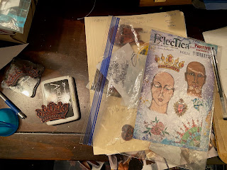
I've always been fascinated with the art on playing cards, especially the face cards. One day when I was toying with the idea of making some ATCs out of a few old playing cards, I had the inspiration to make a giant card using some of Gwen Lafluer's new (and older) stamps.
I didn't want to mess up my good watercolor paper in case I stamped a little imperfectly, so I decided to stamp a few on tissue paper, then cut out the best ones, arrange them on the heavy paper, and glue in place.
* the corner Q is from EGL16, Gwen's Art Deco alphabet
* the collar and heart: EGL36
* the crown and face are from EGL34 (I had a hard time choosing whether to use the heart from EGL34 or 36!)
* the fleur-de-lis decorative compass is from one of the earliest sets, EGL03
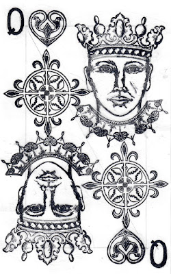
After I stamped a bunch of each of the possible designs onto tissue paper, I cut and arranged them in various ways until I found something that I liked. Below is one of the possibilities. I taped them gently in place on my paper so that I could switch pieces in and out. You can see that I had thought of using the decorative compass cut in half, and that I had trimmed the collar a bit, but left it larger in the final version.
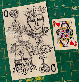
Here is the final design, and a playing card for size comparison and design inspiration.
On my almost final design, I had flipped the Q with the tail going the wrong way!
When I was done with the design, I discovered that some of the ink had smeared and gotten messy from over-handling and from the addition and removal of tape. What was I to do? Rather than starting over, I decided to scan the design, tweak it in Photoshop, and print out a clean version. The unfinished version below was printed on high quality 28 lb. laser paper. I added color with brush tipped Tombow markers and posca paint pens.
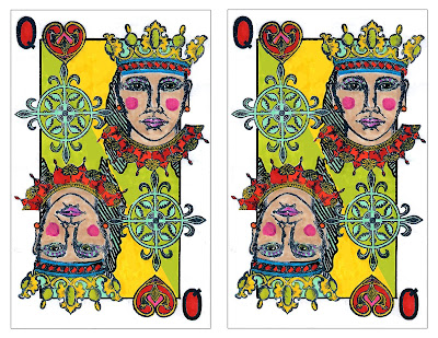
I also added some dots to indicate earrings and a striped shape to the left of the face to make the Queen a little more feminine.
In photoshop, I added a thin black border to mirror what was on the design of the small playing card and unite the elements.
I have what some kindly call a "loose hand." My inner critic just calls it sloppy. I had some trouble when I added the diagonal sections of green and yellow background color, so again I scanned my almost finished colored design and tweaked it in photoshop to even out the color and make a precise diagonal line from top left to bottom right. Below are two copies of my final 5" x 8" Queen of Hearts cards ready to print on a standard 8.5" x 11" paper.


1 comment:
This is awesome! Ironically, I had an idea to make a deck of cards, lol, because I don't think I could make it happen with what I currently have, but they would have been a bit different, mainly to create a back side, and then just cards. But what you cam up with is just awesome! I love the colors, too! Very cool!
Post a Comment