Friday, September 29, 2017

Earth Angel Warrior: A Modern Paper Doll


The things that made us happy in our childhood, when rediscovered as an adult, can be very healing and therapeutic. For me, one of the most joyful childhood pursuits was paper dolls. The fun was two-fold: they were imaginary friends that I could play with and create stories about, and they usually had a wonderful wardrobe—the kind I dreamed about owning or designing.

As an adult, I have rediscovered the simple joy of making paper dolls. Now my paper dolls are art dolls, with crazy hats, crowns, shoes, mismatched clothing, odd heads, and often wearing wings to help them soar. I search the Internet for paper doll templates and royalty-free vintage paper doll images, combining them with my own faces, fashions and magazine advertising images. I relax and become a child again when I putter with my boxes of doll arms, legs, bodies, clothing and heads.

For my latest doll, which I call the Earth Angel Warrior, I started with pre-cut doll pattern from Retro Café Arts. Some time ago I purchased (and used) their chipboard doll, but I saved the leftover cutout/negative space to possibly use as a template. I flipped over a piece of Gwen Lafleur’s gorgeous Florentine paper (which I had already glued to cardstock to give it extra strength for doll-making), then traced the arm, leg and body sections, then carefully cut out the parts.

Doll template, Florentine paper, and other supplies.
Body parts were traced on the back of the cardstock/Florentine paper.
Front of legs on left, back of legs on right.
The basic paper doll parts, made with Florentine paper.
Next, I searched through my boxes of scrap paper and doll parts and “auditioned” different elements. I also looked at Gwen’s downloadable “wondrous wings" PDF to see what caught my eye. I knew my doll would need wings, and I tried several of them, settling on some eagle wings. I sifted through my box of doll faces and found a model’s head from a magazine advertising photo which spoke to me. I also found a little piece of an orange mailing envelope and decided to use it for the torso.

I sorted through my collection of doll heads, hand painted faces and magazine photos.
The face and wings were gray-scale, and I felt they needed a bit of color, so I enhanced them with TomBow brush tipped markers and chalks. I added royalty-free vintage boots from The Graphics Fairy, and an upside-down butterfly from Gwen’s PDF for a hat, an idea inspired by artist Mary Jane Chadbourne.
The doll parts placed together, but not yet attached.
The grayscale wings and face, as well as the monochromatic butterfly,
got a color boost with TomBow markers and pastel chalk.
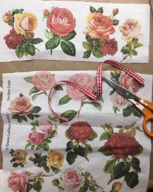
My inner fashion designer decided she needed a skirt. I printed one of the “fabulous florals” PDFs on cotton fabric, then cut a strip, stitched across the top, and pulled the strings to gather it to suggest a skirt.

To print on fabric from an inkjet printer, here’s what you do:
  • 1-Cut a section of cotton fabric about 9” x 12” and iron so it is wrinkle-free
  • 2- cut a piece of freezer paper about the same size
  • 3-place the shiny side of the freezer wrap against the wrong side of the fabric and iron until they fuse and are flat and wrinkle-free (do not use steam)
Freezer paper was ironed on to white cotton fabric in preparation for printing.
After the fabric and freezer paper were fused with an iron, it was cut to 8.5" x 11"
  • 4-using a cutting mat, metal ruler and sharp exacto knife or rotary fabric cutter, trim to exactly 8.5” x 11” so it is the size of a piece of paper.
  • 5-snip off a tiny bit at top left and right corners. This will help the fabric pull through the printer without jamming.

Snipping a tiny bit from the top corners helps the fabric feed through an inkjet printer without jamming.
  • 6-test your printer to see whether to place fabric face down or face up in the printer
  • 7-select the design you want, press print, and it should emerge from your printer
  • 8-peel the freezer paper away, and you will have the printed cloth. If desired, iron the fabric to help set the design and prevent running or fading.
Gently peel the paper from the printed fabric after it comes through the printer.
Two of Gwen's downloadable pdfs were printed on fabric.
For the doll’s skirt, I chose a section about 4” x 8.5”. Rather than keeping the skirt flat, I decided to gather the top to add some dimension. I also added, using a glue stick, a little checkered ribbon at the bottom. Glue sticks are great when using fabric with paper because they don’t stiffen the fabric or cause discoloration. I also added a little rust-colored piece of Gwen’s sari silk ribbon as a belt, which also covered up the stitches at the skirt’s top.

The top few inches of the rose-printed fabric was cut for use as a doll skirt.
Close-up of the skirt fabric, with stitching at top (to be gathered) and gingham ribbon at bottom.
The skirt was gathered at the top and fit to the doll's waist, then glued in place.
The finishing touch was a belt of Gwen's orange sari silk ribbon.
Mini brads were used to connect the body parts and enable the doll to be posed.
The final step was putting all the pieces together. Unlike traditional paper dolls that don’t have moveable parts, and have ineffective little tabs to hold the clothing on, I like to use mini brads to assemble my dolls. With an awl, I hold the pieces in place, then gentle poke through both layers to form a hold. Brads come in many shapes and sizes (like and can be subtle, or used as another design element.

The finished Earth Angel Warrior paper doll, with flora & fauna elements.

When all the elements were put together and I saw the finished doll, I realized that she was made of flora and fauna elements—with the bird wings, butterfly hat and rose skirt. While her face wasn’t traditionally pretty, it looked fierce, confident and interesting, and she seemed like a warrior. So, I decided to call her my Earth Angel Warrior. As a finishing touch, and to echo the flora/fauna theme, I put a feather in her hat and another in her hand.


 We are doing a Gwen Lafluer Artisttribe BlogHop!

One lucky winner will receive $20 Gift Card to the Shop at Gwen Lafleur Studios! All you need to do to enter is leave a comment on any or all of the blog posts during the hop - the more blogs you comment on, the more chances you have to win! (One comment per person per blog please.)
You have until Sunday, October 1st at 11:59 p.m. mountain time to leave your comments. The winner will be announced on the Gwen Lafleur Studios Facebook page (http://www.facebook.com/GwenLafleurStudios) on Monday, October 2nd.

Please visit the blogs of the other Artisttribe bloghop participants:

_____________________________________________________________________________ 
  • To visit artist Mary Jane Chadbourne's website, click here
  • For the Retro Cafe Art website, click here
  • For the Graphics Fairy website of vintage downloadable images, click here


Saturday, September 16, 2017

Stencils as Structure


Frida Kahlo journal page, made using a Crafters Workshop stencil.
When I first encountered the idea of using stencils in my mixed media work, my first thought was "eeew, no." I had the image of very stiff, uncreative, blocky, hard edged stencils, of penciling in lines and carefully filling the shapes with color, much like a coloring book.

But, as I explored the mixed media artwork people were creating that incorporated stencils, I began to get hooked. They layered them. They were sometimes sloppy (in an artful way, of course). They were shadowy. They were backgrounds, they were foregrounds. Some were detailed and tiny, some were bold and splashy.

My favorite stencils are faces. Why? Because faces are tricky. I have taken figure drawing and portrait drawing classes, and understand the anatomy and mathematics of the face and body. But for a quick midday art fix, I don't have time to waste, so using stencils to get the basic features penciled in correctly is really helpful. Getting the proportions right is important. Getting the eyes right, for placement and size, is especially important.

Lately I have been using face stencils on my lunch break, putting in the lines quickly, but going beyond the stenciled lines and giving them my own scribbly, loose-handed twist. The same stencil can look entirely different depending on the color choices, hair, media (watercolor, colored pencil, paint etc.) or background choice.

A Jane Davenport face stencil, with yellow lips and quirky eye makeup.
Jane Davenport's "Tilted Up" face stencil, with loose lines and wild hair.
Another Jane Davenport face stencil, with colors that reflect the medical greens and blues I see on a typical workday.
These faces were done on cardstock in my handmade journal. While cardstock isn't as great for watercolor as good watercolor paper, I like it in journals because it is strong, inexpensive, and works well for collage and also for stamping and stenciling.

Many of my Jane Davenport face stencils are from Artistcellar, and sadly, have been discontinued. However, Jane has her new line of stencil available at Michael's, and Artistcellar is about to debut a new line of Kylie Fowler face stencils, which I can't wait to try.

Friday, September 8, 2017

Tea Rose Khadi Journal


Shabby-chic faux-lace tea and roses Khadi journal cover
It's not easy to find the perfect art journal--you have to consider the size, shape, weight, and most important--the kind of paper. Lately I have been loving square journals. Maybe it's the influence of Instagram, with it's square format, or maybe it is just that I am a true Virgo and love all things neat and regular.

When I saw the Khadi art journal on Gwen Lafleur's website, it called my name. Not only is the shape, size and weight perfect, but the paper is high quality, handmade watercolor paper.

unadorned Khadi journal
The blank pages stared back at me. Putting the first mark on a new journal is a little scary--it makes a statement, sets your mood for future pages. I decided to go with one of my favorite techniques for the cover: printed teabags. I use teabags a lot in my art. They give plain white paper a quick and effective aged effect. When I use stamps on them (with white printmaking paint) the effect is of aged lace...I call it "faux lace."

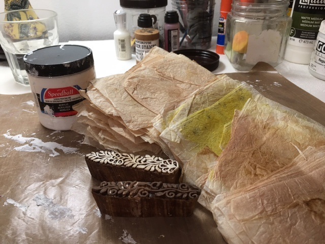
Mini border wood blocks, teabags and printmaking paint
I gathered my supplies for the project: a collection of dried, empty, open teabags, my favorite white printmaking paint, and two of Gwen's woodblock mini border stamps. (Be sure that the teabags are brewed plain--add your sweetener, milk or lemon AFTER you have removed the teabags.) For this project, I used a combination of Earl Grey and plain Lipton tea. (Teas with rose hips gives the paper a nice pink color, and ones with turmeric are a beautiful yellow.)

Two mini border woodblock stamps, with white printmaking paint applied to one stamp.
First, I painted the stamp with white printmaking paint. Next, I draped the teabag over the stamp and gently pressed until the design showed through, then carefully peeled away the printed teabag. (For teabags, this method works better than flipping the block and stamping onto the paper.) Periodically I used a baby wipe to remove the paint from my fingers. Since the teabags are very thin, the paint seeps through a bit, so clean hands lessen the chance of smudges.

Above, the teabag has been gently pulled off the stamp, revealing the print on the right.
Below is the group of printed teabags that I used for this project. I tried my mini border stamps in all over patterns, stripes, alone, as a border around a teabag, in a fan shape, and in the center of some of the smaller teabags. (If you would like to read more about printing teabags to create "faux lace", there is a tutorial on my blog and the link is here.)


Once they dried, it was time to get started thinking about the arrangement. I fiddled with them until I found a design I liked, and took a quick photo with my iPhone. Next, I set about adhering the printed teabags to the Khadi journal cover.

First I spread a thin layer of Liquitex matte medium all over the cover with a credit card. (I keep a container or baby wipes handy to wipe the excess off my credit card as well as my fingers. I also like to use a non-stick surface under my project.)


I added each printed bag one at a time, smoothing it out with the credit card and occasionally with my fingers, and overlapping them a little, then adding some extra matte medium on top, which I smoothed out with a credit card. I used my heat gun to speed up the drying process.

The first teabag has been placed on the journal cover, with a dollop of matte medium waiting to be spread on top.
This is the journal cover about half way through the process of gluing on the teabags.
The last, and center, printed teabag has been placed, and a squirt of matte medium will be spread on top.
When the printed teabags were all in place, it was time to think about embellishment. I tried out a few ideas, and decided on using some roses from Gwen's downloadable pdf. I selected a few, and "auditioned" them for placement on the cover. The roses looked sweet and went well with the vintage effect.


I decided that the background was too stark white, and needed to be aged to go with the vintage look of the teabags. So, here's what I did: first, I gently tore the edges of the paper, because a torn edge is softer than a cut edge, and I was going for a soft, feminine, vintage look. Then I rubbed on some antique linen Distress Stain, intentionally making the white areas blotchy and uneven, and bringing the stain up into some of the flower petals. Last, I took a mini dabber and applied some sepia distress ink and archival ink to the edges and here and there on the white paper.

Then I decided where to arrange the flowers on the cover, and used a glue stick to adhere them. Since I had printed the roses with an ink jet printer, I was worried that the Liquitex matte medium would be too wet and the roses might run and bleed.


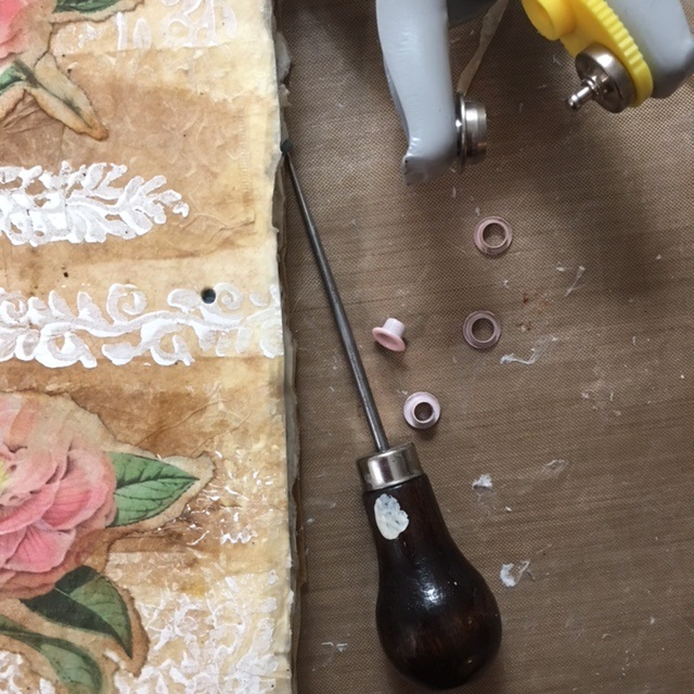
I was almost done, but I needed a closure of some kind. After some thought, I decided to use grommets and ribbon. With an awl, I poked a hole near the center right edge of the cover, then snipped it a little more to be just about the size of the grommet. I inserted the little pink grommet in the hole, pushed the smaller part onto the back, arranged my grommet tool over the pieces, and squeezed to secure it.


 For the back of the journal, I used plain teabags. I put a pink grommet midway down the left side of the back of the journal. After "auditioning" several kinds of ribbon and fiber, I settled on some pink and green dotted ribbon that had been in my "stash" for years. It was just the right shade of pink, and the green was a pretty good match with the rose leaves.

Here is the finished journal, open:


...and here is the finished journal closed and tied. When I look at the journal, it evokes a nostalgic feeling, and reminds me of my grandmother and the flowers growing around her old country farmhouse, and brings back happy childhood memories.


Saturday, August 19, 2017

I'm Part of Gwen Lafleur's Art Tribe!

This week's exciting announcement was the debut of artist Gwen Lafleur's first design team, which she calls her "art tribe." And guess who is part of the tribe? Yes, me! I am super thrilled to have a chance to play with her amazing papers, stencils (she is one of Stencil Girl's designers), trims, washi tape, stamps and journals, as well as her unique jewelry and decorative components from around the world.

The first items I had access to were some downloadable pdfs of butterflies, flowers, birds and animals. Butterflies always make me feel happy, so after a bad day at work, puttering with some butterflies and using them to enhance some previously ho-hum ATCs made me feel a whole lot better.
Some blah ATCs got a boost with butterflies from Gwen Lafleur's downloadable collection of pdfs
While I waited eagerly for my package of Lafleur goodies to arrive, I kept busy with journaling. I took the little journal I made last weekend to work, and pulled it and my watercolors out on my lunch break. I lightly penciled some old Jane Davenport stencils on the page, and painted for about 20 minutes. At home, I took a few more minutes and added stamps, handwritten thoughts and other accents to complete the pages.

Lunch time journal page before stamps were added
Journal page with Michelle Ward's Greenpepper Press stamps added
Lunch time journal page before stamps were added
Journal page with my own hand carved stamp and Michelle Ward's Greenpepper Press stamps
Lunch time watercolor with handwritten thoughts about starting a new job in a new place and missing my old work friends
Lunch time watercolor with unnatural face colors
Finished journal page with washi tape necklace and third eye from Gwen Lafleur's collection. Hand writtten thoughts were also added.
If you didn't see the announcement about the new Art Tribe on Gwen's website, here's the link. I am super excited to start playing with all the new art materials, and also curious to see what my team members will create.


Saturday, August 12, 2017

Making a New Accordion Journal


New handmade Accordion Journal, covered in fabric I designed and printed at Spoonflower
Finding just the right journal isn't easy, even with the multitude of styles available in art stores and business supply stores. For me, there are many factors: size, shape, weight and paper quality. For journals that I keep at home, weight doesn't really matter. But I have been looking for a little journal to tuck in my tote bag, one that I can use on my lunch hour or pull out when I have a chunk of unexpected free time.

Recently I found a journal making kit in an art supply store that looked just right. Small, lightweight, and since I enjoy the bookmaking process--fun to make. But when I opened the package, I was seriously disappointed. The paper was super flimsy, and no good at all for paint. The book spine was flimsy. There was no fabric or paper included to cover the book, and not much thread for binding. I debated about returning it, but didn't want to lose a couple hours going back to the store, waiting in line, and coming home.

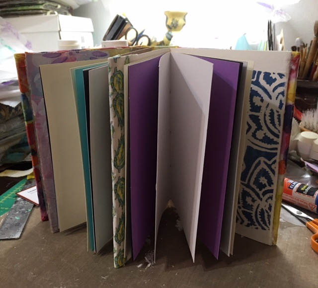
So, I took the two heavy cardboard cover pieces and decided to make a new journal with them, using cardstock that I had on hand, and my own fabric as a cover. I cut a new spine from some heavy cardboard I had on hand, and cut a long, long rectangle to accordion fold and stitch my page signatures into. I used a method that I learned a few years ago in a class I took with Kelly Kilmer at Ink Pad NYC. Here's a link to another book I made with the method.

Step one was cutting the fabric and making sure I had enough to cover the edges and glue to the reverse side.


Next, I went to work on folding the long paper that would hold the signatures, I cut the paper to the size I wanted, put them together into signatures, and stitched them into the long folded paper.


The inside cover needed a book plate, so I chose some deli paper that I had painted and printed with one of Nat Kalbach's positive/negative art foamies. I also rifled through my scrap boxes and chose some paper and fabric scraps to cover the first page of the accordion.


Here's what the finished book looked like open and closed:


Now that I have made my new journal, I discovered what looks like the perfect little journal that I can use on my lunch hour. Artist Gwen Lafleur has a fabulous website with all kinds of unique trims, washi tape and embellishments. I have my eye on a little journal that is 8"x8" and has beautiful sheets of watercolor. Take a look at her website--the art eye-candy is plentiful and there are so many intriguing items it is had not to want it all!

Sunday, July 2, 2017

Turning Over a New Leaf

Doodles, doodles, doodles. I am constantly doodling flowers, leaves, geometric shapes, alphabet letters, names, and faces. I often collect my doodles and turn them into a design, or just tape them on a journal page for later reference.

After I doodled a leaf on a little blue sticky note the other day I realized the symbolism--I am actually in the process of turning over a new leaf--a new job, new duties, with a new location, new co-workers, a new commute--so what could be more appropriate than a journal page about turning over a new leaf?

Then, yesterday morning, I got a package in the mail with some art trades in it, and the trade hostess had included some little cutout pieces of...guess what?...leaves of course. So, I painted them green, and also used them as a stencil while I was painting them.

I was in love with my old journal. It was square, which is perfect for Instagram. Perfect for a Virgo who likes everything neat and square and tidy. But the new journal is a horizontal rectangle, which has me less in love with it than my old journal. Previous to the square journal, I used, or made, journals that were rectangular, but vertical.

So, I decided to create a square space on each page of my new journal, and either leave the extra space blank, or do something unrelated in that space. Sometimes I incorporate it into my design, sometimes not. On the page below, I put the blue sticky-note on the top right, and underneath, some of the little stencils of the cutout leaf shapes I received in the mail. The main design is on the left. I started with a page painted in a bright yellow--one of my favorite colors.

"Turning Over a New Leaf" journal page
 I used acrylic paints, paint pens, and Jane Davenport paint-over pens. Once it was dry, I added white printmaking paint with a Nathalie Kalbach Versailles art-foamie stamp around the edges.

When I was done, I realized it was strikingly similar to a design I made several years ago and turned into fabric. Here is the link to the fabric I designed a couple of years ago, and the blogpost about it. Not only do I keep doodling the same thing, I also seem to choose the same color combinations. I guess they are my happy shapes and colors.

Below is an art journal page that I did a few days before the "turning over a new leaf" page. Again, I used the happy yellow acrylic in the background, then added whimsical vintage paper doll parts, a model's face from a fashion magazine, and some of my own fabric scraps. I finished it with some handwritten words, a Retro Cafe Art solar flare stencil and Artistcellar inspirational word stencils.

"Riding the Waves" journal page
I realized recently something I have always known, but had forgotten: that I love not only making art, paintings, and designing fabrics, but I love turning them in to a useful, beautiful end product. Below I took some paper I had designed in Photoshop and output with a color laser printer on 8.5" x 11" paper, and, using an old envelope as a template, cut, folded and glued my own envelope. I added paper scraps and assorted washi tape. I used the fancy envelope to send out my folding ATC doll to the winner of the Paper Traders June "winner take all" ATC lottery. Here's the link to last week's post in case you were wondering what is inside the envelope.

"Mail Art" handmade envelope