Saturday, April 16, 2016

Cloth Paper Scissors Stencil Challenge

My original stencil design that appeared in Cloth Paper Scissors May/June 2016 issue
In the fall of 2015, Cloth Paper Scissors magazine announced a "make your own stencil" challenge, which was right up my alley. I sat down on Halloween with some heavy cardstock and came up with a 6" x 6" stencil, which I then experimented to try and come up an interesting art piece. The easy part was designing the stencil--I have a lot of swirly shapes that I constantly doodle, so I just let the design flow from my subconscious to my pencil, then carefully cut it out.

Once the stencil was cut, I tried making some art using a few of my old favorite techniques, and they were pretty underwhelming. Not really bad, but lackluster.

Hand-cut, original design stencil
Tea bags stamped with white printmaking paint, pencil, white acrylic and lace
were used for this interpretation of the stencil design. 
The background was done with watercolor and water-soluble colored pencils.
The stencil was printed using white crackle paint.
Feeling really disappointed, I grabbed my journal and decided to just do any old thing in it to let out my frustration. I opened to a piece of dark turquoise paper, and angrily grabbed a purple marker and the stencil, traced around the outline with the fine tip of the marker, then used the fat end to fill in the shapes. I also accidentally used the stencil upside-down from the way I had designed it.

On my table were some pretty scraps from other projects, so I pulled a few pieces, glue-sticked them on. It started shaping up into something kind of interesting. I used painted newsprint, tea bags with white paint stamped on, and washi tape. Next, I used one of my favorite stencils--a piece of an old touch-tone phone pad, and made scribbly squares with a white signo pen. I added some extra splashes of white paint with a dry-brush technique. The words, about following your instincts and written with a ballpoint pen, came to me as I was working. I really liked my journal page, so I decided to do something similar in a 6" x 6" format for the reader's challenge.
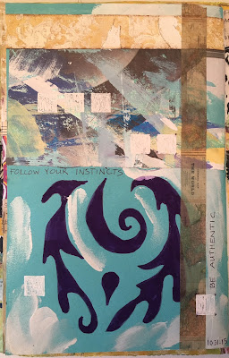
An experimental journal page led to the creation of the 6" x 6" piece
that appeared in Cloth Paper Scissors.
On the 6" x 6" piece, the purple marker was a little lighter and redder, and I added some black dots with a Sharpie to mimic stitching. I also added some brass-colored mini brads to repeat the dot idea and add texture.

Needless to say, I was thrilled when I saw my name on the list of finalists on the Cloth Paper Scissors blog. It is especially gratifying to have my work selected for publication because I switched from being a mostly fiber artist/art quilter to doing mostly mixed media--and on a much smaller scale--a few years ago. My a/c joint and shoulder are damaged, and it is painful to cut and sew through layers of fabric, batting, and backing. It is also painful to draw or paint directly on cloth, so now I use soft paints, pencils and pens and avoid cutting through heavy paper. While art is art and design is design, the learning curve is, and was, steep for mixed media. There are so many products and techniques to try, to test, and to explore, so I have years of fun ahead of me.


Tuesday, April 5, 2016

Muse-Scribe-Angel Painting Tutorial


The idea of painting some kind of angelic being that hints at a past life has been in my mind for a while. For years I have thought that if we have lived past lives, I would have been one of the monks in a Medieval castle or monastery who drew the big letters and decorative items in the pages of illuminated manuscripts. I always pictured myself the artist, but lately I think I was also a scribe. Not the writer of the manuscript...that would have been some kind of monk or holy leader, but I may have been the one who took down the words. Why? It's what I do. In my heart, I am an artist. I love paint, and color and design. But on a daily basis, at work, I am appreciate for my gift of language, for writing, editing, and proofreading, along with the design work. So, on my art staycation, I decided to paint. Of course, the picture in my head looks nothing like what came out. No one can see that image except me.

step 1, sketching the face

step 2, adding a little color and blocking out white spaces for the wings and body
step 3, more color and shading
step 4, more face details

I started with printouts of my Jane Davenport DVD on painting whimsical faces and did the face step by step. It looks a lot like the faces I have done in the past using her method. Here is the first Davenport-esque face.  Here is my yellow Davenport-inspired face.  But then I added wings, and a body and some background.
step 5, face is almost finished and wash of antique linen Tim Holtz distress stain in background

I thought about stopping at step 5 or 6. But, I wanted to add text to express my feelings about a past life.
step 6, a wash of pink acrylic was added to give femininity

I thought since the mood was about illuminated manuscripts, some gold was needed. I put it mostly on the top to hint at a halo effect.
step 7

step 8

I put some deli paper over the painting, deciding on the shape and placement of the words. Next, I used some old fashioned carbon paper in between the deli paper and the watercolor paper and transferred the words onto the painting. Finally, I used a calligraphy tipped indelible marker and wrote them on the design. 
step 9

The words seemed too bold so I added washes of color to tone them down and try to visually separate the wings from the body. It still seemed stark, so I decided to add my favorite stencils. Using a foam roller, I applied thick white acrylic to two of my favorite commercial stamps that had a bit of a Medieval feel to them. I also added some distress inks in golden brown, dark brown and sepia shades.
step 10

With brown distress ink, I added a hand-carved heart in the throat space, where there might be a dip in the neckline or a hint of cleavage. I also added the heart in the top left corner and in the middle of the right edge. A little indigo color was added at the bottom left and some brown tones to the space between the head and right wing. I thought I was done at this point, but hung it on the wall (with tape) temporarily to live with it and see if it felt finished.
step 11-final
After a while, it seemed that the words were too bold still. I wanted to be able to read then, but then I thought, "What the heck, who cares if someone else can't read them? This is for me, and I know what it says." So, I used thick white acrylic paint and a flat thick brush and pulled long strokes down the front of the dress under the heart, and also here and there on the sleeves and wings, intentionally achieving a dry-brush effect so that some of the words would still be visible. The question with art, for me, is often: "Am I done? Is it finished?" If I can't think of anything else it needs, and I like it, it is done. It was starting to get a little "muddy" so rather than risk unintended muddy sections, I called her finished.


Monday, April 4, 2016

Printmaking and Painting and My Art Staycation

Today officially starts my week-long  ART STAYCATION! Unofficially, it started Saturday morning. I pulled out most of my art supplies and scattered them around the living room in organized chaos. Saturdays seem to be the day when I just create a mess, painting backgrounds that don't look like much, pulling prints off my new gelli plate, cutting, measuring, mixing and splattering. On Sundays, I am more rested and often manage to figure out a way to pull the unrelated art bits into some kind of unified piece. Sometimes it is just a little edge of a print that becomes an ATC or a tag.

Collage with Gelli printed deli paper and stencils, assorted papers,
vintage royalty free images and printout of original drawing

Collage using vintage magazine ad, stenciled
Gelli printed deli paper and assorted papers


For my staycation, I have a few plans. One is to work on my faces using the Jane Davenport method. I have a vision of doing something bigger than an ATC, incorporating angels and wings and Medieval illuminated writing on it. I have sketchbooks and journals full of ideas that I scribbled down in moments of inspiration, so I will pull them out and see if anything turns into a solid idea.

Layers of Gelli-stencil deli paper prints, thermofax prints and assorted papers
I hope to pull my 6x6 series from the Julie Balzer workshop into one piece, maybe even hang it on the wall. Strangely, our walls are kind of empty, and my husband keeps saying: "Why don't you hang some of your work up?" Why indeed? Well, much of it is in art journals--can't hang them very easily. Some pieces are too personal, too in-your-face and I don't want to look at them every day. Some of them remind me of where I have been, emotionally, and looking at them evokes feelings I don't really want to revisit.

There's a couple unfinished projects on the horizon: my finishing the hand-quilting on my grand-niece's handmade fabric piece, repairing broken jewelry--some commercial and some handmade. Then there's the canvases...I made a "junque journal" in a Julie Balzer class, which is now so fat it will hardly close. So, I need a new one. I had some painted canvases that were intended to be covers for the first journal, but they weren't quite right. So, yesterday I gessoed over them. I had used some fiber paste through a stencil, and the gesso didn't cover it, so I used molding paste on top. Still didn't cover it. So that's a back-burner project in two parts...making the canvases look okay, and putting them together into a new journal.

Here's the 2"x3" printmaking experiments from yesterday. Two will be traded, one is a "keeper" and the rest will go in the nowhere land storage bin and either be reworked, added to another project, or used for an emergency greeting card.