Saturday, March 28, 2015

Tea Bag and Vintage Photo ATCs


For several years, I have been experimenting with using dried, empty tea bags in my art. I used to print on them using stamps and white printmaking paint, but decided to see how using stencils would work with the white paint and teabags. The short story—great!

I started with some ATC blanks—I like the Art Canvas ATCs from USArtquest, which are lightweight and strong. I coated each blank with matte medium and gently placed the teabag on top. I pulled the bags carefully around the edges of the card, folding the corners so there would be no lumps or puckers, and wrapping them around the back.

The color of the teabags varies according to brewing time and type of tea. Ordinary tea gives a nice warm brown, and I love the Yogi tea called Muscle Recovery, which gives a pretty yellowish color. There are often happy accidents with staining on the folds that gives interesting texture to the bags.

I added an extra layer of matte medium on top of the bags—I was afraid that the wet paint might cause the bags to “grow” while I was stenciling, but the top coat of matte medium prevented any puckering or growth.

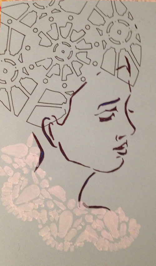
I tested three stencils: Balzer Flower Piecing, Balzer Deco Doily and Crafters Workshop Mini Damask. Two of three worked well, but the mini damask was so delicate that the thick white paint smeared and blobbed—most likely the fault of the sloppy artist more than the stencil. I wiped off the excess paint off the card and moved ahead anyway.

On the flower piecing card, I added a small vintage photo of my mother that had been output on printable cotton, and surrounded it with lyrics from of John Lennon’s “Instant Karma.”

For the doily stenciled ATC, I used the same photo and more Instant Karma lyrics, but arranged differently. For the ATC with the smeared stencil, I adhered a small image of my parent’s wedding photo (December 1945) with matte medium. The photo had been output in sepia tones on Extravorganza printable silk and was very delicate and sheer. I added a piece of lace at the bottom, and with a silver mini brad, attached a cross and an appropriate quote on love from a Yogi Tea hangtag.


Saturday, March 21, 2015

Explore Hidden Corners


Creating unplanned collages in a journal is a practice that is good for the soul, and something that I need to make time for daily. It is very freeing to just grab four or five unrelated papers and randomlyusing matte mediumglue them onto a blank page. You never know where it will lead, how it will turn out, and what thoughts and emotions it will evoke.

I rummaged through my scrap box and chose a few background papers, and selected a couple others for a possible central figure. Step one has a section of a magazine ad and some vintage paper that had accidentally been sprayed with lime and turquoise Dylusions ink while working on another project. At the top, I added a piece from a magazine story on decorating and fabrics.

I love butterflies, so the central figure is a royalty free butterfly from The Graphics Fairy. The page began to feel like I had opened an old trunk in the attic of grandma’s farmhouse, so I added a lacey Victorian effect with white printmaking paint through an old Crafters Workshop stencil. To add to the old attic feeling, I dabbed on antique linen Distress Stain, which enhanced the aged appearance of the newsprint.

Thinking of old houses and attics, the words “explore hidden corners” popped into my head, so I used tiny alphabet stamps with a black archival ink pad to write the phrase. Next, using a Pocket Stencil, I added the word SEEK in two places using a fine black pen, gray Tombow brush tip marker, pencil and white Signo pen. One of the SEEKs changed color from light to dark, and the other faded from dark at the top to light on the bottom.

The final touches were some white dots, some black and white random triangle created with the Harlequin stencil, and a strip of butterfly washi tape on the bottom.


Saturday, March 14, 2015

My Stuff Your Stuff ATCs for Paper Traders

The latest Paper Traders Yahoo group challenge was called My Stuff Your Stuff. We each stuffed a business sized white envelope with ephemera, mailed them to our partners, and made two atcs using their stuff, which we then mailed back to our partner.

My partner was Nancy, and she sent me some beautiful papers, vintage images, lace, old game parts and some circus themed items.

Here are the two atcs I made with her goodies.

I used her papers for the background on "imagine" but aged it with a distress stain. Next, I stamped sepia distress ink on with a favorite swirly stamp, and a little fleur de lis stamp. After it dried, I added gold paint through a harlequin stencil, and gold dimensional paint dots. The edges were aged slightly with a brown chalk ink stamp pad rubbed gently along the edge.

The baseball themed card started with some fancy paper that came in my surprise package. I added strips horizontally and vertically of two other papers. The central figure was cut carefully from a postage stamp. Again I used the harlequin stencil, but just a few to suggest a baseball diamond. They were done with a pencil outline and filled in with a gray TomBow marker. The words were cut from some play money, just added for visual interest.

Faux Raku Recycled Jar


Recycled Body Butter skin cream containers make great homes for little art supplies. The large size from the Body Shop made a great home for my teeny alphabet stamps—I had about four sets in various fonts that fit nicely into the beige plastic jar.

At first I just taped the stamp label to the top of the jar…but it looked sooo ugly on my art shelf. I recently decided the time had come to kick it up a notch. Using a generous amount of matte medium as an adhesive, I started by gluing a pretty beige and white  vintage papercompliments of my friend Susan Morgan Hothonto the jar’s lid, side and bottom. Pretty, but once it dried—lumpy. Maybe I hurried, maybe I used too much matte medium, or maybe the paper was too thick and stiff.
 
Instead of ripping it off, I decided to try and camouflage it with Dina Wakely Crackle Paste. I selected the Garden Gate stencil, applied the paste, and waited a couple hours. It was worth the wait. When the paste dried on the jar, the effect reminded me of raku pottery. I rubbed on some antique linen Distress Stain and brown chalk ink to enhance the crackle.

 I wasn’t sure about the treatment of the side of the lid. It would have been awkward to stencil it with the crackle paste, and might have worn off over time from twisting and handling.

A light bulb went off in my head—washi tape would do the trick—and what could be more perfect than alphabet washi tape? I wouldn’t need a label because the alphabet tape would remind me of the alphabet blocks inside the jar. The tape was just the right width to fit on the lid's side, and should also be durable.


Sunday, March 8, 2015

Retro Modern Woman

 
Artistcellar.com carries a wonderful selection of Jane Davenport face stencils. A lot of people—artists and non-artists alike—are uncomfortable drawing faces, and using one of Jane’s stencils is a good way to get over the “fear of faces.”
 
This journal page began with the Jane stencil called “side.” I used a fine black pen to trace it onto my light blue cardstock journal page. The stencil allows the hat/hair and clothing choices up to the artist.
 
I decided to start the design by stenciling a soft collar on the woman, and used the Balzer Deco Doily stencil and a white paint marker for a soft, turn-of-the-20th century lace collar effect.


The next issue was the top of the head—hair or hat? I was thinking about the contrast between what is on the outside of a person and what is on the inside, and tried a steampunk lace stencil to imply a brain churning with ideas.


She began to look like a weird retro sci-fi woman. I added color to the face and head with the white paint pen and brush tipped markers. To further illustrate the sci-fi idea, I added gears from the steampunk pocket stencils, and a few shapes from the Garden Gate stencil.


The last addition was words—small words, printed on Avery clear mailing labels were added, along with the inspirational pocket stencil word BELIEVE. Last, I hand-wrote the word “dream” on the right side of the page. My aim was to illustrate the many women—past and present—who are stronger and smarter on the inside than the soft, feminine façade the world sees at a quick glance.


Sunday, March 1, 2015

Splatter-Technique House-Shaped ATCs

The PaperTraders Yahoo trade group never seems to run out of good ideas and new ideas. One of their newest challenges was to make house-shaped ATCs using the splatter technique. For a sloppy artist like me who is often making splattery messes, it seemed a natural fit.

Splattering on purpose instead of accidentally had me going back to my early FIT days when I was studying Textile Design, and I took a class called "Painted Wovens." We had to paint very precise stripes, then, at a perfect 90 degree angle, splatter areas carefully to create the same visual effect as a woven plaid would.

I rummaged around in my bin of brushes, and found that--luckily--I still had my Lactona brand toothbrush, which creates a very delicate splatter.

I splattered a variety of papers, including vintage magazine print, glossy fashion magazines, and painted watercolor paper.

I went online and found some cute houses, shrunk them to 2.5" x 3.5", and cut them to use the parts as templates. Next, I cut pieces of the splattered paper and fiddled with them until I got an arrangement I liked. the details were added with white and colored pens, cherry Ricola wrappers were cut to give the little red flowers, and on some I used a mini-brad as a doorknob. I also added, for visual interest, some inspirational words that had been printed on Avery clear mailing labels and some dots, made by punching out little circles of splattered paper.

I made five, kept two (usually I make extra, then keep my very favorite and the one that I think is the worst), and have three ready to trade once the partners are announced.

"The Bridge" ATC Dolls


This summer, there was a new TV series called “The Bridge” that premiered on FX in July. Somehow my local deli ended up—in August—having coffee sleeves advertising the show. I loved the graphics, and the faces reminded me of Starsky & Hutch, from the 1970s TV show. I collected a few of the sleeves and tucked them in my art bin.

This fall, we had an Artistcellar ATC trade through Facebook. I was a little ATC stenciling maniac one Saturday, and made about 40 different ATCs. I traded five and tucked the rest into my art bin for future use. I used many stencils, including the Harlequin, Sunny Compass Rose, Mini Chakras, and pocket stencil words.


 On a recent day off, I pulled out my art bin and rediscovered the unfinished Artistcellar ATCs, a bunch of other unfinished work, and the coffee sleeves, so I decided to combine them.

First, I carefully cut the coffee sleeve so each face was separate. I used pieces from the backside of the coffee sleeve to create necks, and glued them to the faces with matte medium. I added a little packing tape on the back for extra strength. Next, I trimmed the faces down, but left the orange road to suggest a beret. That looked a little strange, so I decided to go really strange, and added crazy hats.

I called the face with the moustache “Starsky,” and gave him a body from one of the extra Artistcellar ATCs that I didn't trade in the facebook exchange. The ATC was created with a Photoshop collage of Graphics Fairy butterflies, which was printed on cardstock. I overprinted it with pocket stencil inspirational words, and flipped the stencils over to create a word shadow in a different color. The head was out of proportion to the body, so I went with the weirdness and gave him tiny child-sized vintage arms and legs from Graphics Fairy royalty free images, printed on cardstock and attached with mini brads.


Doll number two was, naturally, christened “Hutch.” He was awarded a crown, Graphics Fairy vintage child paper doll legs, and arms from a Disney prince. The body was a leftover ATC from a 1960s themed trade—it has a graphic image from a concert poster and a few of the lyrics from the folk/rock anthem “Woodstock” that were combined in Photoshop. Both ATC bodies were edged with brown chalk ink to give a vintage effect.