Saturday, November 12, 2016

Up-Cycling Leftover and Imperfect Artwork

I used to open the refrigerator and look around for something to eat for dinner and close it saying: "Nothing good in there to eat." But my roommate Susan had a knack for cooking, and would rummage around and turn the leftovers into something delicious. Our deal was that Susan cooked and I did the dishes...we both thought it was a good deal.

In the past few days, I decided to apply Susan's creative cooking technique to my art stash and UFOs. First, inspired by a class I took with Julie Balzer, I made a new Junque Journal. I alternated pages of painted deli paper (doubled together with matte medium for strength) with really pretty commercial 12"x12" scrapbooking paper. I decided to try machine binding the pages because I had a shoulder injury and hand stitched binding would have been painful.

Here is the cover I chose: painted deli paper with 6" Artistcellar chakra stencils. (Artistcellar also makes small chakra pocket stencils) The spine was created with some old hippie style trim I purchased years ago on sale. Not a perfect match, but not too bad, and since it is a Junque Journal, it didn't matter.

"Junque Journal" with cover made from painted delipapr and Artistcellar Chakra stencils
The first page I worked on has a beautiful fashion figure that was an illustration in a recent FIT Alumni News magazine. It reminded me of why I came to New York, how much I wanted to be a fashion designer when I was young--but afraid to try, afraid I wasn't any good. I eventually ended up going into the fashion business and found my niche as a fabric designer. It was an uphill battle against parents and teachers who had other ideas of what I should do with my life. I wrote my memories on the page with white and purple ink.

An illustration from FIT's alumni magazine sparked some memories, which are written on the journal page.
A few days later, I decided to use up small ATCs and scraps that were too pretty to throw out, but not quite pretty enough to trade with my Paper Traders yahoo group. Adhering them to some Retro Cafe Art mini gothic arches gave them a new look. I made a duo and a triptych, and hinged them with 1" pieces of elastic and mini brads.

Leftover, imperfect ATCs were used to create this butterfly themed gothic arch mini triptych.


Leftover and imperfect ATCs were the base of this mini gothic arch duo.

On Election Day, I decided to use up some splattered watercolor paper that was hanging around. I cut the pages in half, then folded them, stitched them, and viola...I had a new mini journal. It needed a little something on the cover, so I grabbed my favorite Artistcellar pocket stencils, some Michelle Ward NYC urban-themed stencils, some ink, a cosmetic sponge wedge, and just played. Little did I know that the words I stenciled would have even deeper meaning as the election results began to come in.

This mini journal has 4.5" x 6" pages, with a simple stitched binding.


Monday, September 26, 2016

Arty Envelopes: Making Ordinary Items Beautiful

Mail Art. I love receiving beautiful, hand painted envelopes, especially when they have international postmarks and stamps. For a new Paper Traders exchange, we will be trading decorative envelopes.
Front of a finished envelope
Using a favorite size envelope as a template, I traced the shape on several pieces (double thick) of painted deli paper. They looked pretty good just with splashes of color, but I went another step and added stencils. 


I also was required to add a mailing label, which changed the whole look. To offset the big chunk of white in the middle, I added strips of other designs, washi tape and stamping.

.
Mail Art envelope: painted deli paper, stamps, stencils, paper strips, newsprint.


For other envelopes, I used some ho-hum leftover artwork, traced on the template, and cut to size. Once it was cut and folded, a sort of boring design became a very striking envelope. I especially liked the NYC stencil, from Michelle Ward's exclusive collection at The Ink Pad NYC.

Stenciling experiment
Artwork cut to envelope template shape
Back of finished envelope

Saturday, September 10, 2016

Just Paint

Back in college, there was a professor who taught a course called "The Teaching of Reading." Many years later, his favorite line still rings in my head: "It doesn't matter WHAT you read, it matters THAT you read." His idea was to instill a love of reading in kids and not judge them if they read comic books instead of literature.

A small abstract with layers of paint, painted deli paper, gesso and matte medium.


That is a pretty good idea to live by. An artist--or a writer or designer or any creative person--is constantly bogged down by the inner critic, who judges the work and squashes creativity. I recently took a day-long workshop with Dina Wakley; it was great fun and very productive. Dina is really funny and inspiring, urging us not to waste paint (wiping it on her apron instead of throwing it away). Dina has her inner critic's mouth taped shut. She would look a a work in progress and squeal "oooh, I loooove it!" One of her mantras is "done is better than good."

StayCation series of abstract art experiments using Dina Wakley's painting method.
On my recent summer PaintStayCation, I pulled out my paints, board, paper and tools and just created without too much thought. Lots of experiments, a few successes, and a few failures. A voice from another workshop rang in my ear...Julie Fei-Fan Balzer saying: "knock it back." Unlike working in watercolor, where it is hard to do things over and make corrections, with acrylic you can just gesso over areas that you don't like. Sometimes you get a shadow or hint of the underlayer, sometimes it is completely covered up. I kept layering and repainting until I kind of liked what was there.

Another goal with my art--in addition to shushing the inner critic--is not worrying about what anyone else thinks. Painting in public has always made me uneasy, thinking I am on display and need to be brilliant. On a long Amtrak trip, I pulled out my journal, watercolor pencils, watercolor set and a little koi paintbrush. The brush has a well that you can fill with water and squeeze, which makes a water jar unnecessary, and is idea for travel. I put in my earbuds, cranked up the music and painted away, ignoring my seatmate and other passengers. Here's the journal page that I made:

Abstract swirls and thoughts on a journal spread done while traveling.
Back in highschoool, I knew I loved art but didn't know who I was as an artist. I was experimenting with drawing fashion figures, painting and sketching interesting old homes, and trying to find the right box to fit in. My art teacher looked as some things in my sketchbook and pointed me to some freeflowing, swirly designs and said: "this is what is really special, unique to you." My doodle, my swirls, my musings and random thoughts are now part of my "toolkit" and what I incorporate into a lot of my work.

The journal pages were started on a recent Amtrak trip, and finished at home, with several layers of writing, paint, gesso, watercolor and markers.
It is still hard to squash that inner critic, easy to compare myself to other people, well-known people. Easy to feel discouraged. I remind myself often that art is more about the process than the product. I think of my long-ago professor's words and say my art mantra to myself: "It doesn't matter WHAT you paint, it matters THAT you paint."


Saturday, August 20, 2016

In Love With Aqua

Aqua has been speaking to me lately. When people ask what my favorite color is I usually say yellow. Then I say pink, then lime, then turquoise. But aqua...the color of the sea, the color of calm...that color is calling to me. It was the color prompt to go with the Paper Traders Altered Rolodex card trade this month, along with the theme of Beach.

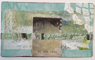
I used some painted deli paper and gelli prints for the background, a leftover scrap of layered painted deli paper, a small printed beach photo with the words "we are here" on it, and a strip of commercial scrapbook paper. In the corner I added a bit of an Artistcellar chakra stencil with crackle paint, and smudged a little sepia ink around the edges and over the crackle.


I liked it too much to give it away, so I made another for my trade partner. I was out of the beach paper and painted scrap, but had another printed paper quote: sandy toes, salty kisses. It needed something more, so a scrap of a cutout heart felt just right.

Still on the aqua theme, I made a bunch of ATCs, and one will go to the Paper Traders "winner take all" monthly ATC lottery. The ATC incorporates painted deli paper, gelli prints, stencils, washi tape, part of an old dictionary page, ink and words printed on clear Avery mailing labels.


So the question remains, why is aqua calling to me? Pale blue-green. Why aqua, why now? It is a combination of two chakra colors: blue for the throat and green for the heart. The throat chakra is something I have been working on for years, learning to speak what I am thinking, and suffering through throat constriction and sore throats if I don't voice my thoughts. But green, the heart chakra? Maybe it is that I am at a time of change in my career, shifting to a new location and new responsibilities in my job...and it is a job I love, but there are new responsibilities and expectations. And why the pastel shade, the soft aqua? Could it be telling me to be gentle with myself, not to be such a critical Virgo, not to listen to my inner critic?

Wednesday, July 27, 2016

Shared Hands Project

An arty friend suggested that three of us do a fun mixed media project last fall. The idea was to make four hands--three right hands (we would each get one of the right) and one left hand, that would be the shared art project. We were to each add something to the hand then mail it back to the originator.

I traced my hands onto hot pressed watercolor paper and made three similar right ones and one left.

Click here for the link to my post about the start of the project, which I posted on January 9.

My artistic influence was the beautiful east Indian henna "tattoos" that are painted on women's hands for special occasions. I tried to create that effect with the stencils and colors I chose.

For the left, I used a stencil with molding paste, and after it dried, painted it partially with my favorite shade of turquoise acrylic. The stencil was one that I had used on the other three. I popped it in the mail and wondered how it would look when it was returned. I eagerly waited for the mailman to bring me the other people's art, and for my final, finished left hand to arrive. It was a loooong wait.

One of the artists decided to make a book of hands as the shared project, and made us each individual clay hands with an east Indian influence. The other artist made each of us a small art quilt of her hand, that is absolutely gorgeous and intricately made. There was a bit of confusion about who should mail what to whom and when.

There were holiday and health delays, but yesterday the finished left hand arrived, and I love it!

The left hand was done collaboratively by three artists; the right hand is one of three similar I kept for myself.
I love the way the paints and inks ran and created a marbled effect, and also the index finger that goes from blue to white with random dots, and ends in a pink nail. The font on the word Bloom is so pretty, as is the hand lettering on Joy. On the right, I used square mini-brads for texture. My art friends adhered dimensional stars which add a subtle texture to the turquoise hand.

I also couldn't resist drawing and painting and stenciling and stamping on both sides of the "hand book" pages that I made for my friend Karen. She traced her hand on some heavy watercolor paper and mailed it to me.  I used some of my favorite Artistcellar stencils and stamps from Ink Pad NYC and Julie Fei-Fan Balzer.

Top of Karen's left "book hand", which was unplanned and instinctively stamped, stenciled and painted.
This was the unfinished left hand that was mailed out.

These are the three right hands. Artistcellar pocket stencil words were used.

Reverse side (palm) of Karen's "hand book" page.


Tuesday, July 19, 2016

Art, the Meditation Egg, and the Letting Go Weekend

A few weeks ago I went to a weekend-long seminar called "The Letting Go Weekend" in upstate New York with my brother. I did not have any idea about what to expect, and quite frankly, wasn't sure I wanted to spill out my inner fears with a bunch of total strangers. But, he had been to a previous seminar and found it really healing and revealing, so I gave it a try.


Sketch of my Meditation Egg journal notes

I arrived on a Friday night after a loooong Amtrak ride. I did a lot of writing in my journal, a little sketching (in public...not an easy thing for me to do) and a lot of listening to music on the way.

The retreat was held in an old nunnery, and I didn't even have any of that old knee-jerk reaction about feeling dirty or shamed or guilty.


This is where the seminar was held.
Over the three days of the seminar (Friday night, all day Saturday and all day Sunday) I did manage to have a lot of insight, and even though there are five years between us, and some other siblings before, after, and between us, there were a lot of shared memories to explore and validate. And the other people were interesting and supportive and not at all scary. I took a lot of notes and did a lot of sketches and doodles as I listened and explored and interacted.


Here's me, walking the meditation circle high on a hill in my hometown...
a perfect ending to a weekend of introspection.
One noticeable difference after the Letting Go Weekend is that I feel less compelled to make art, less driven, less frantic. It is probably a good thing, and means that I released some anger that had been pent up for years. I know that anger is often a driving force that makes me want to paint, draw and create. I am sure I will still make plenty of art, but it will probably be different. I will just have to wait and see, won't I?

Sunday, July 3, 2016

Abstract Sunflower ATCs


Sunflower ATCs should be easy, right? So why did I struggle with making them? I wanted to stay away from cliches, and decided to go abstract...maybe I should have just gotten out my paints and done cutsie little yellow petals with brown centers and called it a day. But I love abstract work, so I sat down at my art table and got to work.

Abstract Sunflower ATCs
First, I started by pulling out my gelli plate, brayers and yellow and magenta acrylic paint. Using various Artistcellar and other stencils, I made about 50 prints on deli paper. They were hideous. Colors too bright, prints too sloppy.

So next I tried layering them onto various papers that I had prepared with a white gesso surface. Some improvement, but still not great.

The next step was stamping some "petals" over the top using sepia archival ink and white printmaking paint on two different Julie Fei Fan Balzer stamps. Better, but not great still. I added a spiral center in sepia and black with an old Retro Cafe Arts stencil, then used a black stamp pad around the edges of the ATCs.

I set the ATCs in my unfinished art box thinking an idea would come to me to improve them. Then I went away for a long weekend to something called "The Letting Go Weekend" in upstate New York. My brother had a lot of insight from going to a previous weekend retreat, so I gave it a try. It was pretty healing and illuminating. I did quite a lot of journaling during the event and feel less stressed, even less compulsive about needing to make art--although I am not entirely sure if that is a good thing or not.

This weekend I decided to finish the ATCs and meet the trade deadline so I added some words with tiny round alphabet stamps and called it a day. So, they aren't the best art I ever made. I don't love them, but like the name of the weekend retreat, I am learning to "let go," move on, and accept that I am not perfect and will not always love my work but I can just meet the deadline and move on. AND maybe somebody will think the ATCs are terrific, after all, beauty is in the eye of the beholder, right?

Monday, May 30, 2016

Sanded Paper Stencils and Journal Pages

This journal page is about a dream I had. Ever since childhood, I have had a fear of alien abduction. I dreamed that a spaceship was coming to take me, and instead of cowering in fear, I looked straight at it and it got smaller and smaller and turned into a tiny dragonfly, then flew away.

Sometimes it is hard to choose between making art, writing about making art, and spending time doing "shameless self-promotion."  I often get so busy making art I don't realize that I haven't found the time to write about it. Sometimes I get busy taking photos to send to magazine or book editors in the hopes of getting published. Often times I get sick of everything and just make art. On days when I actually have time to take my full lunch hour, I eat quickly and then pull out my journal and paint for rest of my lunch time. So, here are the journal pages, ATCs, altered rolodex cards and other things I have been working on lately.

Journal page about why I love NYC, with all its grunge.


This was a lunch hour journal. The top right corner is a doodle that I made while talking on the phone, which I tore and glued to the page. I added color and enhanced the lines.

On this journal page, I tried a new technique that I read about on the Cloth, Paper, Scissors blog. I tucked stencils under magazine pages and other colored papers, then rubbed sandpaper over it until the stencil image emerged.

Lunch hour journaling--random rambling thoughts and flowing color, with deli paper overlay of white diamond-plate stencil.


ATC with layered painted deli paper, newsprint and stamps

ATC from rqandom art supplies

Altered rolodex cards

Altered rolodex card

Earth Day postcards from recycled junk mail
Altered rolodex card back
Textured ATC


Saturday, April 16, 2016

Cloth Paper Scissors Stencil Challenge

My original stencil design that appeared in Cloth Paper Scissors May/June 2016 issue
In the fall of 2015, Cloth Paper Scissors magazine announced a "make your own stencil" challenge, which was right up my alley. I sat down on Halloween with some heavy cardstock and came up with a 6" x 6" stencil, which I then experimented to try and come up an interesting art piece. The easy part was designing the stencil--I have a lot of swirly shapes that I constantly doodle, so I just let the design flow from my subconscious to my pencil, then carefully cut it out.

Once the stencil was cut, I tried making some art using a few of my old favorite techniques, and they were pretty underwhelming. Not really bad, but lackluster.

Hand-cut, original design stencil
Tea bags stamped with white printmaking paint, pencil, white acrylic and lace
were used for this interpretation of the stencil design. 
The background was done with watercolor and water-soluble colored pencils.
The stencil was printed using white crackle paint.
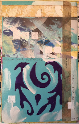
Feeling really disappointed, I grabbed my journal and decided to just do any old thing in it to let out my frustration. I opened to a piece of dark turquoise paper, and angrily grabbed a purple marker and the stencil, traced around the outline with the fine tip of the marker, then used the fat end to fill in the shapes. I also accidentally used the stencil upside-down from the way I had designed it.

On my table were some pretty scraps from other projects, so I pulled a few pieces, glue-sticked them on. It started shaping up into something kind of interesting. I used painted newsprint, tea bags with white paint stamped on, and washi tape. Next, I used one of my favorite stencils--a piece of an old touch-tone phone pad, and made scribbly squares with a white signo pen. I added some extra splashes of white paint with a dry-brush technique. The words, about following your instincts and written with a ballpoint pen, came to me as I was working. I really liked my journal page, so I decided to do something similar in a 6" x 6" format for the reader's challenge.

An experimental journal page led to the creation of the 6" x 6" piece
that appeared in Cloth Paper Scissors.
On the 6" x 6" piece, the purple marker was a little lighter and redder, and I added some black dots with a Sharpie to mimic stitching. I also added some brass-colored mini brads to repeat the dot idea and add texture.

Needless to say, I was thrilled when I saw my name on the list of finalists on the Cloth Paper Scissors blog. It is especially gratifying to have my work selected for publication because I switched from being a mostly fiber artist/art quilter to doing mostly mixed media--and on a much smaller scale--a few years ago. My a/c joint and shoulder are damaged, and it is painful to cut and sew through layers of fabric, batting, and backing. It is also painful to draw or paint directly on cloth, so now I use soft paints, pencils and pens and avoid cutting through heavy paper. While art is art and design is design, the learning curve is, and was, steep for mixed media. There are so many products and techniques to try, to test, and to explore, so I have years of fun ahead of me.