Sunday, December 15, 2013

Verdigiris Paper Doll


It is really hard not to purchase every new and exciting art supply that I read about, but my drawers and closets are overflowing with supplies, and my shelves house shoeboxes full of unfinished projects, recycled materials begging to be used, and little scraps that are too precious to throw away. So, my personal challenge--and perhaps a New Year's Resolution--is to try to work with what I have on hand and only purchase what is essential.

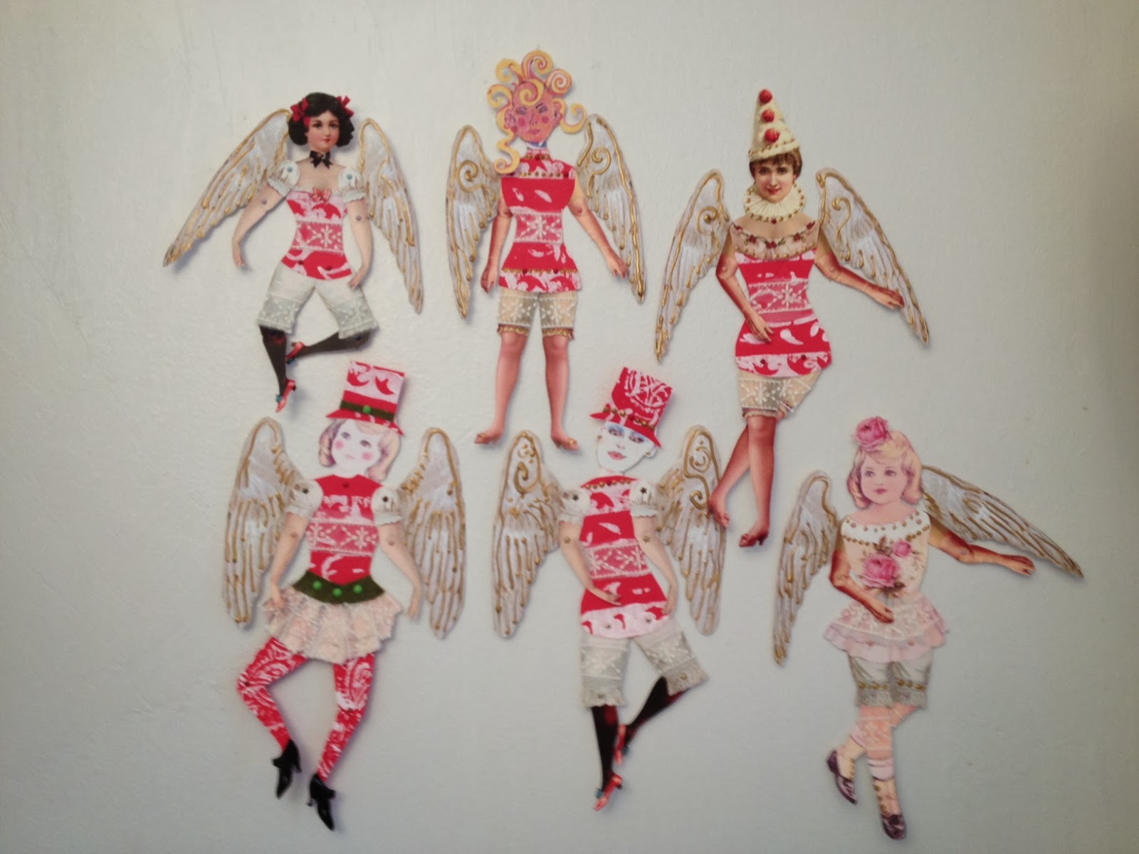
When I want to do a little art, but don't have time or space for a big project, my default project is creating paper dolls. For this doll, I started with leftover pieces of ATCs that I saved from an exchange that had the theme "Verdigiri". My process is detailed on an older blog post,
http://lindaedkinswyatt.blogspot.com/2013/01/1960s-inspired-verdigri-atcs.html. I started with the doll's dress, glued the central flower from the ATC, and added a little from another card at the neck. Next, I added legs and arms using paper from the first issue of Just Steampunk Magazine. I rummaged through my baggies and boxes of paper doll heads and found a printout of one of my original doll heads that was just the right size and color.

She needed accessories, so I chose, from http://thegraphicsfairy.com/, a vintage man's hat (I added a strip of the aqua paper to match her dress) and some boots that were from an old advertising card. She needed a bit of a skirt, so I used some white paper that had been printed with a stamp and ink from a Distress Ink pad.

The template is from Roses On My Tablehttp://rosesonmytable.ning.com/, an online group that trades all kinds of art, including original paper dolls. I altered the template by cutting the arms and legs in half, rounding the edges, and reattaching them with a mini brad to give even more poseability.

Below is a finished Verdigiri ATC that I kept for my own collection.
 

Sunday, December 8, 2013

Funky Flat Angel Dolls

The heARTist trading group side trade for December was flat angels or flat Santas. I started researching both angels and Santas. I found cute, I found pretty, I found sentimental, I found bizarre and creepy. But I didn't find an idea that spoke to me. So, I started puttering with my shoeboxes full of doll parts and scraps, which usually leads me to something interesting and therapeutic.

There were some leftover scraps of white on red printmaking that I used for my house-shaped ATCs, so the scraps became bodies. I used an assortment of vintage and original doll heads and body parts. The main thing that makes an angel is a set of wings, so each has some gigantic wings with gold dimensional paint accent. All the parts are attached with mini-brads to make them poseable. I added a finishing touch of some sheer lace that resembled snowflakes, extra dabs of gold paint here and there, and ended up with an assortment of very funky angels.

I decided to keep one angel. It was hard to choose a favorite, but settled on one that used a vintage Pierrot Clown Lady paperdoll image from the Graphics Fairy. http://thegraphicsfairy.com/

 Thank you Karen Watson for your wonderful site of free vintage images!


Christmas House ATCs

The Roses On My Table online group had a theme of "House Shaped Christmas ATCs" for their December trade. I must confess, I am a bit of a Grinch about Christmas so I didn't want to get all sentimental. Why am I a Grinch? Well, I hate the commercialization, the TV commercials that air right after Halloween, urging you to buy, buy, buy. I don't need any presents. My family doesn't need any presents. There are so many homeless people, so many world disasters, that is seems crazy to buy into the materialistic Christmas agenda. Still, I wanted to try the theme because the house shape was so darn cute.

I bumbled on a test print I did of an Indian wood block I recently purchased in the East Village. The block has stripes on the top and bottom and a paisley/floral shape in the center. I had a lot of red cardstock left from a project, and had done the print on red with my favorite white printmaking paint.

I decided to start with the print and cut it into little house shapes, 2.5" x 3.5". I added a simple door, made of cut paper that came in a pad of ugly scrapbooking paper that I received a gift. The ATC was beginning to shape up, but it needed more, so I pulled out my very favorite lace, purchased at M&J Trim, that gave the feeling of snowflakes. The finishing touch was a star shaped mini-brad as a doorknob.

NYC Subway Map ATC

Maps were the theme for the December 2013 heARTist group ATC trade. After researching  antique maps of all sorts, I still felt uninspired. Then, a little voice (voices of teachers past) said "Do what you know." With that advice ringing in my head, I settled on the New York City subway map, and centered on the routes I take on a daily basis. I zeroed in on the east side of Manhattan, where I live, and included the tiny Roosevelt Island, where I work, and Harlem, where I will be working in the near future. (Roosevelt Island is the little pill shaped island between Manhattan and Queens.)

I cut out the map and adhered it to a greenish batik, then added a mini metro card and the vintage subway token that was in use when I moved to New York many years ago. The edges were touched with a gold paint pen, darkened with a liquid chalk stamp pad and the ATC finished with a coat of Modge Podge for shine.

Sunday, November 24, 2013

Jazz Cabaret Paper Doll

I am making an effort in my artwork to use up what I have on hand. I have a shoebox full of doll parts, so this doll was a result of opening the shoebox, sorting out heads, arms and legs, choosing the ones that worked together, and then finding unused scraps for clothing.  The face is one I drew/painted myself (her name is Enid...I don't know why, it just seemed to fit the face). The dress is a piece of my own fabric (printed at Spoonflower). The arms and legs are from a vintage doll I found in an online search, but I cut both the arms and legs in half and reattached them with mini brads so they would be more poseable. Her hat and shoes are compliments of The Graphics Fairy http://thegraphicsfairy.com/ (I made the white shoes yellow with a little magic marker so they would match the dress). She reminded me of Liza Minnelli in Cabaret, especially after I added the hat and beaded fringe on the bottom of the dress. Can't you just hear her singing?

Sunday, November 17, 2013

Vintage Tiny Dancer Paper Doll

My Sunday art therapy seems to be paper doll making. Like collage, it uses up small but cherished scraps of paper and cloth and is unplanned...which I find enormously therapeutic.

For Tiny Dancer, I used several Graphics Fairy http://thegraphicsfairy.com/ elements: the head, sacred heart, body (using script from an antique letter) and shoes are all compliments of Karen at The Graphics Fairy. In Photoshop, I sized the pieces so they would fit my doll template and printed the elements on cardstock. I added some arms and polka dot legs (cut from the pages of Just Steampunk Magazine), cut them carefully, and attached with mini brads.

The skirt was made from a dried, used tea bag. I carefully opened the teabag, emptied out the tea, and printed  the little sheet, ecru paper with an assortment of Tibetan wooden stamps using white printmaking paint. I gathered the little printed teabag with a running stitch at the top, and pulled on the string until it was waist sized and looked like a tiny skirt. I then tied the strings in the back and added a few stitched at the waist to keep it from slipping off.

Monday, November 11, 2013

Zetti...Me! Paper Doll

 One of my favorite things to do is make paper dolls. Another favorite art theme is self portraits. So, it makes sense that self portrait paper dolls would be right up my alley. When I am not sure what to do, or need some art therapy, I like to rummage in my box of paper doll parts and my box of random scraps. Today I used some leftover pieces--a head from an old black and white family photo taken when I was about 11; a body made of my own fabric (available on Spoonflower.com), and I cut arms and legs from a cast aside painted piece of watercolor paper. I added a steampunkish/zetti hat made by covering a Graphics Fairy hat with checkered paper, and some Graphics Fairy http://thegraphicsfairy.com/ antique boots. The body parts, wings, boots and hat are all attached with mini brads so that they are moveable and removable as well.

Friday, November 8, 2013

Prayers to the Moon ATC


“Prayers to the Moon” was the theme for our November heARTist ATC exchange. The words suggest a myriad of images—Goddesses glowing in the moonlight, mermaids basking on a moonlit beach, Wicca gatherings, Native Americans honoring Sister Moon, children’s stories of the Man in the Moon, and all kinds of ideas that ranged from deeply spiritual to silly.

I wanted to capture the tranquility of moonlight on the beach, so I began by using gradated Derwent sticks in hues of indigo and blue on watercolor paper. I wanted to have words—the refrain of John Lennon’s “Instant Karma” seemed perfect—but I couldn’t figure out how to get words to show on the dark paper. After cutting the background to 2.5” x 3.5”, I tried overprinting the scraps with white paint on a lacey stamp, and discovered that the lyrics, which I had printed on clear Avery labels, fit just right on the little painted, lace-stamped rectangles. I glued the small pieces to the backgrounds and then played with moon ideas, settling on using some old gold certificate stickers, carefully cutting out the center and leaving a pointy gold halo. It seemed to need a little more, so the final touch was some silver star-shaped mini brads as accent.

No-Theme Postcards

Some people love and need prompts to spark their creativity. Most of the time prompts just annoy me, and I find them alternately confining and confounding. So, when I have a chance to do a “no theme” exchange, it is a chance to work on my own ideas that have been in the back of my mind or scribbled in a sketchbook. It is also a chance to rummage through my boxes and bins to find and use little tidbits I have been hoarding that were too pretty to throw away, and unfinished pieces begging to be completed.

On a trip to a great little store in NY called The Ink Pad http://www.theinkpadnyc.com/, I purchased a stamp that reminded me of William Morris’ textile designs. I tested the stamp on some coquille watercolor paper a month or so earlier, then got super busy and put the work aside. I decided to fill in the white space with watercolor, watercolor pencils & markers, and was happy with the result. I then looked for postcard sized 4” x 6” backgrounds for the mini watercolors. I found three: a leftover piece from a pink recycled tissue paper and fabric collage, a green stamped cardstock background leftover from some “jonquil” themed ATCs I made over a year ago, and part of a big blue watercolor that I over-stamped with a white circular texture that I had been saving for a special project. I wanted to add texture, so I attached the colorful mini Morris watercolor by zigzag it to the various backgrounds.

Sunday, October 6, 2013

Day of the Dead ATCs


I have always loved the Day of the Dead artwork. After I did some research on it, I understood the odd combination of religion, culture and art, especially about the meaning of the sugar skulls.
The Day of the Dead theme for October’s heARTist Trading group was pretty far outside my comfort zone, and even after I did a lot of research, I still didn’t know where to begin.
So, I rifled through my boxes and bins and drawers looking for inspiration—which I found in a piece of “scrappy” fabric that I made a while back. It was too brightly colored—garish really—so I tucked it away in the bottom of a box for months. But when I took it out last week, it said “Mexican Fiesta” to me, so I used it as the base of the ATCs.
I auditioned a bunch of other elements, finally settling on a little blue paper sugar skull and some metal crosses that had been in my jewelry components box for ages. The final touch was the “ruby” gems in the eyes, giving it just the right amount of creepy magic.

Sunday, September 15, 2013

Frida Kahlo Art Paper Dolls

What a fun theme for the Roses on my Table September paper doll trade--Frida and the Day of the Dead.
I used some Graphic Fairy http://thegraphicsfairy.com/ images for Frida's heart and shoes and for the big flower in her hair, and an assortment of paper and fabric scraps.

Woodstock Music ATCs

Here is what I have been working on lately for Music ATCs for the heARTist Trading group.  I went back to the Woodstock era for design inspiration and added some lyrics from the famous song, written by Joni Mitchell and made famous by Crosby, Stills and Nash. The designs were done in Photoshop and Quark, then overprinted with white printmaking paint, and the edges aged with liquid brown chalk.


Monday, August 12, 2013

Retro Canning Tag

While looking through the archives on The Graphic Fairy’s website, http://thegraphicsfairy.com/I found a beautiful old canning tag. Alone it was quite striking, but I decided to play around with different images superimposed on it. My favorite one to combine with the canning tag was another Graphic Fairy image, a big botanical pink floral, which added a retro feel.
In Photoshop, I sized the canning tag to standard tag size (43/4” x  23/8”) for the first layer, then added the floral, with the white background removed, in another layer. I duplicated the floral layer twice, then changed the size slightly and moved it around until I had an image I liked.
Next, I printed the tag on cardstock from a color laser printer. Using white printmaking paint, I stamped over the design with a delicate William Morris-style floral, and, once dry, aged the tag by applying liquid chalk to the edges.

Saturday, August 3, 2013

Butterfly ATCs: Lift Your Glistening Wings


The heARTist Trading group’s August 2013 ATC exchange theme is butterflies. What could be more summery and lovely? I have a soft spot in my heart for butterflies—my daughter’s middle name is Kamama, which means butterfly in Cherokee, so butterflies are extra magical for me. I also love the butterfly bush, which smells heavenly and really does attract tons of butterflies.

I made a number of collages in Photoshop, layering the images and using a soft eraser brush set at 50% to give some transparency. I combined various butterflies with flowers, old newsprint, textures and words. Many of the flowers, patterns, and butterflies were from The Graphics Fairy. http://thegraphicsfairy.com/ On several, I inserted (using an assortment of fonts) words from Society’s Child, an old favorite song by Janis Ian:  “…one of these days I’m gonna lift my glistening wings and fly…” On others I used the words kamama, papillion and mariposa, which all mean butterfly.
I had such a good time designing the Photoshop collages that I made about 30 ATC printouts, output on cardstock with a color laser printer. Going back to my tried and true favorite technique, I printed over them using white printmaking paint applied to some of my favorite commercial and hand-carved stamps. The edges got an aged effect by dipping them in distress ink and/or liquid chalk. Pictured are the 11 I liked best…but I can’t pick a favorite, can you?

Sunday, July 28, 2013

Zetti Turn of the Century Bathers Paper Dolls


For the Roses On My Table Paper Doll art group’s July challenge, the theme was Zetti, which was right up my alley. But wait—the twist was that it had to be a couple in turn-of-the-20th century bathing costumes. That threw me a bit of a curve ball. So, I researched turn of the century fashions and old postcards from the seashore to get an idea of the clothing style, and then started rummaging through scrap boxes madly for the right elements.

Usually I gravitate to female dolls, but this time I started with the man. I used a face from a Graphics Fairy http://thegraphicsfairy.com/   image called PartyPeople, altered the top of his head in Photoshop, and added color. A moustache seemed very 1900s, and I couldn’t resist some faux tattoos (from one of my fabric designs) on his skin. The female doll also uses a Graphics Fairy face, this one called the ArtNouveauLady; I added color with watercolor pencils and markers. The end result for the male bather is rather Freddie Mercury meets James from the 1970s version of Upstairs Downstairs.

Both dolls use paper printed with my original textile designs, “skin” made of teabags stamped with assorted commercial and hand-carved stamps using white printmaking paint, wild-west style words stamped on with Distress Ink, and some harlequin b/w patterns from Adobe Illustrator. The butterfly accents are also from Graphics Fairy images.

Thursday, July 11, 2013

Vintage Typography


Typography is one of my favorite themes, so I don’t know why it took me weeks to decide on what to do for my heARTist Trading ATCs. There were so many directions within typography that I tried three or four approaches, but nothing was really working. 

My family has been watching the old 1970s PBS show “Upstairs, Downstairs”, so I wanted to do something with the Art Nouveau style. I puttered for hours with Nouveau-inspired fonts and played with letters, words, and fabric designs in Photoshop and Adobe Illustrator without too much success. Next, inspired by the work of artist Lisa Occhipinti, I used portions of the swoop of a Q, Z and M Art Nouveau backgrounds, an antique beach, and my own designs—without success.

So, I went back to my old favorite—vintage advertising, and layered Graphics Fairy http://thegraphicsfairy.com/ and other antique images in Photoshop to create this month’s ATCs. I tried about 50 different ideas, and printed the five styles I liked best. I surrounded a Pears Soap ad with text about cleanliness and beauty in an old west-inspired font. The Monaco-Monte-Carlo card was the only one in an Art Nouveau style; I layered a Mucha poster on one of my own designs. The beehive/rose, bird in an envelope and French advertising all multiple vintage images that were layered and softened in Photoshop.

Tuesday, June 18, 2013

Romantic Distressed Tags and Zetti ATCs


Tags are so much fun…even though I have almost no art space to work in and most of my supplies are crammed into a tiny closet I couldn’t resist joining the June heARTist Trading group's side trade. I returned to the techniques that I love and find soothing and therapeutic—designing collages in photoshop with vintage images Graphics Fairy images http://thegraphicsfairy.com/  overprinting by stamping with white printmaking paint; and using recycled teabags that have been stamped with white printmaking paint. I added a rusted folk-art heart and subtle lace to the teabag tags, and distressed all the tags with liquid chalk stamp pad to get an aged effect.


Zetti is one of my favorite themes, so I had a lot of fun with this month’s theme. The top one uses a Graphics Fairy vintage angel image. In Photoshop, I layered in a different face, added some Adobe illustrator black and white patterns, a hand that came from a small carved wooden Tibetan stamp and inserted the word “believe.” I finished it with gold acrylic accents. On the left is my alter-ego Esme, who emerged while I was doodling during a lengthy phone call with an old friend of my husbands who claims to have psychic abilities. I was inspired to add the “fish hat” after seeing the work of Deborah Burnahm (Land of Nod Studio). The words “strange things on my mind” seemed particularly appropriate. The ATC on the right is a five year old me, who was very, very shy and dreamed of being an artist. I added the words “trust yourself” because art was a path that was discouraged by my parents, and not encouraged by a teacher until I was a senior in high school. The design was done in Photoshop, and the background color added with water-soluble colored pencils.


Sunday, June 9, 2013

Zentangle Kaleidoscope ATCs


For my zentangle ATCs for a recent heARTist Trading exchange, I had what I thought was a brilliant idea: draw a zentangle on a rubber block and carve a stamp. While the idea was solid, and the carving came out pretty good, the prints were terrible; they came out weak and indistinct. So, I put on my thinking cap, and decided to scan the bad print and see what kind of repairs could be done in Photoshop. I bumped up the contrast and played with some filters (finally choosing a “stamp” filter) and got a workable image.  Since I am a fabric designer at heart, I couldn’t stop myself from playing with the image more, and I step and repeated it with a kaleidoscope-like mirror image and added a red border. I printed them on cardstock, and then backed them with fusible lightweight interfacing for strength since I planned to add some stitching. They still needed something more to make each one unique. I tried hand-stitching red and white buttons to the corner and center, but it was a bit corny. I auditioned an assortment of beads, sequins and ribbon but nothing worked. I finally remembered some black and white rubber beads from bracelets that I found in a Michael’s sale bin a few years ago—each one was just a little different, and they were just the right final touch.