Tuesday, June 30, 2015

Beauty's Only Skin Deep


For years I have made art paper dolls, so after I made an collaged journal background, I decided to see how my doll parts would work in collage. I chose a few interesting, unrelated leftover body parts (mostly printouts of royalty-free vintage graphics from The Graphics Fairy) and, using a glue-stick, stuck them to the page without over thinking it. I ended up with two unrelated pages side by side. the background has charred baking parchment, printed tea bags, painted deli paper and other assorted papers.


The left side has a face that I just didn't know what to do with. It started with a small square stamp of a face, but the face had a black border around it which made it awkward to use. I enlarged it added color, a neck and hair and turned it into something that looked like Chrissie Hynde on a really bad day. It sat in my doll part box for years looking kind of sad.

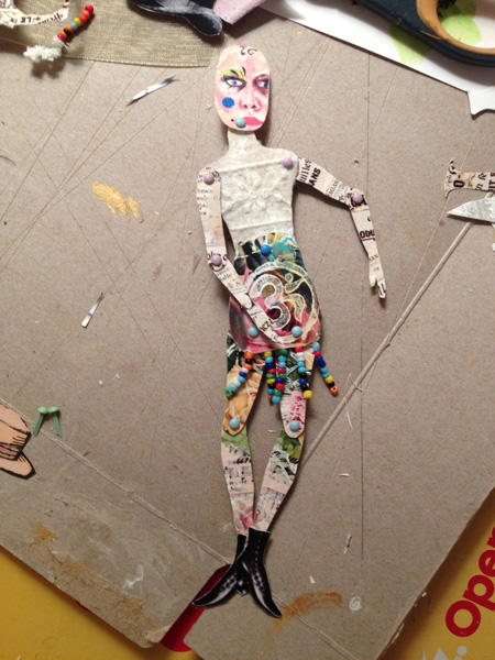
The pear is a not very subtle reference to the pear shaped body type, and the little face at the bottom of the pear is a salute to pregnancy and motherhood. I liked being able to have the boot unattached to the body--it suggests a young woman who is rushing and barely has time to get dressed, maybe juggling motherhood and family and a career.


The right side is a face from a New York Times Magazine fashion spread and body parts from a vintage paper doll. I didn't intend to do a two page journal spread, but I had so much fun with the left side I decided to keep going and do two doll pages.

As I looked at it and decided what to do next, words came into my head: "beauty's only skin deep." Using mini alphabet stamps and a permanent black ink pad, I wrote out those words on the left, and on the right, the "model" joins in to the musical refrain of the Temptations hit song with "yeah yeah yeah."

Monday, June 29, 2015

Lefty Art: Painting With the Other Hand


If there is enough time on my lunch hour, sometimes I pull out a few art supplies and paint, or draw, or doodle. The other day I did a lot of typing and graphic design in the morning, and my shoulder was aching. But I still wanted to relax and do some art to clear my head. So, I decided to use my left hand—since I am a righty, it was a little tricky. With the left brain/right brain idea in mind, I thought that switching hands would help clear my head.

I used some watercolor pencils on standard white cardstock and scribbled, then used a brush and water to pull the color around. I also dipped the pencils in water and drew with them and then wet the page and drew on the wet surface. It not a masterpiece, but it was therapeutic, and the colors were pretty and soothing.

I took the scribble piece home, then selected a 4” x 6” section that I liked, and trimmed it. I enhanced it a little with a Scribe-All White Marking Pencil and a little Faber-Castell: Stampers Big White Brush Pen. The Vonnegut quote was printed on Avery clear mailing labels. The quote seemed to go along with a piece that was created left handed. The Avery labels have a sticky back so the quote adhered nicely.  I ran the edges over a sepia distress ink pad to give an aged look, and also added some gloss medium over the whole thing because I didn’t want to take a chance on the quote falling off when it traveled across the country to its destination.
 
 
To strengthen the postcard, I used a reject/unfinished piece of watercolor paper for the back, decorating it with washi tape and zetti-ish harlequin paper.

Sunday, June 28, 2015

Empowerment Paper Doll

This post from a couple months ago somehow got deleted from my queue...no idea how, but I love this little paper doll so here it is...


Lately, my personal challenge has been to use up what I have on hand before buying new art materials. I have boxes and boxes of paper scraps, unfinished projects and things that just didn’t turn out quite right. On Sunday mornings my husband watches all the news shows for hours, so I have a window of undisturbed art time to putter and sip my coffee.

 
This Sunday, I pulled out my boxes of little bits and pieces to see what I could do. As I was sorting, I came upon a little brown cardstock figure that I purchased from Retro Café Art. It was smaller than I was comfortable with, and I had put it together with little star brads just to see what it looked like, and then put it aside.

I decided that one of the problems was that the star brads were too big, especially since they had points sticking, out so I took the doll apart. Next, I sifted through my piles of scraps to find something just right to cover the body parts. For the face, I thought I might use a mini-self-portrait from an old business card. The template had a teeny tiny head, so I cut mine a little bigger. I found some old ATCs that weren’t quite right, and used the sections I liked for the arms, legs and body.

With matte medium, I glued some vintage advertising typography from the Graphics Fairy to the arms. The legs are floral sections of cast-off ATCs, and the upper body has printed tea bags with a snippet of sheer lace. The bottom torso has a stamp of the OM symbol—also from a section of an imperfect ATC—and some beaded trim at the bottom edge for the suggestion of a skirt.
This time, I put the parts together with tiny mini brads in pastel colors, which worked better than the stars. Any points that were sticking out from the backside were snipped shorter with a jewelry wire cutter.

One of the fun parts of art paper doll making is putting it together—you never quite know what the doll will look like, and what kind of “personality” it will have until all the parts are connected. I often switch out faces or clothing until it seems right. I didn’t like the face as much as I thought I would, so I rummaged through my baggie of faces and found one I had made a few months before. I made a bunch of heads when I tested some Dina Wakely face stamps, using Artistcellar's black ink pad and Derwent blocks for spots of color. (Non-water soluble ink works best if you are planning to add color after the stamped image dries.)
 
The new head was oversized for the body, but it added to the eccentricity of the doll. It also wasn’t a happy, beautiful face—it is actually kind of sullen—but then, who is always happy and beautiful?
For pizzazz, I added a pair of vintage boots, also from the Graphics Fairy. Somehow my dolls don’t seem complete without wings and a hat, so I added a bowler hat and my favorite Graphics Fairy butterfly (cut in half and glued to the upper arm with matte medium, carefully avoiding gluing the brads, so that the doll will still be poseable.) The finishing touch was a saying from a Yogi tea bag: You are unlimited.

 
The doll reminded me of an angst-filled teenager who doesn’t fit in anywhere. It seemed that she needed the extra oomph of the inspirational words from the tea tag, the OM symbol and the butterfly wings, to empower her and know she is okay just the way she is.

Saturday, June 27, 2015

Tutorial: Faux Lace from Recycled Tea Bags


-ATC Box with paisley stamped tea bag faux-lace,
lace trim and gold dotted accents-
 
Tired of spending a lot of money on art supplies? Here’s a frugal way to recycle and make some cool art and craft.
1)      Save your used teabags. Pull them out of the water BEFORE you add milk, sugar, honey, lemon or any other flavor-enhancer.
 
-figure A-
 
2)      When the bags are completely dry, carefully open them and remove the dried leaves. (The paper is very delicate.) [A]

3)      Flatten out the paper. You will see mottling/staining—that’s part of the fun. Paper will be different colors depending on what kind of tea you use and how long you steep it. [B]
 
-figure B-
 
4)      Choose a variety of stamps—I prefer lacey feminine ones with good detail. You will need to experiment to see what you like best. You can also use hand-carved stamps and/or wooden stamps. [C1, C2]
 
-figure C1, hand carved stamps-
 
-figure C2, commercial stamps-
 
5)      Apply white printmaking paint to the stamp. You can brush it on or use a brayer. (Printmaking paint stays wet longer than other paints.) [D]
-figure D-
6)      Drape the teabag over the stamp and gently press it down all over. [E]
 
-figure E-
 
7)      Gently pull the paper off the stamp. If it didn’t print perfectly, don’t worry…it can often add textural interest to have an imperfect stamp. (I use the imperfect ones for collage and the “perfect ones” for ATCs and tags.) [F1, F2]
 
-figure F1 shows the printed tea bag as it is pulled away from the stamp-

-figure F2-
 
8)      Drape the empty sections of the teabag over the stamp and press. (You will probably get paint on your fingertips. I keep a wet paper towel or rag nearby to wipe my fingers as I work.) I usually reapply paint every other time.

9)      Keep filling in sections until the whole teabag is covered. You can also mix stamps—you don’t have to use the same stamp on each teabag. [G1]

10)   Once the painted bags are dry, you can make all kinds of things with them:

a.       Collage them into one big piece and use it as a journal page or background for other artwork [G1, G2]
 
-figure G1-

-figure G2 has a tea bag lace background overlaid with a
vintage wedding photo printed on sheer silk, with lace and
button trim-
 
b.      Cover a small box with it and decorate with lace (atc box). Be sure to cover box with white gesso first (and let dry) so that the nuances of the printed tea bags show up. [H]. I often use recycled boxes but this one was purchased from Retro Café Arts.
 
c.       Wrap it around an ATC or tag for a base. You can also layer it over a colored paper or fabric background [I1-I5]
 
-figure I1-

-figure I2-

-figure I3-

-figure I4-
 
-figure I5-
 
d.      Scan the design into a photo editing program and manipulate or mix with other images to create very personal art or background papers. [J1-J4]
-figure J1-

-figure J2-
-figure J3-

-figure J4-

e.      Use it as “skin” or a base of a Santos cage on an arty paper doll [K1-K6]

-figure K1-
-figure K2-
-figure K3 used a Dina Wakley stamp face,
Graphics Fairy shoes and tea bag lace arms-


-figure K4 uses faux tea bag lace on a large paper doll template from
Retro Café Arts-
 
-figure K5 has a tea bag faux lace base and arms
with Graphics Fairy wings and face-
 
-figure K6 has faux lace arms and legs, an original face
hat made from a recycled, painted coffee filter and
Graphics Fairy butterflies -
 

Monday, June 22, 2015

Batik Effects with Masking Fluid


Back in the early ‘70s, I used hot wax on fabric and paper to create delicious batiks. But wax batik can be messy, smell, time consuming, and take up quite a lot of space. When I read about a new masking fluid with a very fine tip that Artistcellar carries in their online store, my inner flower child cried out for it.
I spent a couple weekends playing with the masking fluid, testing it using a variety of papers and paints. (It is not intended to be used on fabric.) The resist liquid flows out of the bottle very nicely and is easy to handle. It has no odor, which is a nice change from trying to use rubber cement for a resist, and it has a light green tint so—unlike wax—you can easily see what you are working on and how the design is going to look.


I wrote a favorite Kurt Vonnegut quote on cardstock, then doodled around the edge. If you like to doodle, you will have great fun with the resist. I covered it with diluted green acrylic paint, and had no trouble peeling off the resist…I do wish I had used a darker color though.

Finding the right paper and right paint proved a little trickier. On thick, smooth black cardstock with gold Viva Decor’s Inka Gold, my little sample came out great. On cheap cardstock and one of my imported watercolor papers, the dried resist peeled off the paper in some areas. When I used thick acrylic, the paint peeled away with the dried resist.


The perfect papers were smooth surfaces, like a good hot press watercolor paper and a smooth but textured paper called coquille. The perfect colors to go over the resist were either watercolor or very diluted acrylic.
When I tried Tim Holtz Adirondack spray, the resist absorbed the dye. However, even though it didn’t turn out the way I expected, I was able to use it as a background for sacred heart journal page (left).
 
Inspired by the Frida Kahlo art exhibit at the New York Botanical Gardens, I used a section of their membership pamphlet over the green not-so-perfect resist background. The top LOVE-LOVE-LOVE strip was part of a resist test piece. Rather than use a red or pink heart, I used white printmaking paint through an Artistcellar sacredheart stencil. A tiny bit of the bubbles stencil at the top of the page, also in white, unified and completed the page.
The right side was a happy accident. I tested the resist on deli paper that had been painted randomly with pale aqua and white acrylic. I decided to use my “word of the year”, BE, as the test message. As I wrote, I thought, “Be what?” Remembering an art workshop I saw advertised that was called “Excavating your authentic self”, I wrote be authentic. After the resist dried, I used a deep teal/indigo watercolor to cover it. The watercolor pooled on top of the painted deli paper. When it was dry, it reminded me of a seascape, so I added some white printmaking paint with a stamp on the top corner, and a little bit at the bottom to resemble foamy crashing waves. I especially liked the way the dark watercolor created an outline around the resist.


Tuesday, June 16, 2015

Making a New Journal With Deli Paper and Scraps


 This is the cover of the new accordion journal that I just finished making. The cover is made from recycled cardboard and painted deli paper. The Kurt Vonnegut quote on the bottom expresses the reason I feel compelled to do mixed media work in my journal...it lets the crazy energy out that might otherwise be trapped inside me and make me anxious, panicky and physically sick.


Last summer's class with Kelly Kilmer at the Ink Pad got me addicted to journaling and to making my own journals. I have beautiful journals that I have purchased or received as gifts that are too precious to use. I am always afraid of messing them up, and I also have my inner critic telling me that only fabulous work is worthy of the pages.

With a journal made from leftover cardboard and junk art that is too good to throw away but not good enough to hang on the wall, the voice of the inner critic is silenced. It also becomes very personal and really belongs to you.

Following the directions that Kelly gave to class participants, I made my third accordion journal recently. I love every aspect of the journal making...I love sewing, so that skill comes into play with sewing the signatures together. I love construction and cutting, so measuring and cutting the cardboard (from the backs of used-up legal pads) is right up my alley.

I rummaged through my pieces of painted deli paper for the cover, and used reject paintings for the accordion sections. The signatures were made with assorted colored cardstock I had on hand. I ran out of waxed linen to stitch it with, and couldn't find my big blunt needle with a huge eye, so I doubled dental floss and used an embroidery needle.

Here's how it came together:

I used two similar pieces of painted deli paper
and connected them using matte medium
I glued the cut cardboard pieces to the deli paper with
matte medium, then wrapped them around the edges.

I made signatures of folded cardstock (in a variety of colors) then stitched them to
a long, accordion-folded piece of hot pink paper, recycled from a poster


Here is the book opened and folded after the pieces were stitched

I didn't like the hot pink, so I covered it with reject mixed media paintings and
painted deli paper with printmaking experiments.

interior view of book

Another interior view of a deli paper covered accordion section

This is the old cover. The striped part is the back.
(silly me, I had it upside down when I took the photo!)
The front sectionwas lumpy and bumpy because I did not use enough matte medium
when I covered the cardboard with the painted deli paper. I tried and failed
twice to fix it, without success, so I just added a smaller piece of
another painted deli paper for the final cover.


This is the final journal, front and back, with the new cover. I can't wait to use it!